Neo2 magazine
Democràcia. License: All Rights Reserved.


The biannual, Spanish-language lifestyle magazine Neo2 was redesigned in 2024 by Democràcia. It’s typeset in Universal Sans (Family Type) and HAL Timezone (HAL Typefaces).
Democràcia shares the following notes on the design:
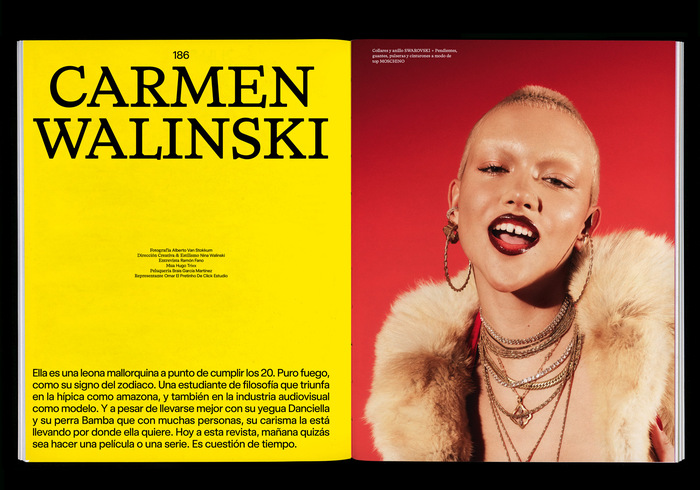
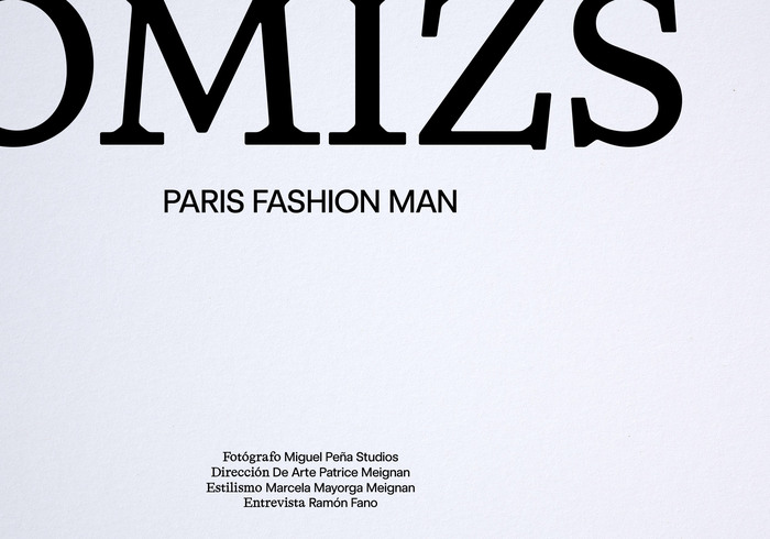
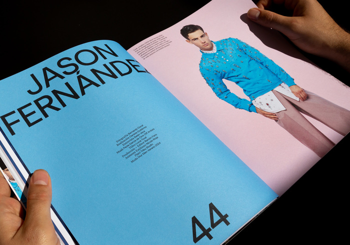
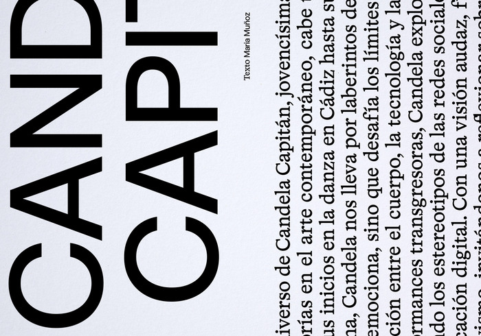
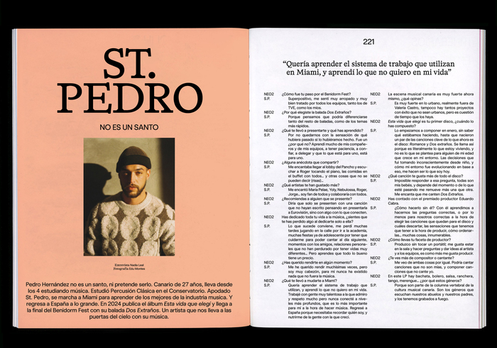
The layout of NEO2 magazine and the image for its 30th anniversary were resolved in a simple way. The graphic solution to ensure the new header does not compete with the identity of its 30th anniversary is the creation of a typographic non-logo. Creating a visual system without generating competition. Combining efforts in the same direction. An ad-hoc universal sans typeface. The header design has been conceived from geometric elements such as the circle and the square. A typeset that combines serif (HAL Timezone) and sans serif (Universal Sans) to achieve solidity and minimalism. Rescuing and reinventing its history since 1994. Very grateful to have been part of this project.
Democràcia. License: All Rights Reserved.
Democràcia. License: All Rights Reserved.
Democràcia. License: All Rights Reserved.
Democràcia. License: All Rights Reserved.
Democràcia. License: All Rights Reserved.
Democràcia. License: All Rights Reserved.
This post was originally published at Fonts In Use