Eppelheim

Source: www.eppelheim.de License: All Rights Reserved.


Eppelheim recently rebranded with Gamay.
The city in southwestern Germany revealed its new design in September 2025. The logo is set in caps from the Medium weight of Gamay’s Editorial width, which is slightly wider than the Regular. The wordmark is complemented by a symbol that marries the initial letter E with a heart shape.
Visitors of the municipal website are greeted by a typographic animation. It shows the name Eppelheim in two lines and adds a third one in a lighter weight from Gamay, engaging in various wordplays: Heimspiel (home game), Heimarbeit (homework), Heimweh (homesickness), etc.

Source: www.eppelheim.de License: All Rights Reserved.
Animation featuring a second weight of Gamay

Source: www.eppelheim.de License: All Rights Reserved.
Website detail with the new symbol used to mask an image. Headlines are shown in all-caps Gamay, while text is set in Roboto.

Source: www.eppelheim.de License: All Rights Reserved.
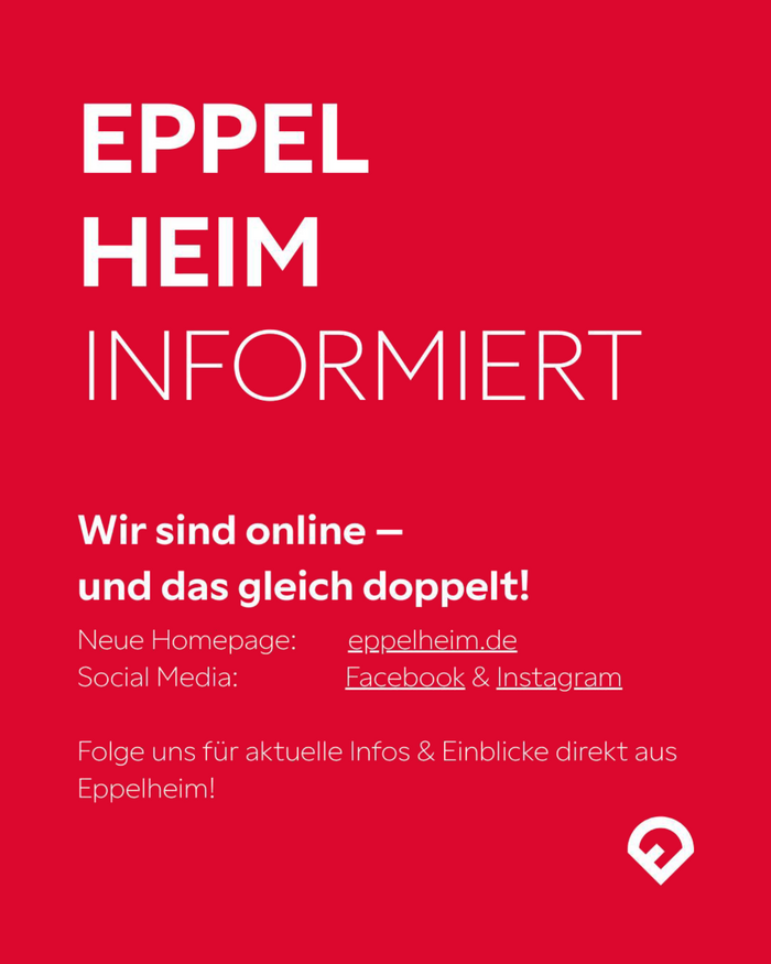
Source: www.instagram.com License: All Rights Reserved.
Eppelheim’s social media channels also use Gamay in mixed case.
This post was originally published at Fonts In Use