Studio Freight
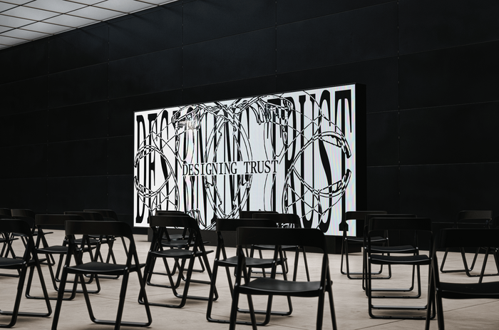
Photo: Studio Freight. License: All Rights Reserved.


Studio Freight delivers brands, digital experiences, campaigns, and special projects to move missions forward. Their global team works across categories, continents, and capabilities to transport client partners from where they are to where they want to be.
Recently, the studio introduced a new brand and website, ending its “speakeasy era,” with a clarified promise of Moving Missions Forward and an unfolding ecosystem of initiatives, including The Manifest. The new logomark draws on the narrative depth of crests and hieroglyphs, combining a horse, a key, and an F that together hint at a pegasus.
The identity pairs JJannon (by Optimo) with Publico Text Mono (by Commercial Type). JJannon carries body copy and longer reading, where its editorial heritage and slightly austere contrast bring intelligence and care to the studio’s writing. Publico Text Mono anchors headlines, eyebrows, and supporting marks, where its monospaced, data-vernacular texture lends the brand the cadence of annotated research. Together, the two scale between quiet and loud, giving the system the feel of brutal elegance.
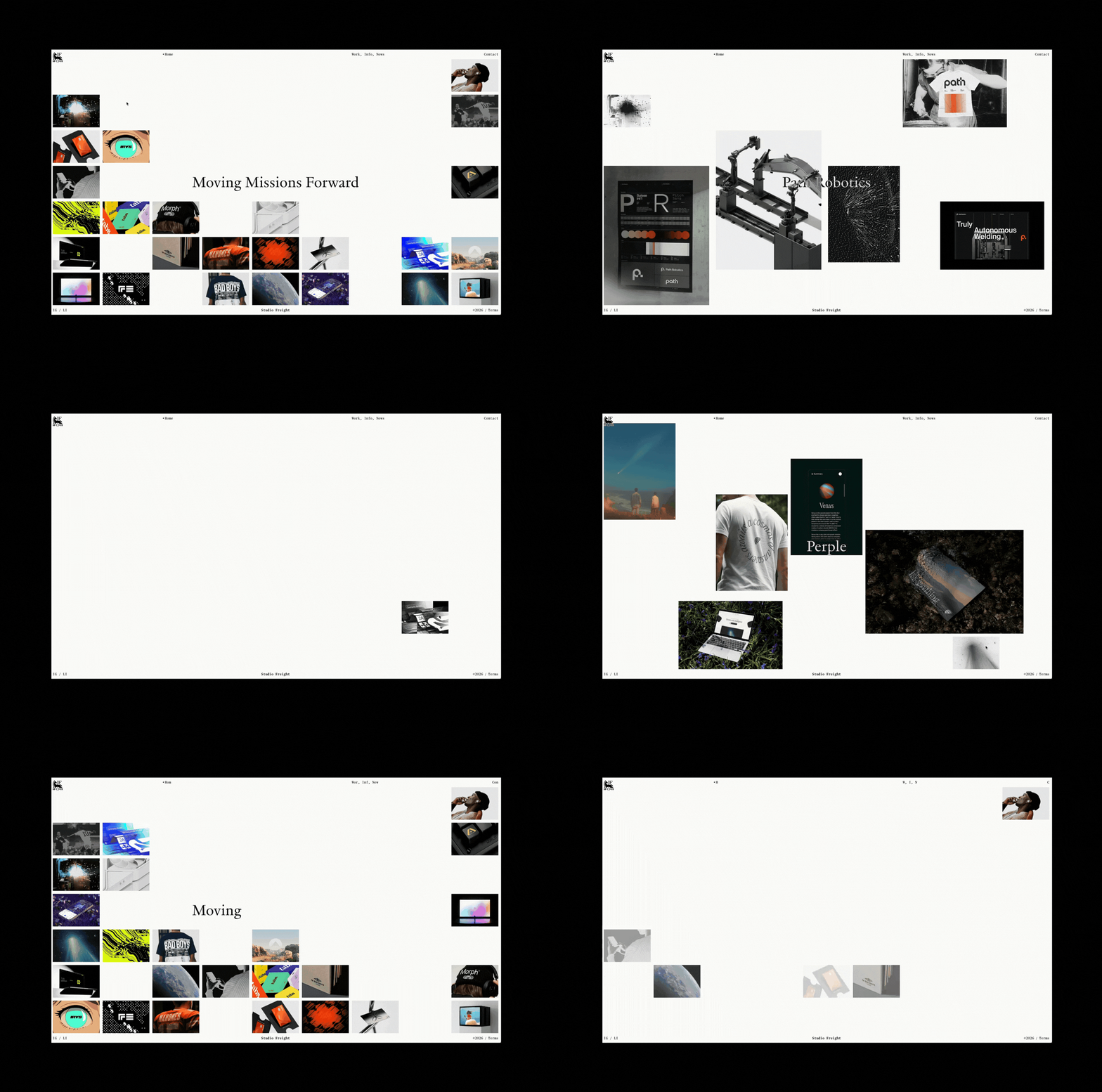
Photo: Studio Freight. License: All Rights Reserved.
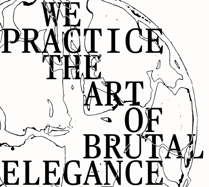
Photo: Studio Freight. License: All Rights Reserved.
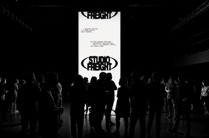
Photo: Studio Freight. License: All Rights Reserved.

Photo: Studio Freight. License: All Rights Reserved.
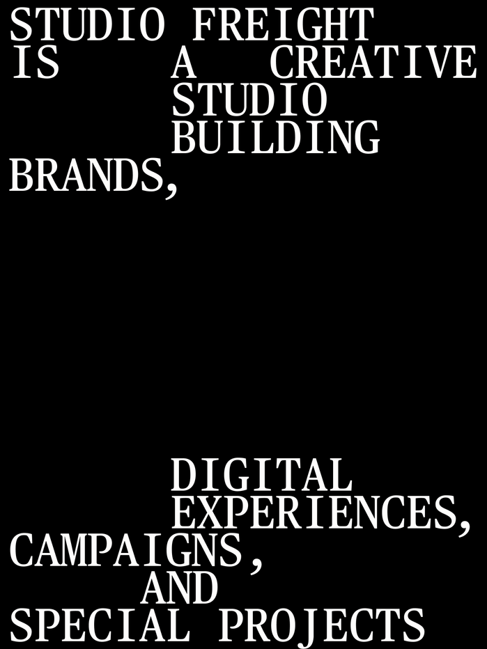
Photo: Studio Freight. License: All Rights Reserved.
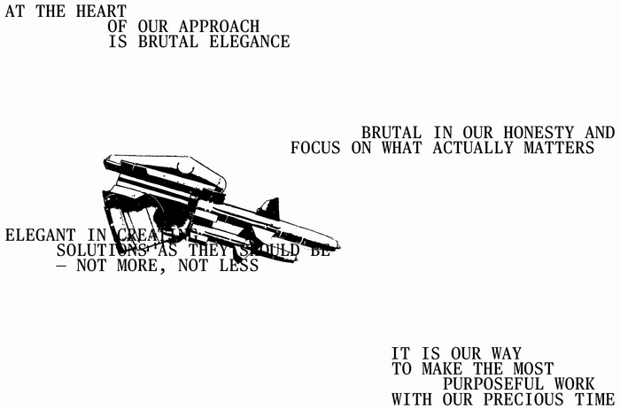
Photo: Studio Freight. License: All Rights Reserved.
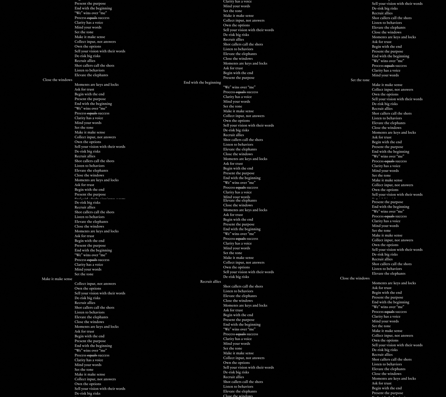
Photo: Studio Freight. License: All Rights Reserved.
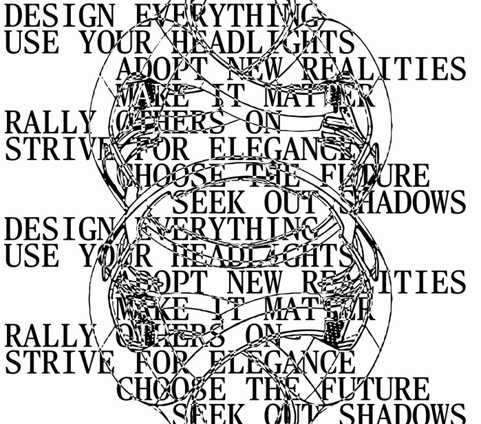
Photo: Studio Freight. License: All Rights Reserved.
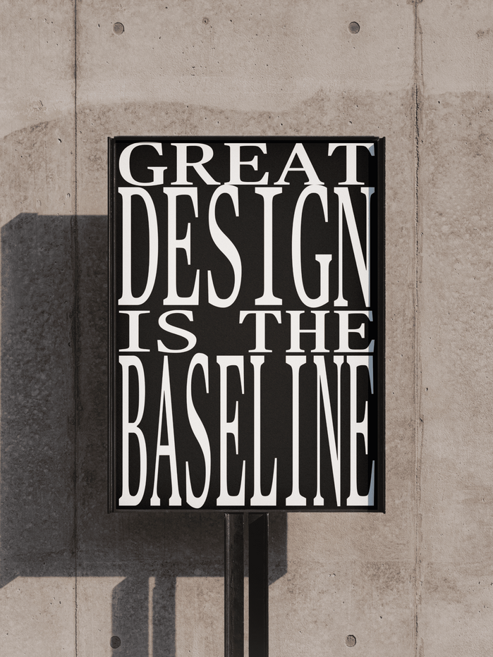
Photo: Studio Freight. License: All Rights Reserved.
This post was originally published at Fonts In Use