Redheads
Source: olivergrace.com.au Redheads. License: All Rights Reserved.
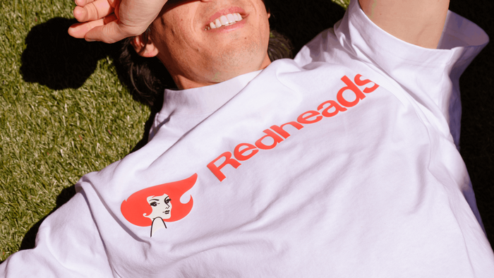
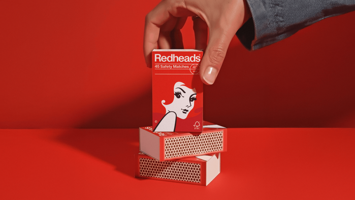
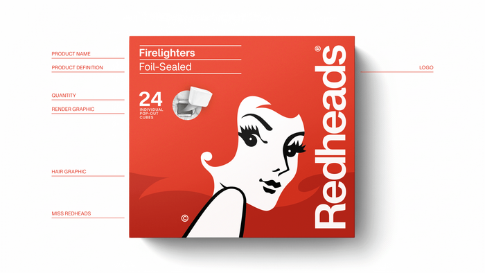
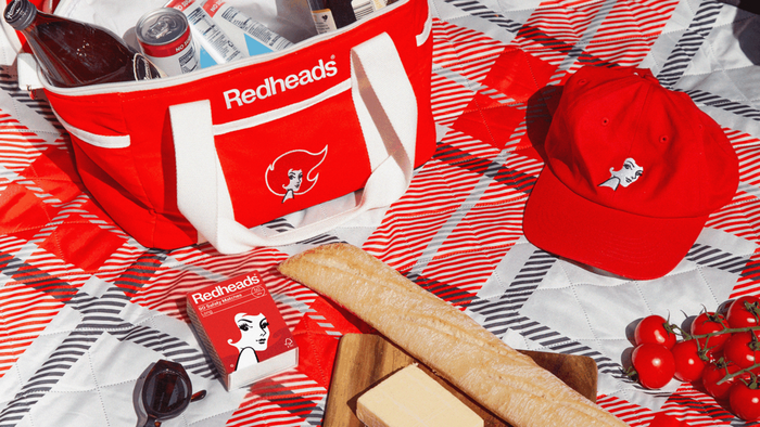
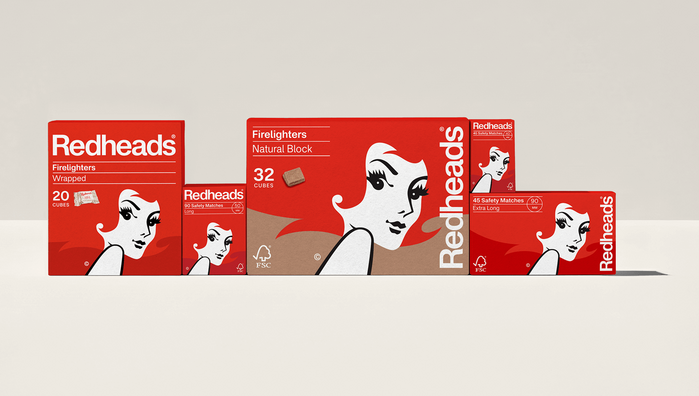
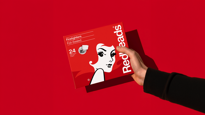
Oliver Grace has updated the identity of the Australian brand Redheads, drawing inspiration from its archives of the 1960s and 70s. The project simplifies the historic Ms Redheads icon, whose hair is now treated as a graphic flame flickering across the bottom of the packaging. The goal is to modernize this national institution while preserving its original spirit, ensuring it remains recognizable both in-store and on e-commerce platforms.
The new logo features Fusion from the Blaze Type foundry. This typeface was chosen for the specific details in the lowercase l, t, and a, which add a touch of personality to an otherwise understated structure. This typographic choice bridges the gap between the Swiss design rigor historically present in Redheads’ identity and a more contemporary, effective aesthetic.
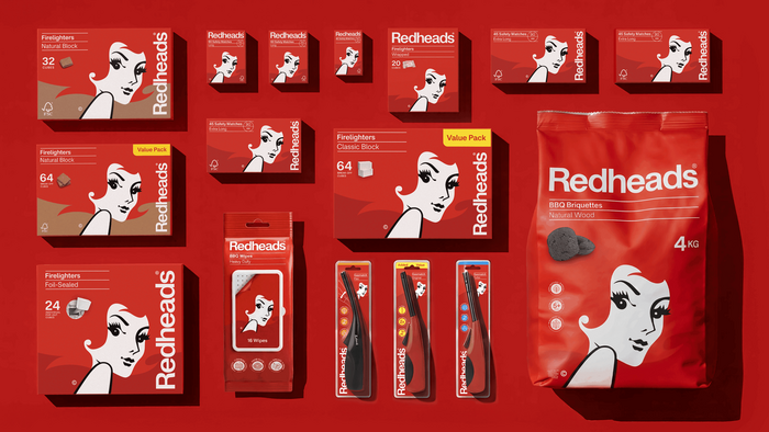
To ensure consistency across the range, a flexible grid system was implemented. This allows visual elements to adapt to vastly different formats, from small matchboxes to four-kilogram charcoal bags, while clearly integrating mandatory regulatory information. This modular organization provides a technical balance between respecting a well-known visual heritage and meeting today’s logistical needs.
Source: olivergrace.com.au Redheads. License: All Rights Reserved.
Source: olivergrace.com.au Redheads. License: All Rights Reserved.
Source: olivergrace.com.au Redheads. License: All Rights Reserved.
Source: olivergrace.com.au Redheads. License: All Rights Reserved.
Source: olivergrace.com.au Redheads. License: All Rights Reserved.
Source: olivergrace.com.au Redheads. License: All Rights Reserved.
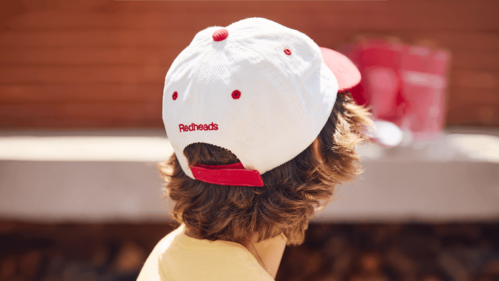
Source: olivergrace.com.au Redheads. License: All Rights Reserved.
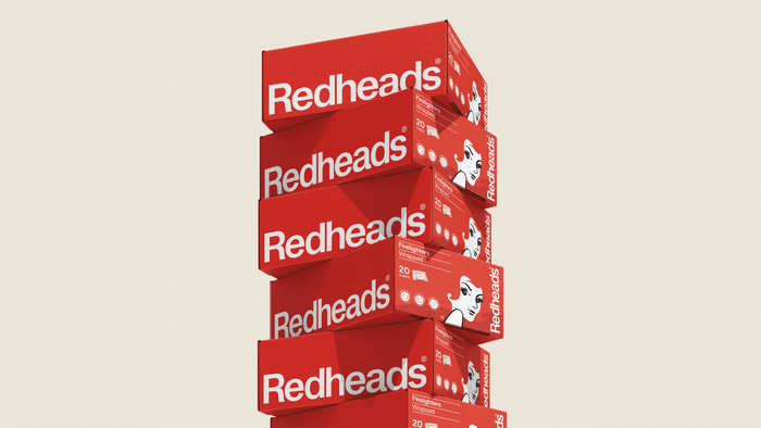
Source: olivergrace.com.au Redheads. License: All Rights Reserved.
This post was originally published at Fonts In Use