Kea Elisa
Melina Heggenberger. License: All Rights Reserved.


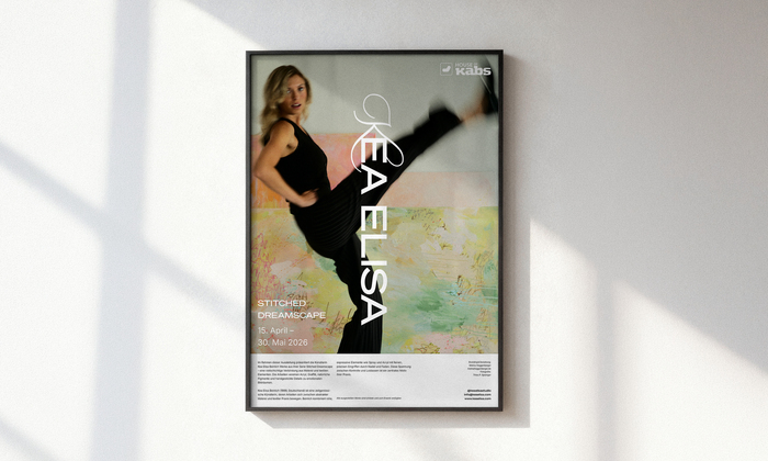
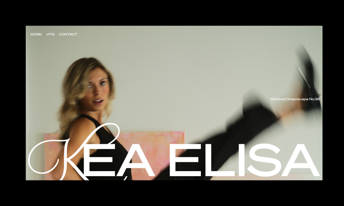
The visual identity for artist Kea Elisa is shaped by intuition, presence, and inner energy. It’s guided by the mantra “Own your space. Own your power”. The design strategy centers on a deliberate tension between raw expression and architectural clarity, making the process of transformation visible rather than concealed.
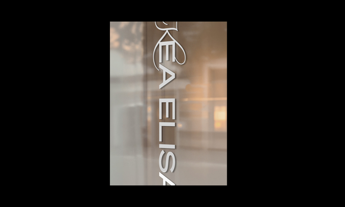
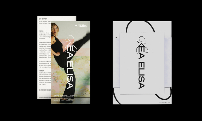
The signet combines custom lettering with typography. The hand-drawn K was conceived as an expansive, dynamic gesture, intentionally breaking away from standardized norms. This custom lettering serves as a point of origin, carrying the personality and “inner energy” of the brand into a physical, visible form.
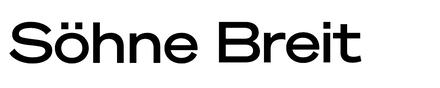
The typeface Söhne Breit acts as a precise, structural counterbalance. While the signet represents movement and intuition, Söhne provides a sense of permanence and geometric rigor. The wide, space-filling typesetting of “EA ELISA” creates a powerful typographic foundation, mirroring the balance between an inner creative process and an outward professional expression.
A brand identity that rejects the static and the standardized. Through the juxtaposition of organic custom lettering and the systematic precision of Söhne, the design achieves a unique presence that commands its own space.
Melina Heggenberger. License: All Rights Reserved.
Melina Heggenberger. License: All Rights Reserved.
Melina Heggenberger. License: All Rights Reserved.
Source: www.keaelisa.com License: All Rights Reserved.
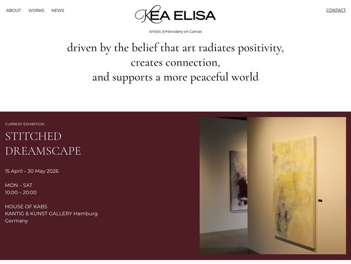
The website additionally uses Montserrat and Cormorant.
This post was originally published at Fonts In Use