Unicorn Financial Solutions
Published May 27, 2026
By FontsInUse
Contributed by Bureau Brut
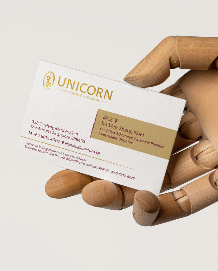
Unicorn. License: All Rights Reserved.





Unicorn. License: All Rights Reserved.

Unicorn. License: All Rights Reserved.
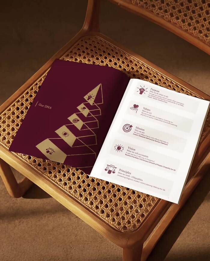
Unicorn. License: All Rights Reserved.
This post was originally published at Fonts In Use
Unicorn. License: All Rights Reserved.
Fable designed the identity of Unicorn Financial Solutions. From their case study:
Unicorn, otherwise known as Unicorn Financial Solutions, recently underwent a thoughtful rebranding to reflect its core philosophy as a family wealth management office dedicated to offering ‘A Freehold Life For All’. […] The logotype introduces a unique family, Roman Grotesque by Bureau Brut, that mixes sans serif and serif – a representation of the cherished past and nodding towards the modern future. This typeface draws its inspiration from sans serif typefaces with structured design and serif typefaces with calligraphic heritage. It proposes a meeting between these two great typographic categories, neither quite a grotesque, nor a serif typeface, but more a serif grotesque. PT Serif and Fable Type’s Tenet also make up the type usage hierarchy.
A suite of colours was introduced to allow various touchpoints across their marketing, recruitment, and investment efforts to be consistent, intentional, and exuding gravitas. To top it off, we created a variety of icons, illustrations, and stickers to promote fun, engagement, and clarity in both internal and external communications, adding a layer of character and cohesion to the brand system. This cohesive visual language carries through to Unicorn’s website, guidebooks, and social media – ensuring a consistent and recognisable presence at every interaction.
The Chinese typeface used for the business card is yet unidentified.
Unicorn. License: All Rights Reserved.
Unicorn. License: All Rights Reserved.
Unicorn. License: All Rights Reserved.
This post was originally published at Fonts In Use
Read full story.
WRITTEN BY
FontsInUse
An independent archive of typography.
More from FontsInUse