Studienrat Wahlen Heidelberg 2023
Published August 19, 2023
By FontsInUse
Contributed by Juli Gutschmidt

Source: instagram.com Gestaltung Mannheim. License: All Rights Reserved.
Source: instagram.com Gestaltung Mannheim. License: All Rights Reserved.
Source: instagram.com Gestaltung Mannheim. License: All Rights Reserved.
Source: instagram.com Gestaltung Mannheim. License: All Rights Reserved.
This post was originally published at Fonts In Use
Source: instagram.com Gestaltung Mannheim. License: All Rights Reserved.
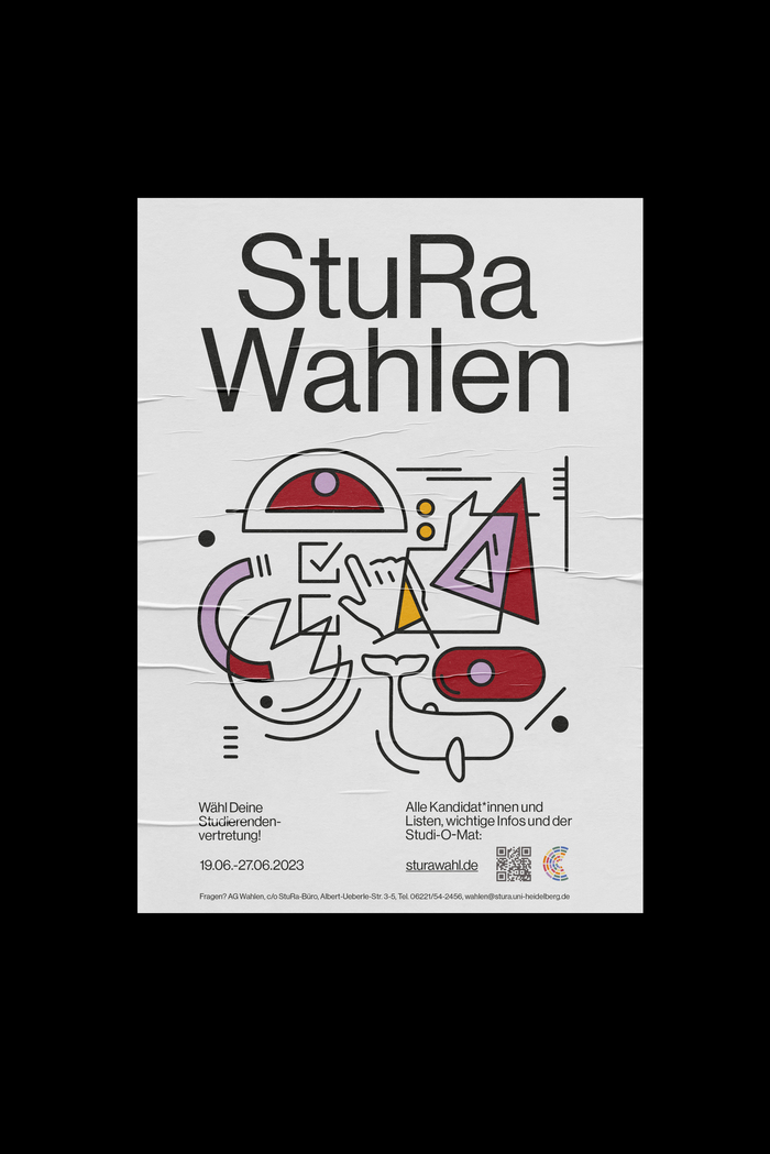
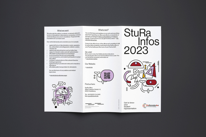
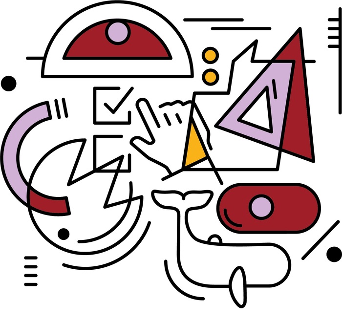
For the official student representation in Heidelberg, German studio Gestaltung Mannheim has created a campaign and its visual identity based on a clear white background, small funny shapes (animals, speech bubbles, arrows) with contours, the StuRa’s corporate colors, and vexing overlaps. The lettering, on the other hand, is simple, straightforward and easy to read. For this we decided on Neue Haas Grotesk Display, in its roman style.
Source: instagram.com Gestaltung Mannheim. License: All Rights Reserved.
Source: instagram.com Gestaltung Mannheim. License: All Rights Reserved.
Source: instagram.com Gestaltung Mannheim. License: All Rights Reserved.
This post was originally published at Fonts In Use
Read full story.
WRITTEN BY
FontsInUse
An independent archive of typography.
More from FontsInUse