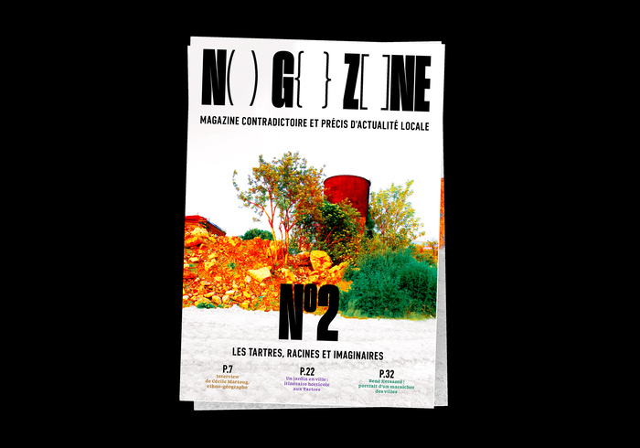
No Go Zone magazine
Source: guillaumepavius.com License: All Rights Reserved.


Why call a magazine “No Go Zone”? In 2015, American TV Channel Fox News decided to call the suburbs of Paris “no go zones” which they deemed too dangerous to visit. This magazine aims to appropriate this designation and give the alternative point of view – written by people who actually live in these “no go zones” – of a new neighbourhood for each issue. It gathers photographic, artistic, journalistic, and poetic cotributions.
This second issue was designed with black markups as layout and very visibly edited photography, aiming to put the reader at a critical distance from the content.
The magazine is distributed locally in a small network of libraries in Seine-Seint-Denis, France, as well as in protests.
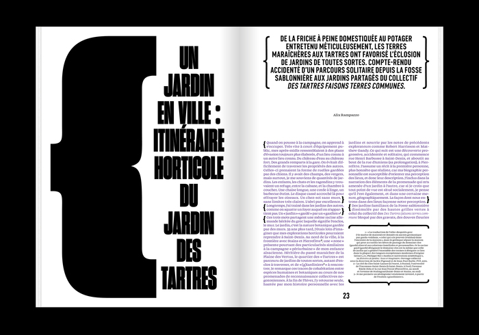
Sharp Grotesk by Sharp Type in its Black 11 style was chosen for the titles and the markups, and DIN Condensed by Paratype for the subheads. Swear by OH no Type Co. in its Text Medium style is used for the main text.
20×30 cm, 76 pages
Source: guillaumepavius.com License: All Rights Reserved.
Source: guillaumepavius.com License: All Rights Reserved.
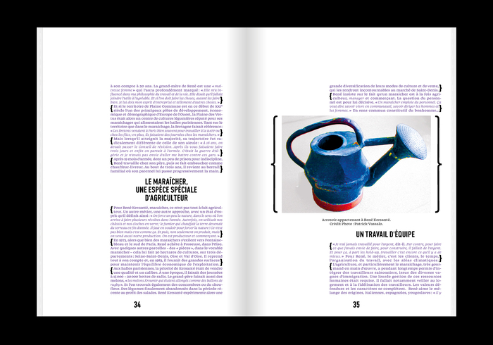
Source: guillaumepavius.com License: All Rights Reserved.
Source: guillaumepavius.com License: All Rights Reserved.

Source: guillaumepavius.com Photo: Guillaume P. License: All Rights Reserved.
This post was originally published at Fonts In Use