State Library of Western Australia

Source: www.blockbranding.com Block. License: All Rights Reserved.


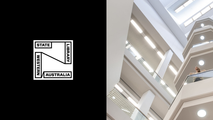
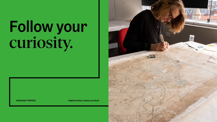
For the State Library of Western Australia, Block developed a refreshed identity that positions the institution as both a cultural anchor and a contemporary public space. The typographic concept is built around the deliberate pairing of Delphia (sans) and Gestura (serif), often set closely together within the same headline.
Rather than assigning each typeface a distinct functional role, the two coexist in direct dialogue. Gestura brings contrast and historical depth, while Delphia’s clean forms provide structure and modernity. Their interplay—sometimes alternating word by word or line by line—creates a dynamic rhythm that mirrors the Library’s mission: connecting the past with the present.
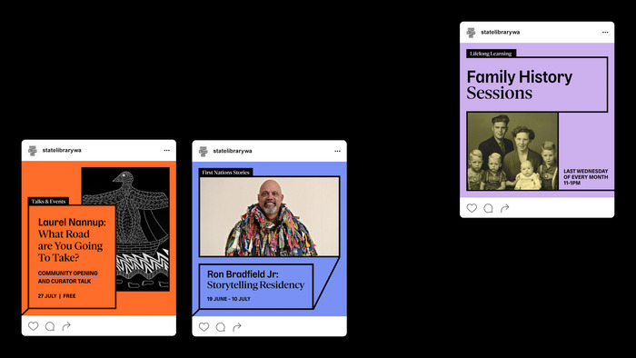
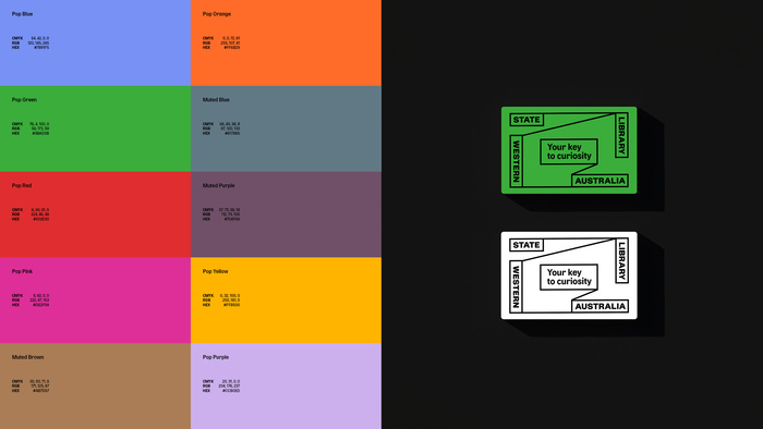
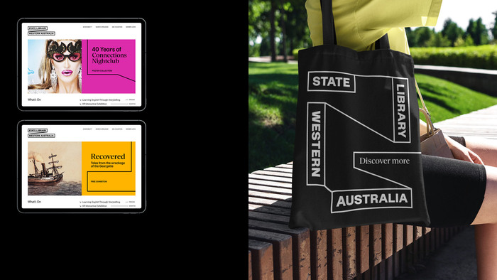
The system is supported by a flexible layout grid and ample white space, allowing type, image, and color to interact without hierarchy feeling rigid. The result is a visual identity that is literate, lively, and open to interpretation.
Source: www.blockbranding.com Block. License: All Rights Reserved.
Source: www.blockbranding.com Block. License: All Rights Reserved.
Source: www.blockbranding.com Block. License: All Rights Reserved.

Source: www.blockbranding.com Block. License: All Rights Reserved.
Source: www.blockbranding.com Block. License: All Rights Reserved.
Source: www.blockbranding.com Block. License: All Rights Reserved.

Source: www.blockbranding.com Block. License: All Rights Reserved.
Source: www.blockbranding.com Block. License: All Rights Reserved.
Source: www.blockbranding.com Block. License: All Rights Reserved.
Source: www.blockbranding.com Block. License: All Rights Reserved.
This post was originally published at Fonts In Use