Stadttheater Gießen
Source: www.patrik-huebner.com License: All Rights Reserved.

Stadttheater Gießen, or casually also called Theater Gießen, is a municipal theater and the cultural center of the German town Gießen. With two stages and 700 seats the theater hosts and entertains its guests with plays, musicals, operas, operettes, and dance performances.
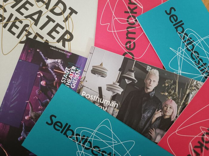
Their typography uses CJ Type's geometric sans Dunbar Tall across all mediums including posters, brochures, website, and online presence, as well as for the “STADT THEATER GIEßEN” logo in all caps behind the brand’s iconic squiggle lines. The logotype is set in Dunbar Tall Medium.
Dunbar includes OpenType features catering to German language use, such as stylistic alternates for capital umlauts, as well as contextual ligatures for ch and ck.
The main theater building’s neo-classical architecture with Jugendstil influences from around 1907 reflects a preservation of the traditional entertainment artforms whilst appealing to younger contemporary audiences. The brand's typographic style plays on a similar appeal with its modernity: Dunbar was inspired by Erbar-Grotesk, a typeface designed in Germany by Jakob Erbar who first started exploring sans serif design in the early 1900s, close in time to when the theater in Gießen was built.
The visual identity complements its clean geometric typography with organic interactive squiggle lines unique to each performance. This component was developed by Patrik Hübner as a fluid generative design system.
These dynamic patterns mirror the gestures, voices, and movements of the stage, evolving in real-time to reflect the collaborative and exploratory spirit of the Stadttheater.
In 2022 the theater celebrated its visual refresh with a launch event. Visitors could interact to generate their own personalized squiggles, which blurred the lines between audience and performative play.

Source: stadttheater-giessen.de License: All Rights Reserved.
The logo combines caps with a lowercase eszett. CJ Dunn decided not to include an uppercase eszett. The font is a static version in which the letters R S T look different from the variable font version.

Source: www.patrik-huebner.com License: All Rights Reserved.

Source: www.patrik-huebner.com License: All Rights Reserved.

Source: www.patrik-huebner.com License: All Rights Reserved.

Source: www.patrik-huebner.com License: All Rights Reserved.

Source: www.patrik-huebner.com License: All Rights Reserved.

Source: stadttheater-giessen.de License: All Rights Reserved.

Source: stadttheater-giessen.de License: All Rights Reserved.

Source: stadttheater-giessen.de License: All Rights Reserved.

Source: www.patrik-huebner.com License: All Rights Reserved.
This post was originally published at Fonts In Use