Diana’s Seafood rebrand

Wedge. License: All Rights Reserved.


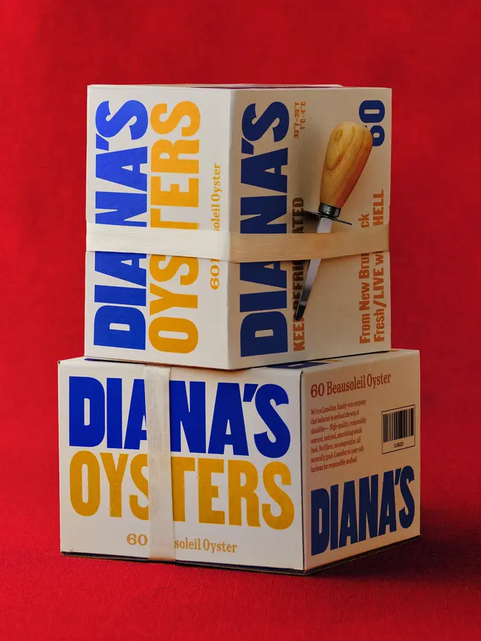
Wedge brings new life to a Canadian classic with its rebrand for Diana’s Seafood, a family-run business founded in 1979 and long trusted by Canada’s top chefs. For over 45 years, Diana’s has been known for its high-quality seafood. The rebrand translates this legacy for a new audience – from Michelin-starred kitchens to home tables – by positioning Diana’s as The Mother of Seafood.
Designed by the Montreal-based studio, the new identity combines simplicity, craftsmanship, and warmth. The monogram, formed by two fish creating a subtle D and S, serves as a mark of quality and authenticity. The logotype and titles are set in Martin by Vocal Type, customized with “fins” on the terminals of the S. The identity also features AL Milano by Alex Lescieux, used for text across six widths – from Compressed to Expanded – within a flexible typographic system that brings rhythm and character to the brand. Its use recalls the utilitarian lettering once painted on wooden fisherman crates, grounding the identity in a sense of craft and heritage.
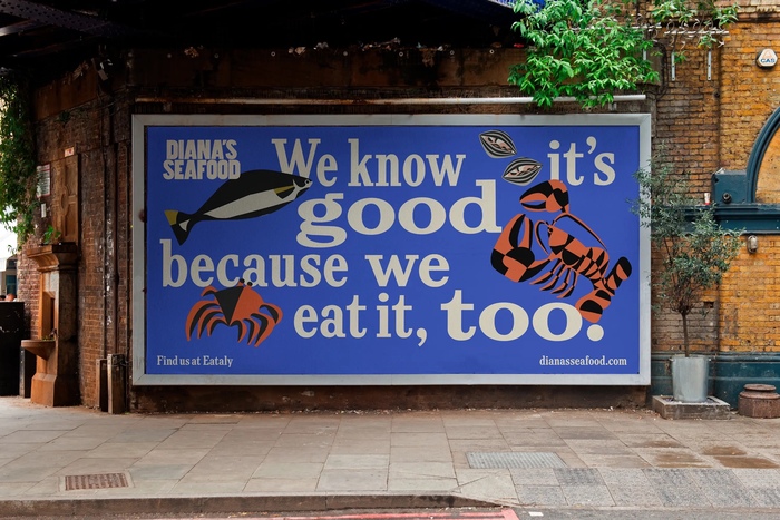
Illustrations by Bill Rebholz add a warm and human touch that complements the typographic system.

Wedge. License: All Rights Reserved.
Wedge. License: All Rights Reserved.

Wedge. License: All Rights Reserved.

Wedge. License: All Rights Reserved.

Wedge. License: All Rights Reserved.

Wedge. License: All Rights Reserved.
Wedge. License: All Rights Reserved.

Wedge. License: All Rights Reserved.

Wedge. License: All Rights Reserved.

Wedge. License: All Rights Reserved.

Wedge. License: All Rights Reserved.

Wedge. License: All Rights Reserved.

Source: www.dianasseafood.com Wedge. License: All Rights Reserved.
This post was originally published at Fonts In Use