Staatstheater Mainz (2014-)
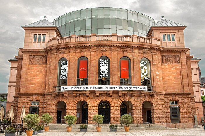
Source: www.tripadvisor.com © Andreas Etter. License: All Rights Reserved.


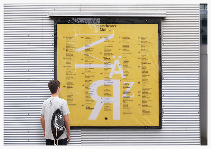
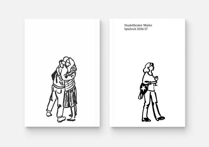
Since 2014, the visual identity of Staatstheater Mainz has been developed by the Berlin-based agency Neue Gestaltung. Applied across posters, season guides, flyers, and digital communication, the identity is built around continuous renewal rather than a fixed graphic system. Each production receives its own visual treatment through photography, illustration, and typography, while recurring elements such as the star logo maintain continuity across the series.
Central to the identity is the use of Swiss Typefaces’ Suisse Int’l and Suisse Works. From the words of the agency:
We introduced Suisse as part of a redesign (2014) of the visual identity in the context of a change in artistic direction. At the time, it was still a relatively lesser-known alternative to Helvetica. We chose it quite deliberately [...] because it allows for a kind of visual mediation between grotesque, serif, and slab-serif typologies.
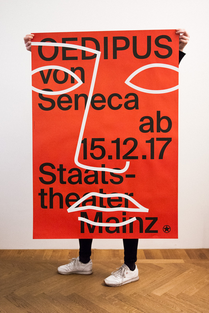
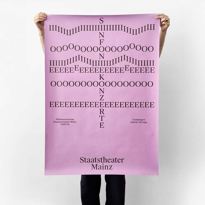
The posters in particular emphasize variation and visual experimentation. Typography changes in scale, weight, spacing, and stability depending on the production, at times becoming deliberately unsteady or fragmented. This approach mirrors the theatre’s broader emphasis on reinvention and the plurality of a multi-genre repertory program.
Neue Gestaltung's work for Staatstheater Mainz has been awarded multiple prizes along the years. Among them the 2016 Red Dot, the 2017 TDC, the 100 Beste Plakate, and the 2026 Tokyo TDC.
© Neue Gestaltung. License: All Rights Reserved.
© Neue Gestaltung. License: All Rights Reserved.
From the saison 2017/2018
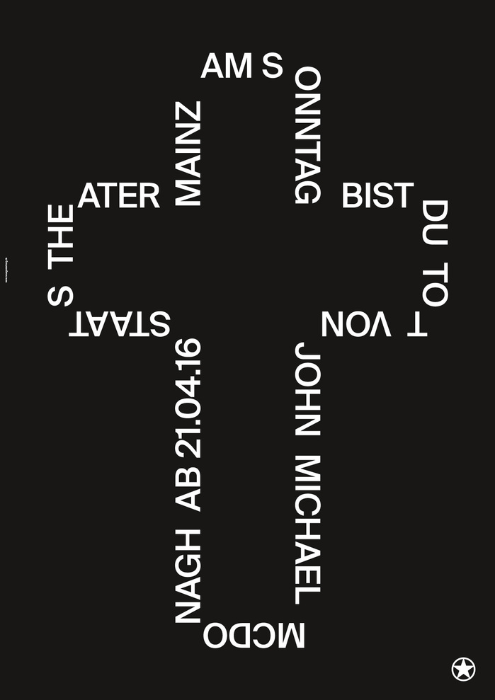
Source: neuegestaltung.de © Staatstheater Mainz. License: All Rights Reserved.
From the saison 2015/2016
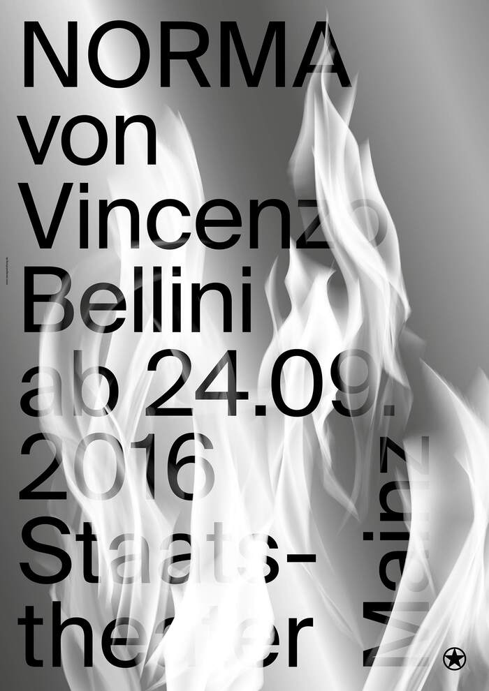
Source: neuegestaltung.de © Staatstheater Mainz. License: All Rights Reserved.
From the saison 2016/2017
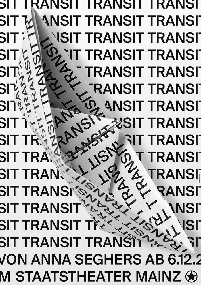
Source: neuegestaltung.de © Staatstheater Mainz. License: All Rights Reserved.
From the saison 2020/2021
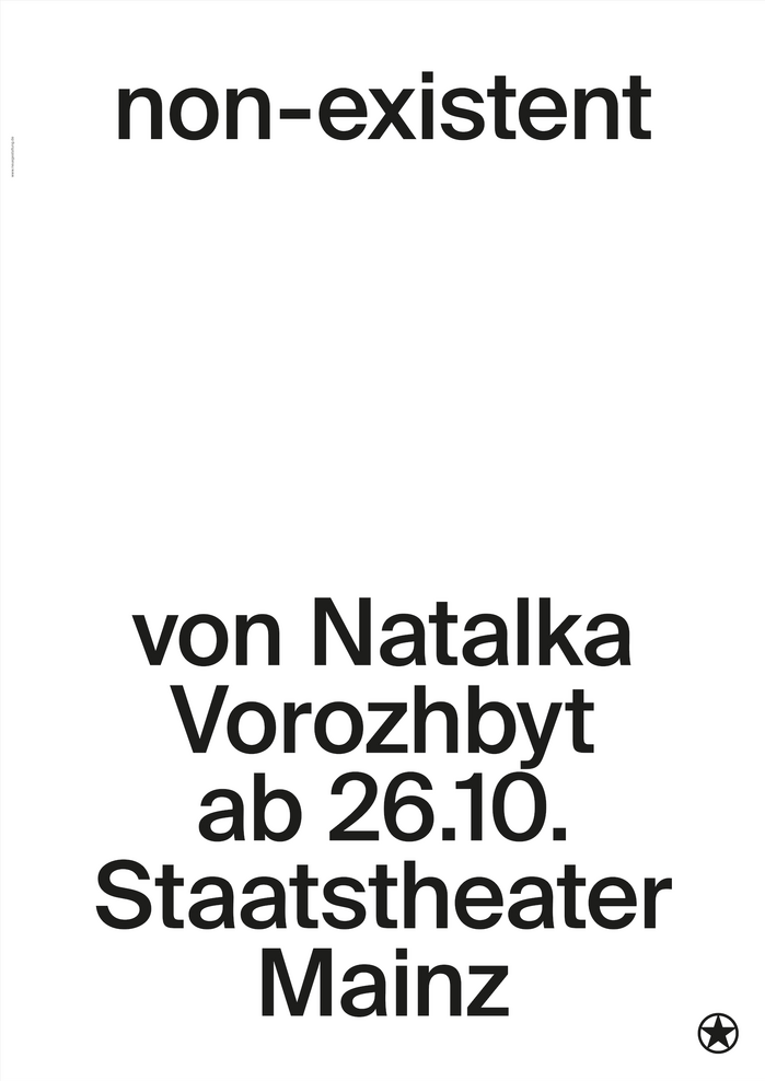
© Staatstheater Mainz. License: All Rights Reserved.
From the saison 2024/2025 - Winner of the 100 Beste Plakate
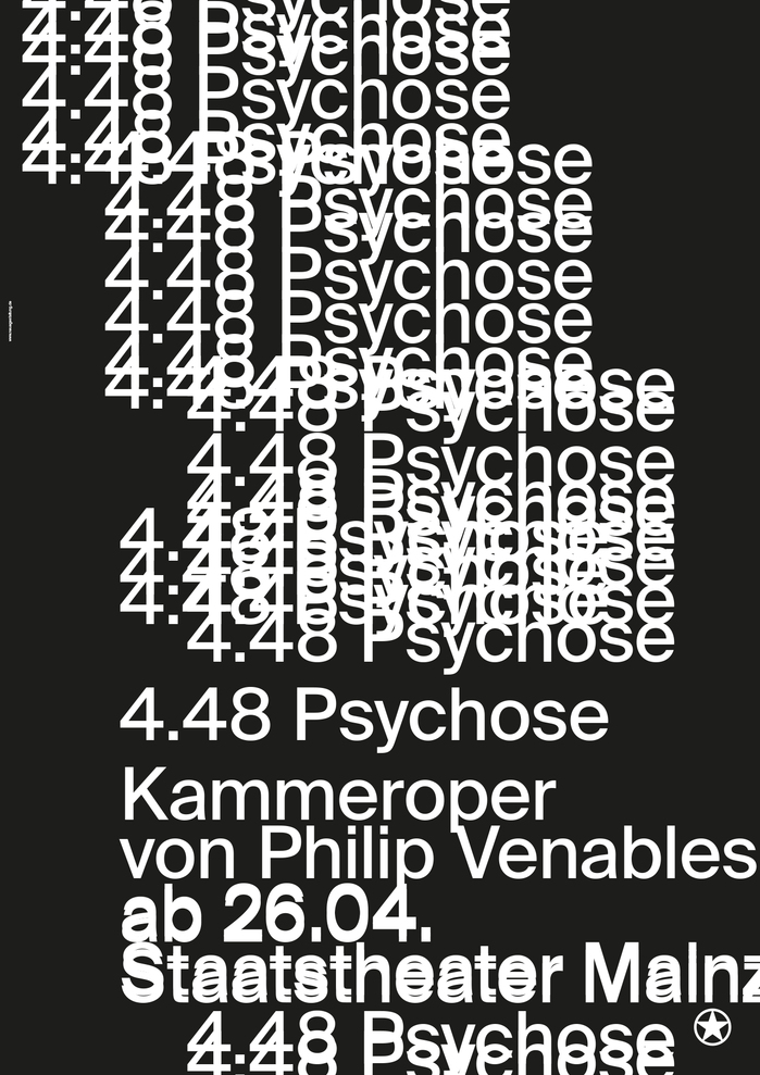
© Staatstheater Mainz. License: All Rights Reserved.
From the saison 2024/2025
Source: www.instagram.com © Neue Gestaltung. License: All Rights Reserved.
From the 2025/2026 concert saison
© Neue Gestaltung. License: All Rights Reserved.
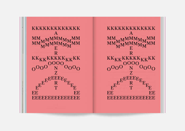
From the 2025/2026 concert saison program

© Neue Gestaltung. License: All Rights Reserved.
© Neue Gestaltung. License: All Rights Reserved.
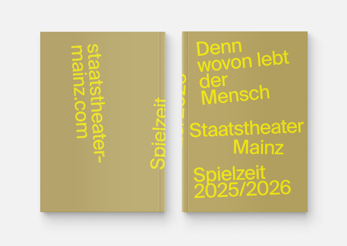
Source: neuegestaltung.de © Neue Gestaltung. License: All Rights Reserved.
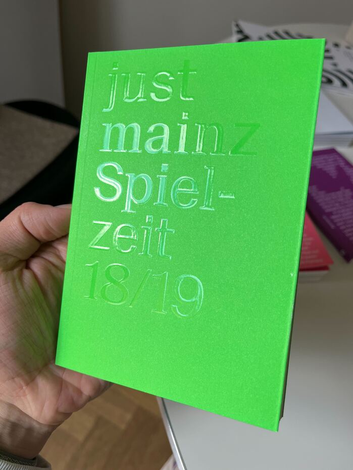
Photo: Swiss Typefaces. License: All Rights Reserved.
The 2018/2019 program features Suisse Neue on its cover.
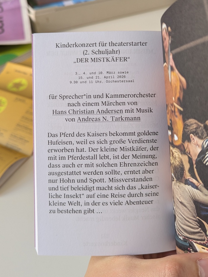
Photo: Swiss Typefaces. License: All Rights Reserved.
In the concerts program 2025/2026 Suisse Works is supported by Suisse Int'l Mono.
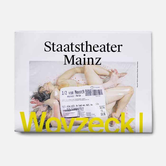
© Neue Gestaltung. License: All Rights Reserved.
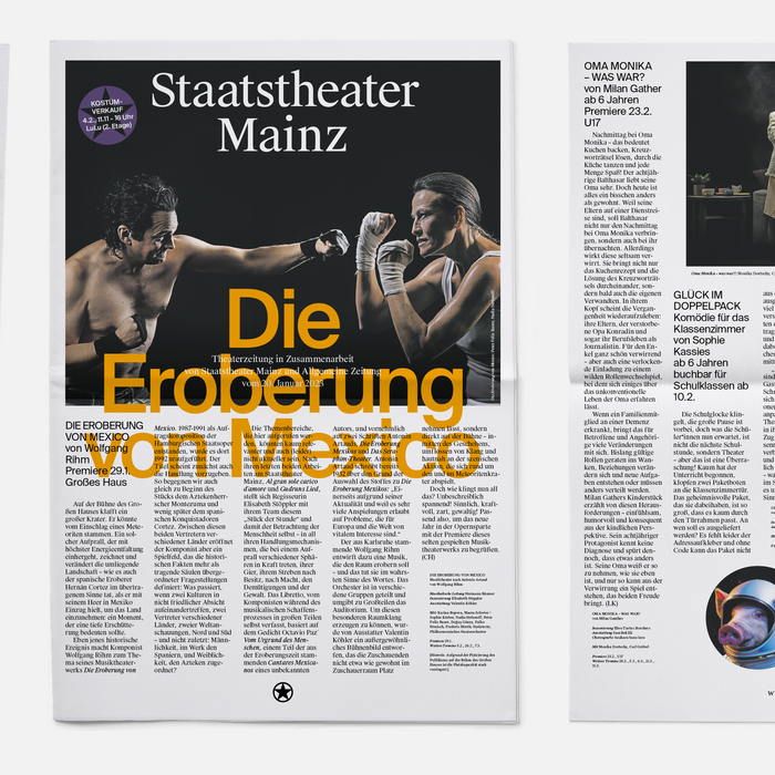
© Neue Gestaltung. License: All Rights Reserved.
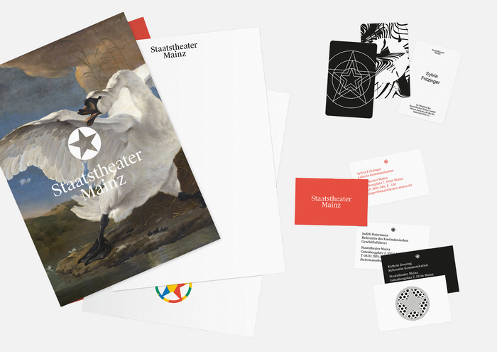
© Neue Gestaltung. License: All Rights Reserved.
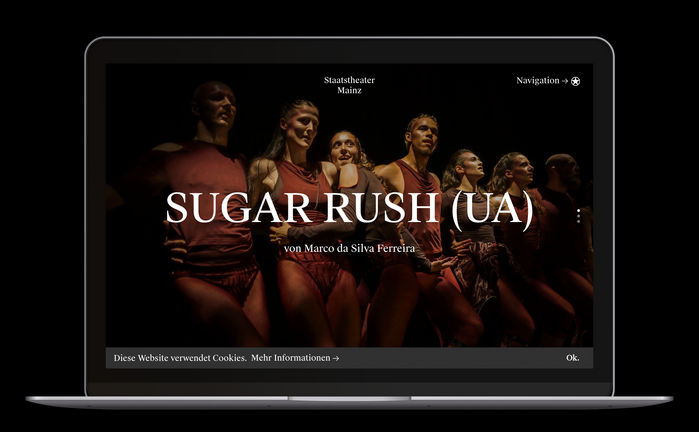
Source: www.staatstheater-mainz.com Photo: Swiss Typefaces. © Staatstheater Mainz. License: All Rights Reserved.
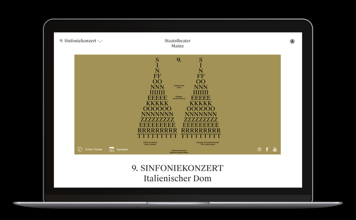
Source: www.staatstheater-mainz.com Photo: Swiss Typefaces. © Staatstheater Mainz. License: All Rights Reserved.
This post was originally published at Fonts In Use