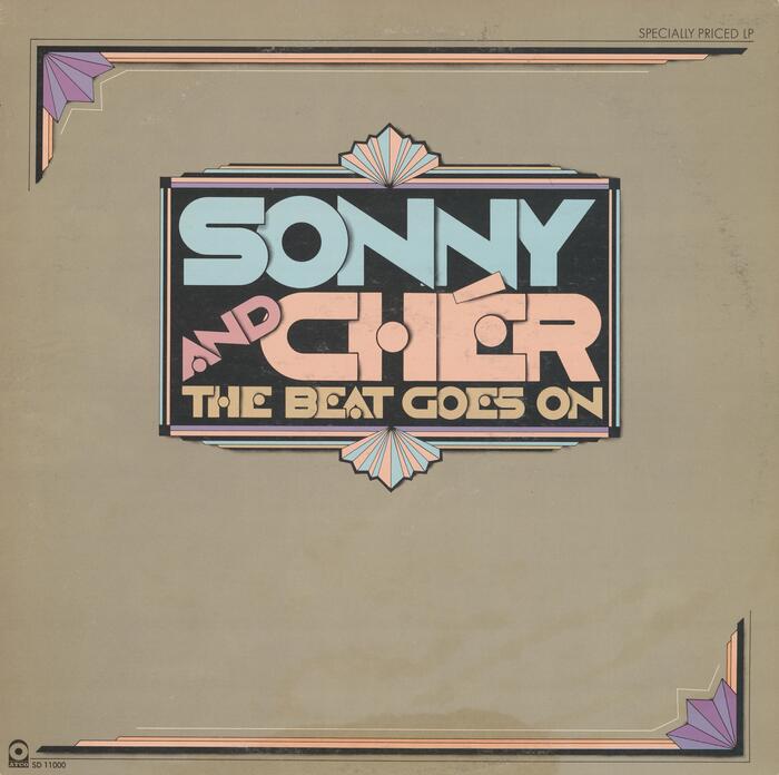
Sonny & Cher – The Beat Goes On album art
Source: archive.org Internet Archive. License: All Rights Reserved.
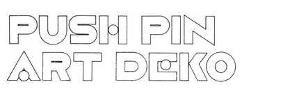

Push Pin Art Deko in use for a 1975 best-of compilation by Sonny & Cher.
Paula Scher (b. 1948) used Milton Glaser’s sans-serif caps with solid letterforms. She overlayered the letters to counter their wideness, additionally creating a spatial effect through the shadows cast onto the subsequent glyphs. The disc-like crossbars in A E H get this treatment, too, turning them into floating objects. To further increase the compactness and to reduce clutter, Scher moved the two stems of H closer together and made the vertical in E thicker. The acute accent most likely is a custom addition. Finally, the lockup is enclosed in an Art Deco frame that echoes the pastel colors of the type.
Source: archive.org Internet Archive. License: All Rights Reserved.
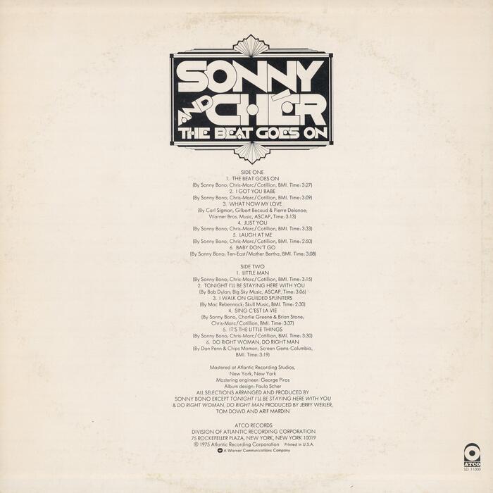
Song names and credits on the back cover are set center-aligned in light Futura.
This post was originally published at Fonts In Use