Oslo Kunstforening
Published December 13, 2024
By FontsInUse
Contributed by Frode Helland (Monokrom Skriftforlag)
Source: www.kreativtforum.no ANTI. License: All Rights Reserved.


Source: www.kreativtforum.no ANTI. License: All Rights Reserved.
Source: www.kreativtforum.no License: All Rights Reserved.
Source: www.kreativtforum.no License: All Rights Reserved.
Source: www.kreativtforum.no License: All Rights Reserved.
Source: www.kreativtforum.no License: All Rights Reserved.

Source: oslokunstforening.no License: All Rights Reserved.
Source: oslokunstforening.no License: All Rights Reserved.
This post was originally published at Fonts In Use
Source: www.kreativtforum.no ANTI. License: All Rights Reserved.
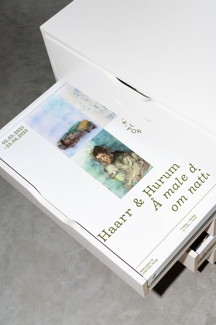
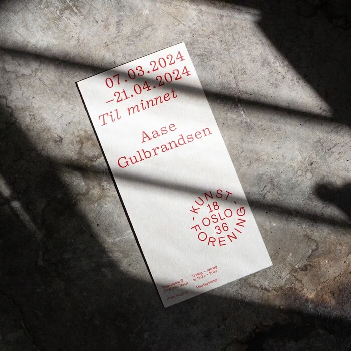
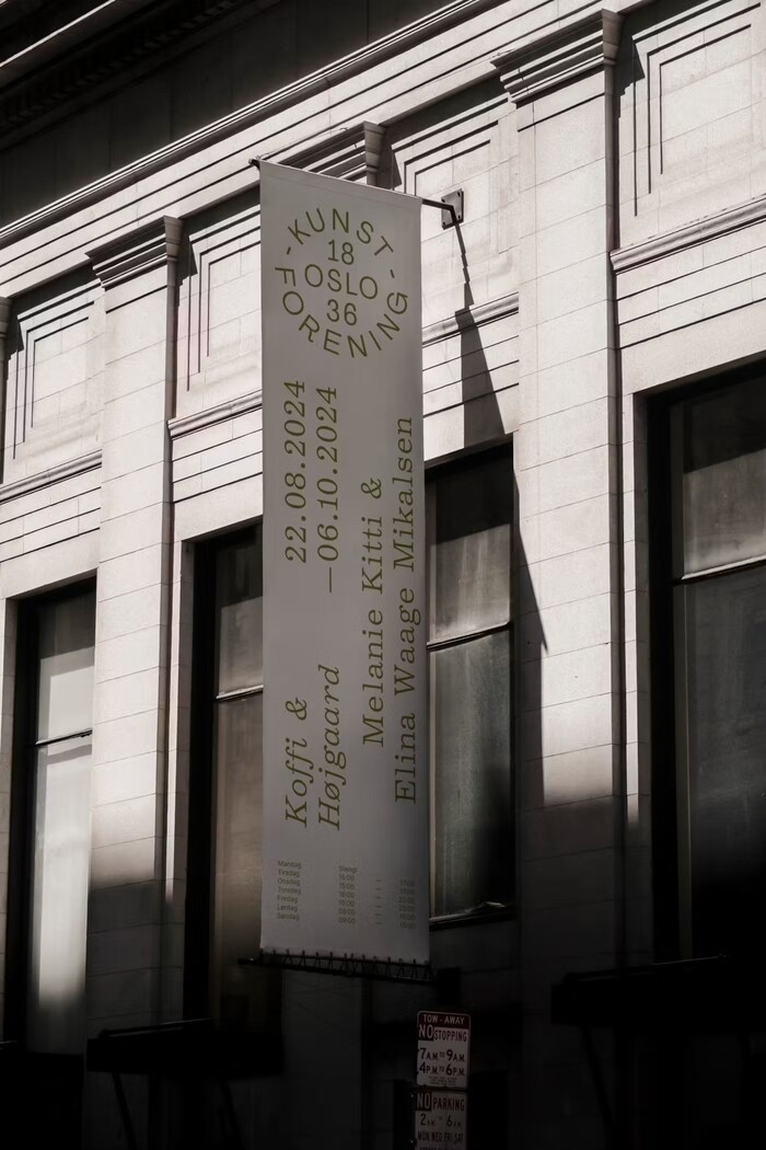
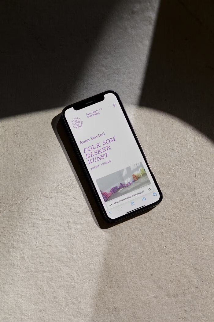
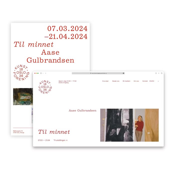
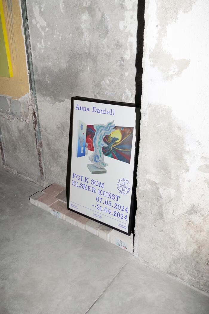
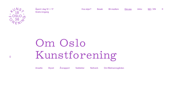
The new visual identity for Oslo Kunstforening is developed by ANTI. The identity adapts to each exhibition and puts the art in focus. The typefaces used are Monokrom Skriftforlag’s proportional typewriter face Dewey Decimal in large sizes, with Rasmus Andersson’s Inter handling the smaller text. The logo uses Agrandir Narrow by Alex Slobzheninov.
Oslo Kunstforening is a non-commercial exhibition space and member organisation with a focus on contemporary art. Founded in 1836, it is the oldest art institution in Norway.
Source: www.kreativtforum.no ANTI. License: All Rights Reserved.
Source: www.kreativtforum.no License: All Rights Reserved.
Source: www.kreativtforum.no License: All Rights Reserved.
Source: www.kreativtforum.no License: All Rights Reserved.
Source: www.kreativtforum.no License: All Rights Reserved.
Source: oslokunstforening.no License: All Rights Reserved.
Source: oslokunstforening.no License: All Rights Reserved.
This post was originally published at Fonts In Use
Read full story.
WRITTEN BY
FontsInUse
An independent archive of typography.
More from FontsInUse