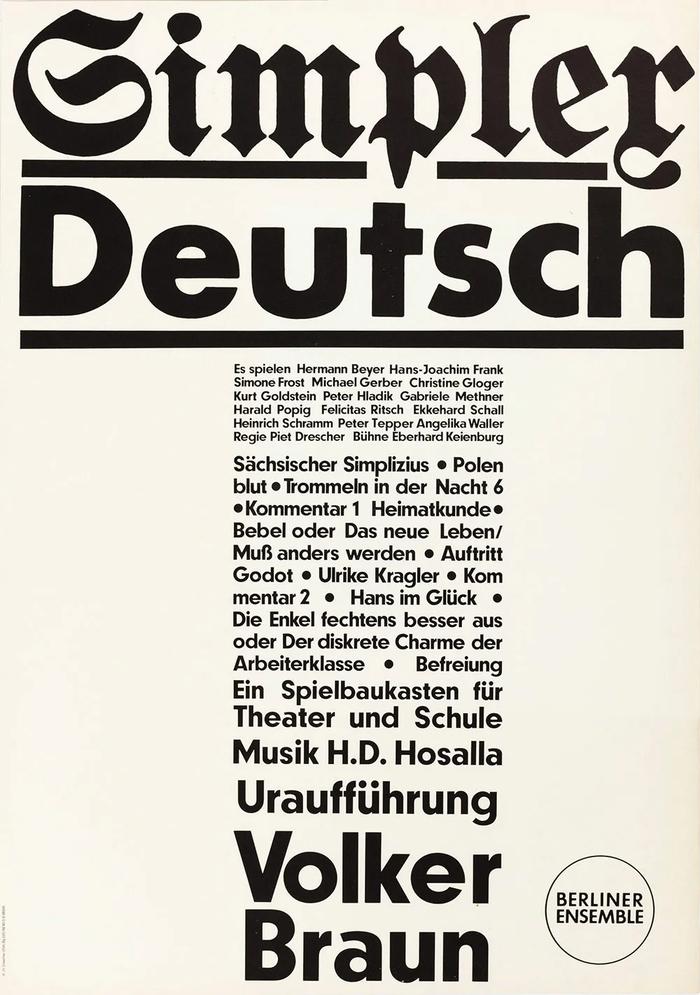
Simplex Deutsch, Berliner Ensemble poster
Source: www.slanted.de License: All Rights Reserved.


From the Slanted website :
Karl-Heinz Drescher (1936–2011) was a graphic designer who worked for almost 40 years at the world famous Berliner Ensemble theater of Bertolt Brecht. His catalog of works today comprises over 400 posters, about a third of which are printed by letterpress.
Drescher had a knack for boldly mixing different sans serif fonts: in this 1980 poster, Futura (for the word Deutsch and the Berliner Ensemble logo) is paired with Neuzeit-Grotesk (with the alternate a and u, for the cascading text in the central column) — see Markus Lange’s wonderful book Karl-Heinz Drescher—Berlin Typo Posters, Texts, and Interviews (2020) for more eye-watering examples.
This originally came from having to work with what was at hand in the type shop, though it is a habit Drescher kept even when using photographic enlargements of typefaces not available in the desired sizes. This may be the case here for the title at the top: the blackletter type (Fette Mainzer Fraktur) and the line in Futura Bold may have been copied and blown up from samples found in type catalogues.
[Many thanks to the ever-reliable Dan Reynolds for helping me to identify Fette Mainzer Fraktur.]
This post was originally published at Fonts In Use