Trijntje Oosterhuis – Wrecks We Adore album art and singles
Published April 30, 2023
By FontsInUse
Contributed by D Jones

Source: archive.org Internet Archive. License: All Rights Reserved.

Source: archive.org Internet Archive. License: All Rights Reserved.

Source: archive.org Internet Archive. License: All Rights Reserved.
This post was originally published at Fonts In Use

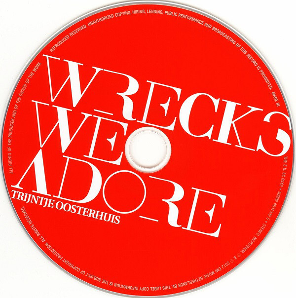
Talk about wrecking the type. On the cover of Trijntje Oosterhuis’s 2012 album Wrecks We Adore the text has been made by wrecking a Bodoni (Bitstream’s Bauer Bodoni looks close).
Disturbingly, the letterforms for “Wrecks We Adore” have been modified by removing strokes (R and E), reducing strokes from thick to thin (W, K, and D), eliminating contrast (O), and clipping rectangles out (S). A similar treatment is used for the singles from this album too.
I only came here for the TJ kern in “TRIJNTJE”.
Source: archive.org Internet Archive. License: All Rights Reserved.
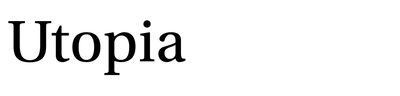
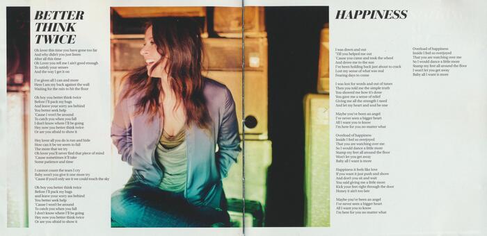
Detail from the CD booklet. The lyrics are set in Utopia.
Source: archive.org Internet Archive. License: All Rights Reserved.
Another detail from the CD booklet. Photography by Marc de Groot at Witman Kleipool.
Source: archive.org Internet Archive. License: All Rights Reserved.
Back cover with track list in all-caps italics


This post was originally published at Fonts In Use
Read full story.
WRITTEN BY
FontsInUse
An independent archive of typography.
More from FontsInUse