Trijntje Oosterhuis – Sundays in New York album art
Published April 30, 2023
By FontsInUse
Contributed by D Jones
Source: www.discogs.com License: All Rights Reserved.


Source: archive.org Internet Archive. License: All Rights Reserved.

Source: www.ebay.com bortoloso. License: All Rights Reserved.
This post was originally published at Fonts In Use
Source: www.discogs.com License: All Rights Reserved.
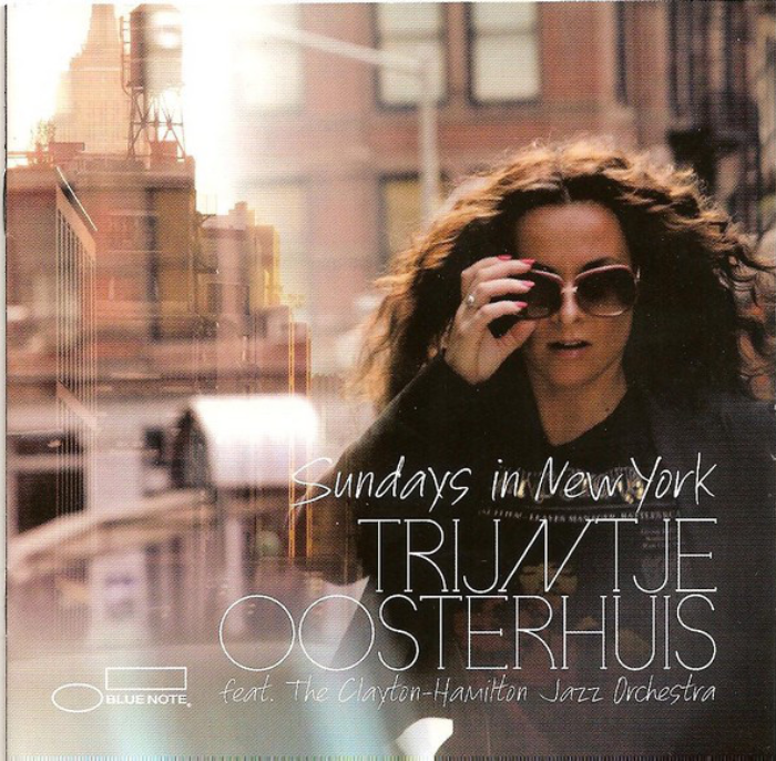
A couple of Fonts In Use debuts for the 2011 album from Trijntje Oosterhuis and The Clayton–Hamilton Jazz Orchestra.
The informal pen font FG Caroline is used for the title and “feat. The Clayton-Hamilton Jazz Orchestra”, and the slab serif Inlove Light used for the artist name and for many of the liner notes.
I thought the slanted N in TRIJNTJE was a special effect applied by the graphic designer, but it’s supplied in the font as the primary N, with an upright form as an alt. Inlove has a sprinkling of slanted forms that leads naturally to some very satisfying kerning combinations, which sadly we don’t get to see in this showing.
Source: archive.org Internet Archive. License: All Rights Reserved.
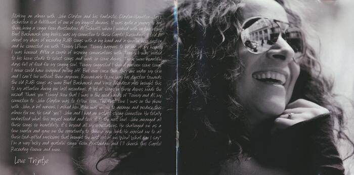
Liner notes from Trijntje set in a big block of FG Caroline
Source: www.ebay.com bortoloso. License: All Rights Reserved.
Alternate cover used for the digipak release
This post was originally published at Fonts In Use
Read full story.
WRITTEN BY
FontsInUse
An independent archive of typography.
More from FontsInUse