Silver Bridge Coffee
Published August 11, 2026
By FontsInUse
Contributed by Mark Simonson
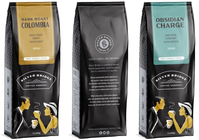
Source: www.slagledesign.com License: All Rights Reserved.


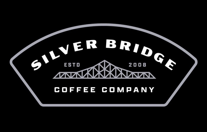
Source: www.slagledesign.com License: All Rights Reserved.
This post was originally published at Fonts In Use
Source: www.slagledesign.com License: All Rights Reserved.
Slagle Design created the identity and packaging for Ohio-based Silver Bridge Coffee Company using Acme Gothic by Mark Simonson and Apotek designed by Dyana Weissman for Kerns & Cairns. Acme serves as the primary display face, while Apotek’s range of widths accommodates secondary information and other typographic elements without sacrificing consistency. Together with the simple illustration style, the typography reinforces the brand’s retro character across the logo, labels, and packaging.
Source: www.slagledesign.com License: All Rights Reserved.
This post was originally published at Fonts In Use
Read full story.
WRITTEN BY
FontsInUse
An independent archive of typography.
More from FontsInUse