Show LA Love
Hoopbus. License: All Rights Reserved.


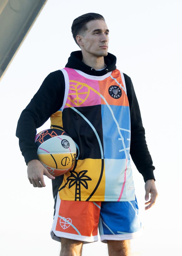
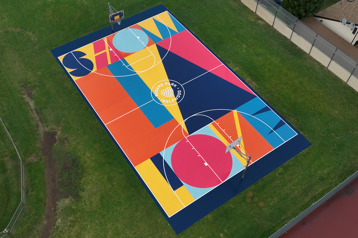
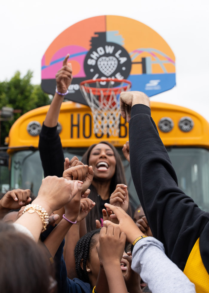
Show LA Love is a visual identity system developed by Ben Loiz Studio for Hoopbus during NBA All-Star Week in Los Angeles.
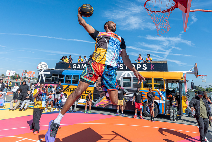
The project translates elements of Los Angeles’ visual language into a system that can move across courts, buses, apparel, and public space. References include hillside lettering, layered highway interchanges, and the shifting geometry of the city.
Typography plays both a structural and expressive role within the system. The typographic approach draws from the irregular rhythm of signage such as the Hollywood Sign, where letterforms respond to landscape rather than sit on a fixed baseline.
Primary typefaces include Cina GEO and Industry, selected for their balance of clarity and utility. In parallel, custom-drawn letterforms are developed directly within the court designs, where typography becomes embedded into the surface itself.
Across the courts, type operates less as applied text and more as form. Scale, movement, and interaction shape how the letterforms are read, allowing typography to function as part of the spatial and physical experience of the game.
The result is a system that extends beyond traditional identity, using typographic thinking to connect visual language, environment, and community. See the full case study on benloiz.com.
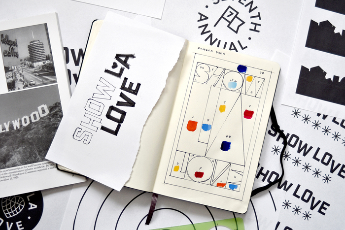
Photo: Ben Loiz. License: All Rights Reserved.
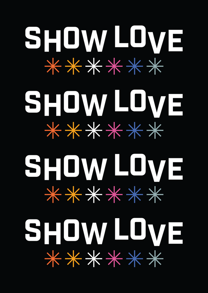
Photo: Ben Loiz. License: All Rights Reserved.
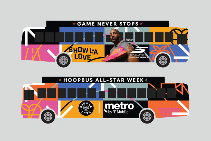
Photo: Ben Loiz. License: All Rights Reserved.
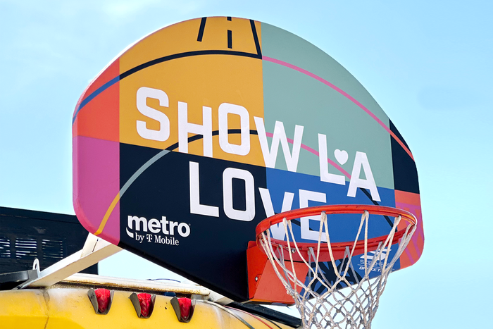
Photo: Ben Loiz. License: All Rights Reserved.
Hoopbus. License: All Rights Reserved.
Resoe. License: All Rights Reserved.
Hoopbus. License: All Rights Reserved.
This post was originally published at Fonts In Use