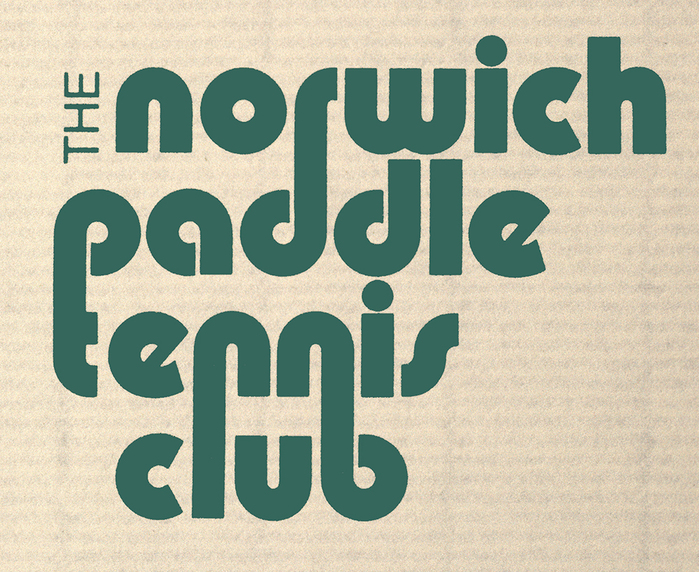
The Norwich Paddle Tennis Club logo
Published April 12, 2026
By FontsInUse
Contributed by Richard Sheaff
Richard Sheaff. License: All Rights Reserved.

This post was originally published at Fonts In Use
Richard Sheaff. License: All Rights Reserved.
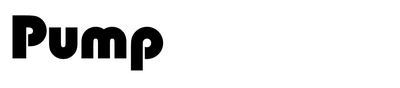
Pump Bold is a typeface I would normally never consider using. I created this logo in the early 1970s when I was first becoming a self-taught designer. It was done with Letraset rub-down lettering. I liked that the d’s and the p’s were the same letterform, and that the lines could interlock up and down in an interesting way.
This post was originally published at Fonts In Use
Read full story.
WRITTEN BY
FontsInUse
An independent archive of typography.
More from FontsInUse