Antonio’s Pizza, Buenos Aires
Published April 13, 2026
By FontsInUse
Contributed by Belen Saralegui
Malcontenti Studio. License: All Rights Reserved.


Malcontenti Studio. License: All Rights Reserved.
Malcontenti Studio. License: All Rights Reserved.
Malcontenti Studio. License: All Rights Reserved.
Malcontenti Studio. License: All Rights Reserved.
This post was originally published at Fonts In Use
Malcontenti Studio. License: All Rights Reserved.
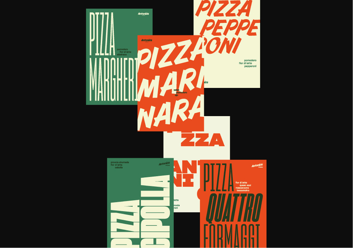
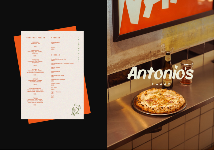
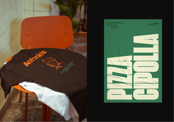
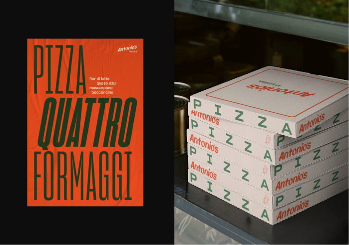
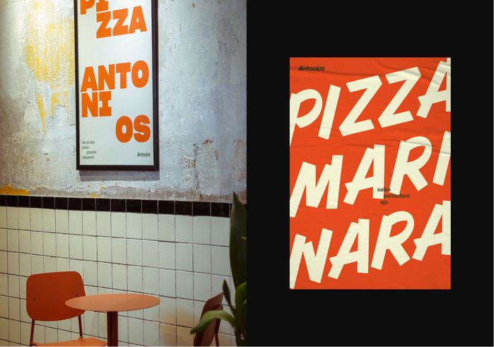
Malcontenti Studio was invited by Antonio’s Pizza to develop their brand identity—an exercise rooted in heritage and cultural intersection.
The concept pays homage to both Buenos Aires and Naples, drawing from the visual language of traditional pizzerias in each city: bold signage, vernacular typography, and a strong sense of locality shaped by generations.
The typographic system combines various styles from the variable Sharp Grotesk with Joe182, balancing warmth and familiarity with a distinct, expressive edge. Together, they evoke the character of hand-painted signs and historic storefront lettering, reinterpreted through a contemporary lens.
Malcontenti Studio. License: All Rights Reserved.
Malcontenti Studio. License: All Rights Reserved.
Malcontenti Studio. License: All Rights Reserved.
Malcontenti Studio. License: All Rights Reserved.
This post was originally published at Fonts In Use
Read full story.
WRITTEN BY
FontsInUse
An independent archive of typography.
More from FontsInUse