Secret Menu magazine, issue 02, “Miami's Almighty Hustle”
Studio Yukiko. License: All Rights Reserved.


Studio Yukiko has created a playful, energetic, and—dare I say—delicious design for Door Dash’s Secret Menu magazine about local food culture. From Studio Yukiko:
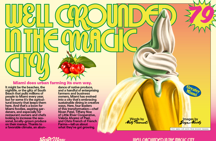
This issue dives deep into Miami’s almighty hustle - A food scene boasting one of the wildest most diverse restaurant cultures in America. It follows stories of taco stands morphing into Michelin starred Italian spots, Black-owned vegan restaurants, reinvented Jewish delis, Cuban and Caribbean stalwarts, and so much more…
“Wild” and “diverse” could also be used to describe the issue’s design and typography. The fonts and layouts are playful, colorful, fun, and varied, with each article spread getting its own special typographic treatment. There is no shortage of sunset-like linear gradients, text effects like outlines and glows, and mixing of typefaces on the same line.
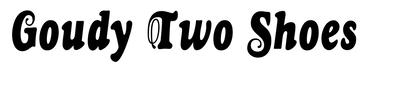
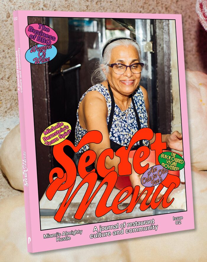
The eclectic design is united by a core palette of typefaces: Megascope is used across the issue for headlines, a callout to Miami’s connection to Art Deco. Random letters are replaced by Ed’s Market (both script and slant styles), bringing some movement and dynamism into the static, geometric typeface. Text is set in Surt and ITC Bookman, with Mrs Sheppards appearing in supporting text such as bylines. Goudy Two Shoes and Middleton Brush are featured on the cover, and Compagnon and Pipo make special appearances in individual spreads. One of my favorite details is how the page numbers—mostly set in Megascope—become such a dominant part of the layout. A few tiny appearances of other guest typefaces (for photo credits, or a single word here and there) are not mentioned here.
The design team for this project included Sebastien Millot, Michelle Phillips, and Kir Nazarov, with production by Mike Teevee. David Amsden and Erin Ruffin are the editors-in-chief of the magazine. According to Phillips, “for the Miami Issue for Secret Menu, we wanted to bring the instantly recognisable world of Iconic Miami’s Mimo and Art Deco style together with it’s lax small-town scrappiness by combining a geometric sans (Megascope), with a brush script (Ed’s Market) to really bring out Miami’s almighty food culture scene.”
Studio Yukiko. License: All Rights Reserved.
Cover
Studio Yukiko. License: All Rights Reserved.
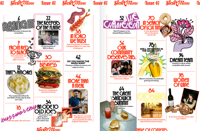
Table of Contents
Studio Yukiko. License: All Rights Reserved.
Studio Yukiko. License: All Rights Reserved.
Studio Yukiko. License: All Rights Reserved.
Studio Yukiko. License: All Rights Reserved.
Studio Yukiko. License: All Rights Reserved.
Studio Yukiko. License: All Rights Reserved.

Studio Yukiko. License: All Rights Reserved.
Studio Yukiko. License: All Rights Reserved.
Studio Yukiko. License: All Rights Reserved.
Studio Yukiko. License: All Rights Reserved.
Studio Yukiko. License: All Rights Reserved.
Studio Yukiko. License: All Rights Reserved.
This post was originally published at Fonts In Use