GrillGott visual identity
Source: page-online.de License: All Rights Reserved.
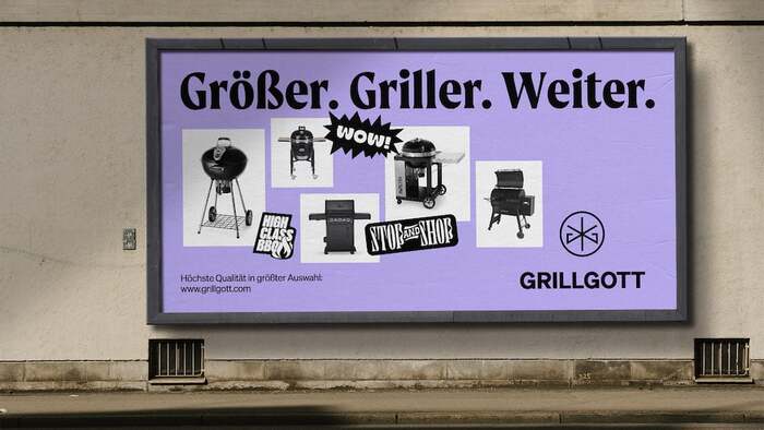
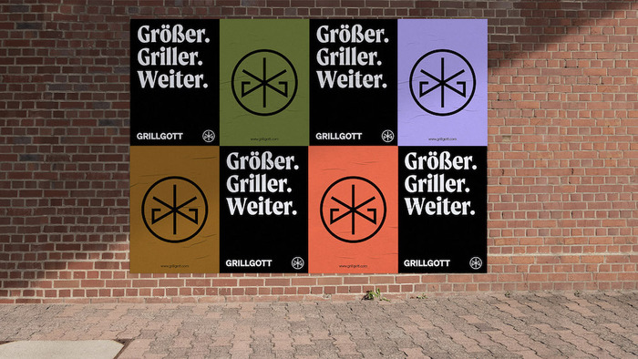
Billboard, with typographic guest appearances from Jérémy Landes’ Digestive and a few other typefaces.

Moret fits the grill perfectly as the type family of choice for the rebrand of GrillGott by Arndt Benedikt. It is paired with Söhne from Klim Type Foundry. Designer Arndt Benedikt explains:
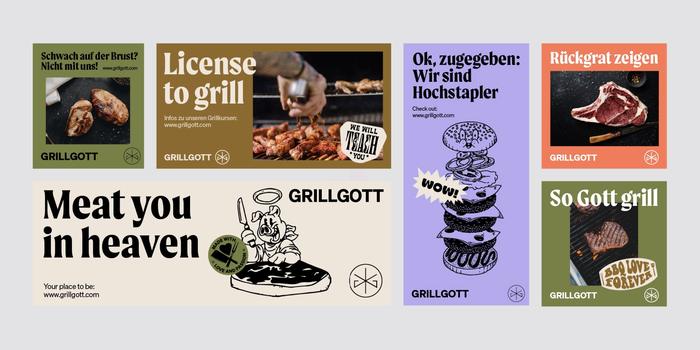
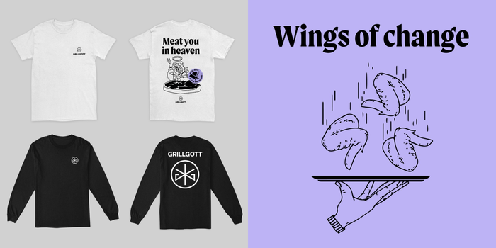
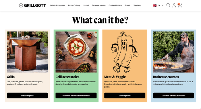
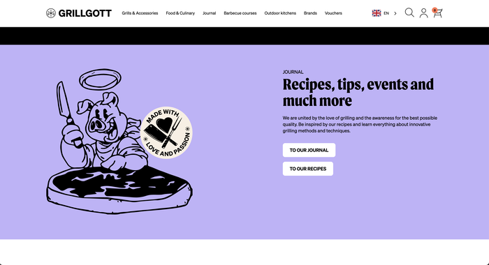
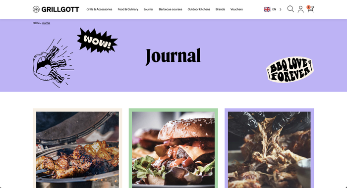
Whether it’s meat, veggie alternatives, outdoor kitchens, recipes or grilling classes, the idea behind GrillGott is to give everyone the opportunity to explore their passion for grilling. Quite simply, to make you a GrillGott (GrillGod). We had the pleasure to redesign the brand positioning, the corporate design and the webshop for the grill expert.
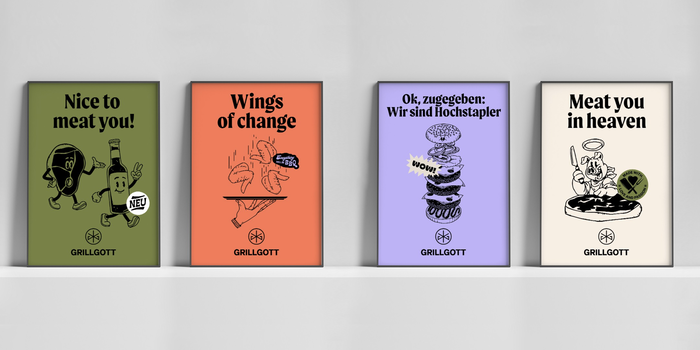
The visual identity is designed to stand out from the monotonous competition. No stereotypical flame logo, no fonts with textures. Rather, the focus was on a clear logo. Derived from the initials GG, barbecue utensils serve as a visual starting point, a star as a sign of the highest quality one can think of and of the perfectionism lived by GrillGott. This results in a seal to certify the dedication. Speaking of gods, it gets a little more mystical: all the letters of the name are found in the sign.
Source: www.instagram.com License: All Rights Reserved.
Source: page-online.de License: All Rights Reserved.
Source: www.instagram.com License: All Rights Reserved.
Source: www.instagram.com License: All Rights Reserved.
Source: www.instagram.com License: All Rights Reserved.
Source: www.instagram.com License: All Rights Reserved.
Source: grillgott.com License: All Rights Reserved.
Source: grillgott.com License: All Rights Reserved.

Source: grillgott.com License: All Rights Reserved.
Source: grillgott.com License: All Rights Reserved.
This post was originally published at Fonts In Use