Scribd rebrand
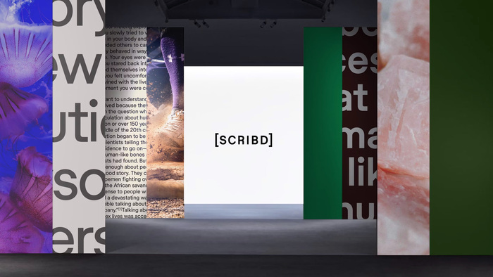
Source: www.instagram.com License: All Rights Reserved.

Mother Design has redesigned the identity of user-powered library and tech company Scribd.
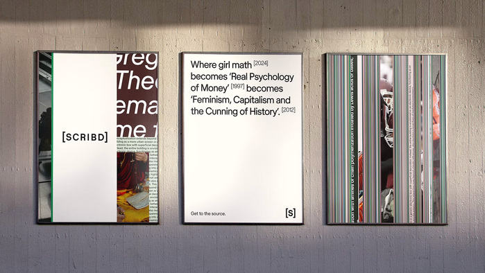
The typeface used is Scribd Sans, a customised version of Store Norske Ja, from Skriftkompani. The letters G, R and u have new alternative shapes and all dots and tittles changed from squares to circles.
On launch Mother Design wrote in their Instagram post:
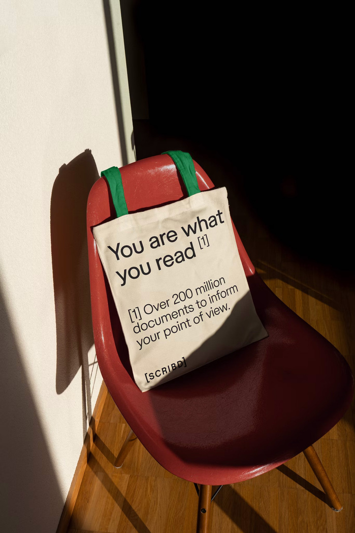
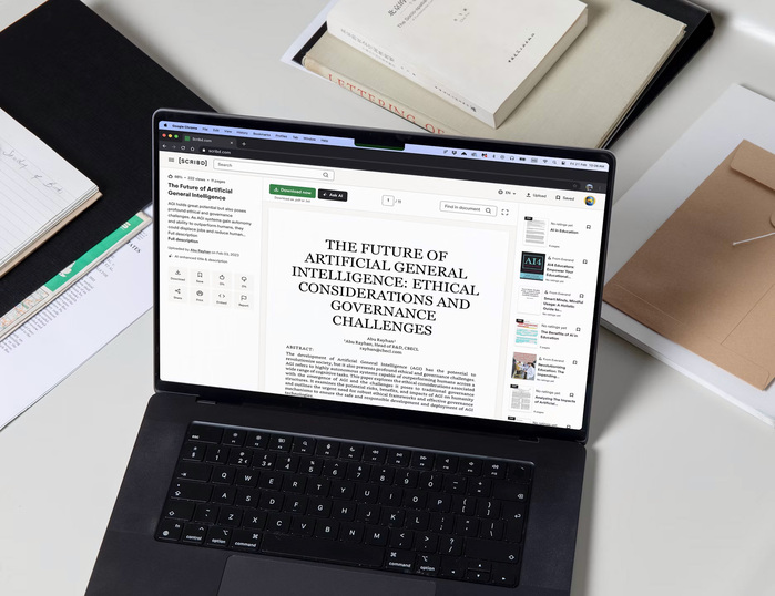
Scribd is the document sharing tool nearly everyone’s used but not many remember. With 2 million contributors and over 200 million documents, you can access everything from washing machine manuals to studies on ancient botany. The challenge was getting people to treat it as a destination, rather than a place they happened upon after searching on other parts of the internet.
We worked closely with the team to build a brand that rejects our culture’s fixation on fast results and surface level knowledge, and instead supports contributors and readers in their quest to understand things deeply. Borrowing cues from the world of referencing, we positioned Scribd as life’s bibliographer with a brand language that speaks to the depth and breadth on the platform and evokes a sense of discovery along journeys for information.
Source: www.instagram.com License: All Rights Reserved.

Source: www.instagram.com License: All Rights Reserved.
Source: www.instagram.com License: All Rights Reserved.
Source: www.instagram.com License: All Rights Reserved.
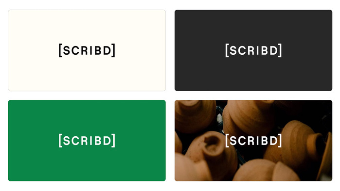
Source: www.instagram.com License: All Rights Reserved.

Source: www.instagram.com License: All Rights Reserved.
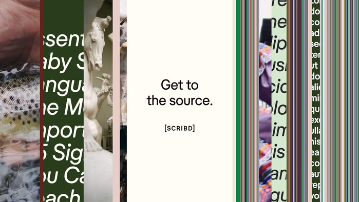
Source: www.instagram.com License: All Rights Reserved.
This post was originally published at Fonts In Use