Frankie & Benny’s
Published April 28, 2025
By FontsInUse
Contributed by Darden Studio

Source: www.frankieandbennys.com License: All Rights Reserved.

Source: www.ubereats.com License: All Rights Reserved.
Source: www.ubereats.com License: All Rights Reserved.

Source: www.frankieandbennys.com License: All Rights Reserved.

Source: www.frankieandbennys.com License: All Rights Reserved.

Source: www.frankieandbennys.com License: All Rights Reserved.

Source: www.frankieandbennys.com License: All Rights Reserved.

Source: www.frankieandbennys.com License: All Rights Reserved.
Source: www.frankieandbennys.com License: All Rights Reserved.

Source: www.instagram.com License: All Rights Reserved.

Source: www.facebook.com License: All Rights Reserved.

Source: www.facebook.com License: All Rights Reserved.

Source: www.frankieandbennys.com License: All Rights Reserved.

Source: www.facebook.com License: All Rights Reserved.

Source: www.facebook.com License: All Rights Reserved.
This post was originally published at Fonts In Use
Source: www.frankieandbennys.com License: All Rights Reserved.
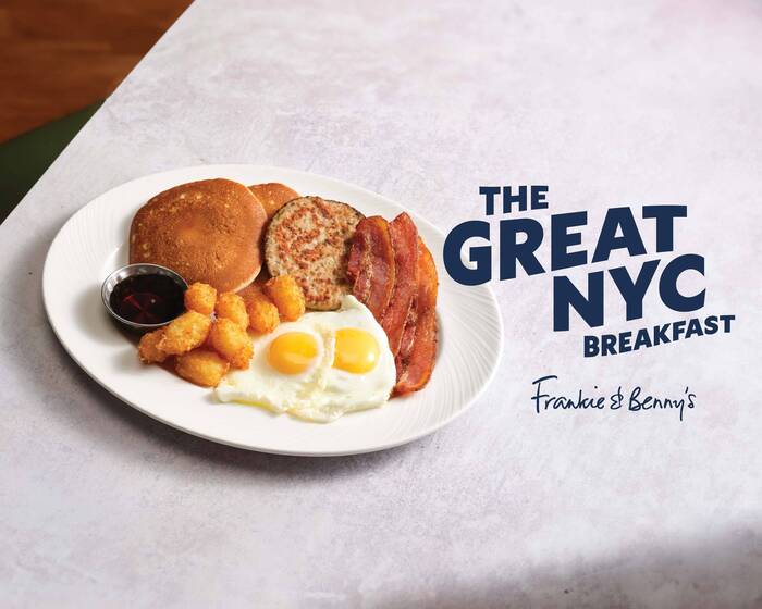
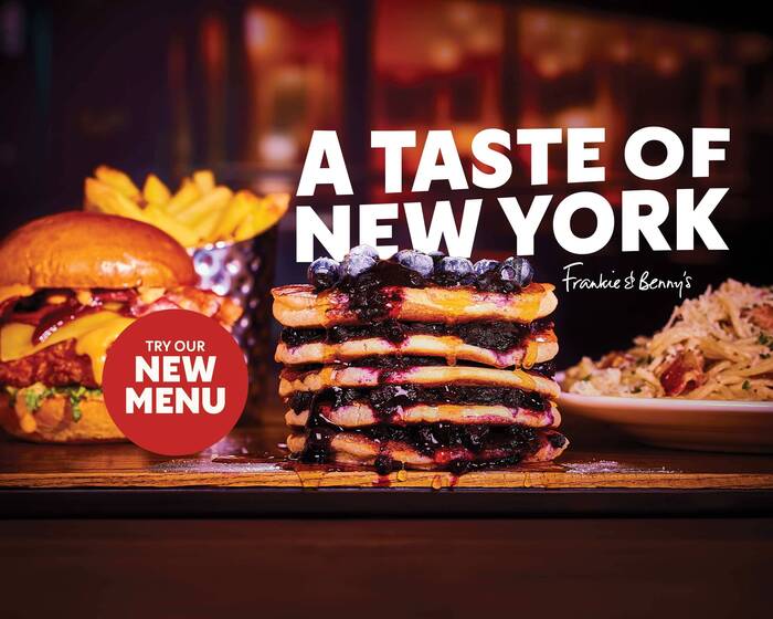
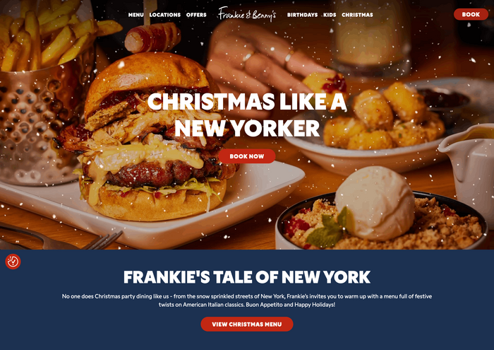
Gamay is the new branding typeface for Frankie & Benny’s.
The chain with restaurants across the United Kingdom underwent a major rebrand. The new identity takes the New York-Italian-themed family restaurant back to its original concept when it first launched in 1995, with a fresh menu and red and blue as the new brand colors.
In terms of typography, Frankie & Benny’s goes all in on Gamay. The new sans serif by Darden Studio serves across every aspect of the brand, from the website to advertising campaigns and printed menus, in various weights of the comprehensive family. Headlines often are shown in bold all-caps settings. In promotional graphics, such lines are made more dynamic by slight distortion, adding a sense of space and motion.
Source: www.ubereats.com License: All Rights Reserved.
Source: www.ubereats.com License: All Rights Reserved.
Source: www.frankieandbennys.com License: All Rights Reserved.
Source: www.frankieandbennys.com License: All Rights Reserved.
Source: www.frankieandbennys.com License: All Rights Reserved.
Source: www.frankieandbennys.com License: All Rights Reserved.
Source: www.frankieandbennys.com License: All Rights Reserved.
Source: www.frankieandbennys.com License: All Rights Reserved.
Source: www.instagram.com License: All Rights Reserved.
Source: www.facebook.com License: All Rights Reserved.
Source: www.facebook.com License: All Rights Reserved.
Source: www.frankieandbennys.com License: All Rights Reserved.
Source: www.facebook.com License: All Rights Reserved.
Source: www.facebook.com License: All Rights Reserved.
This post was originally published at Fonts In Use
Read full story.
WRITTEN BY
FontsInUse
An independent archive of typography.
More from FontsInUse