The Vampire. In Legend, Fact and Art by Basil Copper

Source: www.ebay.com bythecover (edited). License: All Rights Reserved.


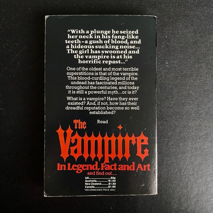
With terminals as sharp as fangs, Gothic Tuscan Pointed was a natural choice for the title of Basil Copper’s popular study of vampires. First published in hardback by Robert Hale in 1973, this is Corgi’s paperback edition from 1975. The specific font in use likely is the phototype adaption made by Headliners as part of the Morgan Press Collection, which includes a lowercase. The descender in p apparently was cut short to avoid spacing issues.
One of the oldest and most terrible superstitions is that of the vampire. This blood-curdling legend of the undead has fascinated millions throughout the centuries, and today it is still a powerful myth … or is it? What is a vampire? Have they ever existed? And, if not, how has their dreadful reputation become so well established?

Source: archive.org Internet Archive. License: All Rights Reserved.
The typography of the title page is carried over from the first edition by Robert Hale & Co., featuring Cloister Black – with appropriately bat-shaped top serifs in V – and Futura. The Shakespeare motto is added in Plantin.

Source: archive.org Internet Archive. License: All Rights Reserved.
Plantin is also used for the interior typography, with headings in Cloister Black.

Source: alldatalostbooks.co.uk All Data Lost Books. License: All Rights Reserved.
The teaser quote on the back cover is set in the underused fett weight of Trump-Mediäval, digitally available as Bitstream’s Kuenstler 480 Black. The synopsis is in Rockwell.
This post was originally published at Fonts In Use