Rise & Ruin cider
Source: steventachauer.com License: All Rights Reserved.


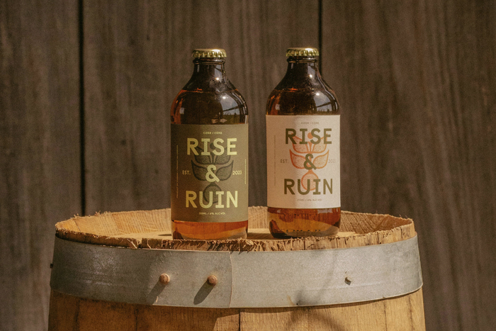
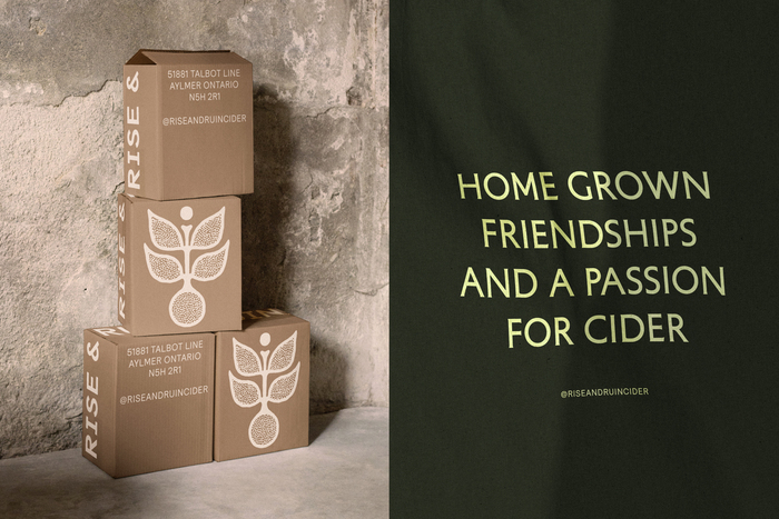
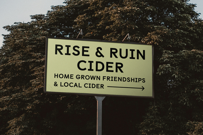
With a genuine voice in the world of craft cider, Rise & Ruin exists to make cider for all types of drinkers. What started as a group of friends sharing drinks and pressing cider at every harvest quickly evolved into a passion for home grown craft cider. Set on their multi-generational orchard in Elgin County, the founders are personally involved in every step of the process from growth and harvesting, to fermenting, and bottling.
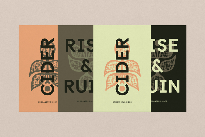
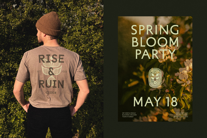
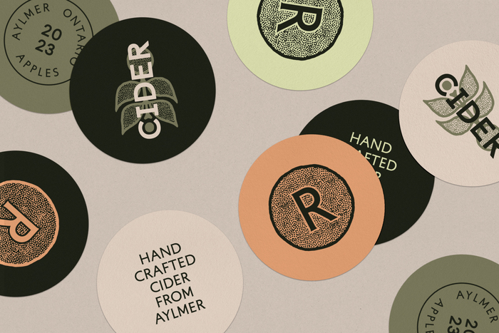
A flexible visual identity was designed to serve both an unconventional and familiar energy rooted in the outdoors. The visual language combines bold yet humble typography with earth-like illustrative elements creating a visual system that evokes warmth and familiarity. A custom illustrative heritage mark was crafted to symbolize the transformative cycle of growth and decay, while serving as a seal of authenticity.
When designing Rise & Ruin Cider’s identity, it was important for me to feel a visceral connection to the typographic choices that felt both down-to-earth and authentic, while remaining contemporary. This juxtaposition of typographic styles — Castledown and its clean, softened edges, Petit Serif with its eclectic, historical nod, and the contemporary Relative — really brings the hand-crafted humanism to the forefront, while keeping the brand warm and approachable in its modernity.
Source: steventachauer.com License: All Rights Reserved.
Source: steventachauer.com License: All Rights Reserved.
Source: steventachauer.com Photo: Steven Tachauer. License: All Rights Reserved.
Source: steventachauer.com License: All Rights Reserved.
Source: steventachauer.com License: All Rights Reserved.
This post was originally published at Fonts In Use