Making Neuland by Dan Reynolds, Poem Pamphlet No. 7
Source: www.poem-editions.com License: All Rights Reserved.


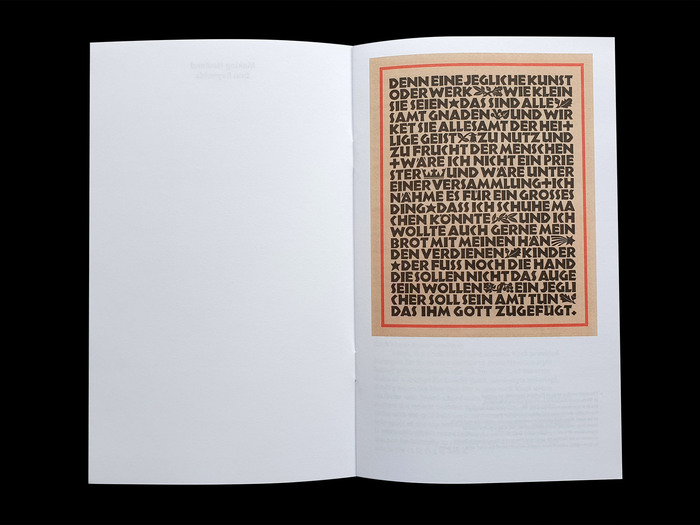
Of the display typefaces Rudolf Koch designed, Neuland may have received the most use abroad. But how was it made? A 1922 letter Koch sent to Ernst Kellner provides more questions than answers, and designers have speculated for almost half a century about whether Koch really cut its punches without any preparation.
Dan Reynolds’s essay reviews these textual sources, comparing them with surviving process material preserved in the Klingspor Museum and elsewhere. Written by Dan Reynolds and edited by Alice Savoie and Jérôme Knebusch in the Poem Pamphlet series. Typeset with Instant, Almost Roman Italic and Koch Grotesk 16 Tertia Minuskel – a revival of a never-released Neuland subfamily consisting of a lowercase with matching uppercase characters, shown on a Klingspor proof dated 1929.
Source: www.poem-editions.com License: All Rights Reserved.
Source: www.poem-editions.com License: All Rights Reserved.

Source: www.poem-editions.com License: All Rights Reserved.
Source: www.poem-editions.com License: All Rights Reserved.
Source: www.poem-editions.com License: All Rights Reserved.
This post was originally published at Fonts In Use