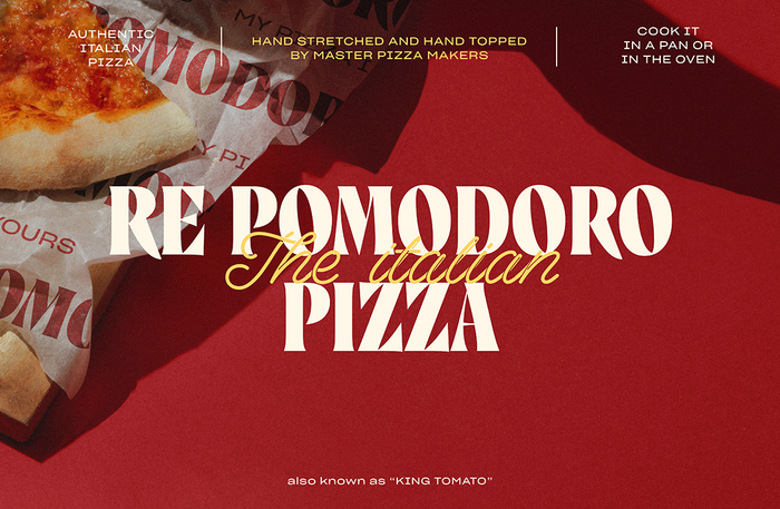
Re Pomodoro
The 6th. License: All Rights Reserved.


Marcovaldo is the main typeface used for Re Pomodoro by Margherita S.p.a.
From design agency The 6th:
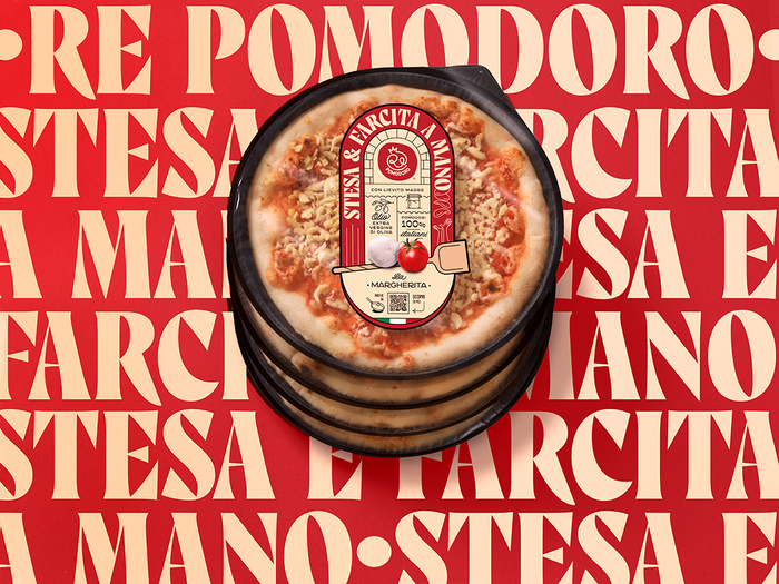
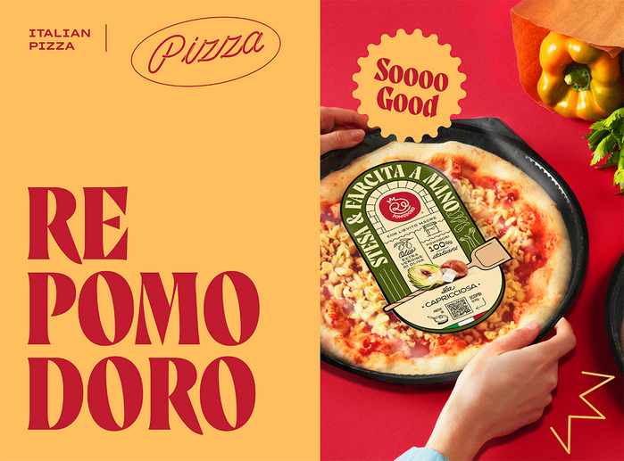
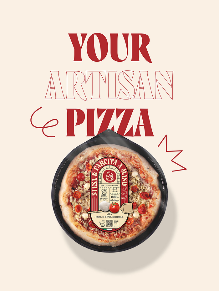
Re Pomodoro is a fresh pizza brand sold in supermarkets but made with artisan process and selected top-quality ingredients. Every pizza is hand-stretched and hand-topped (“stesa e farcita a mano” in italian) so we designed a logo stressing this uniqueness: the final “o” becomes a pizza throwned up by the pizza-maker hands.
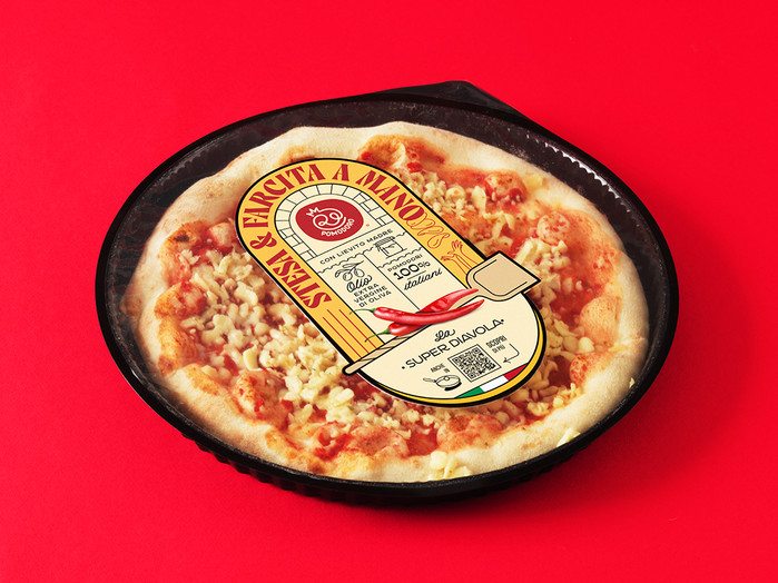
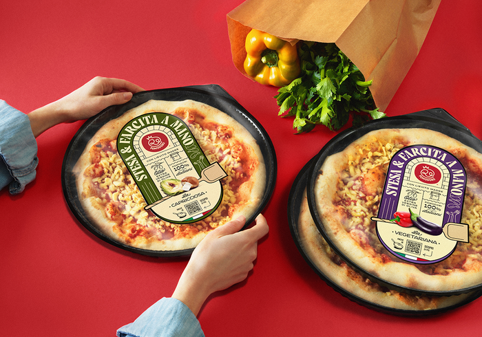
The logo Re Pomodoro too seems to come out from a wood-fired oven and the top quality ingredients are designed recreating ancient hand-made labels.
The QR code on the label sends back to a landing page explaining everything about the product: production, ingredients, cooking tips, etc. So everyone can enjoy at home the authentic pizza taste just like in a pizzeria!
Additional fonts include CA Negroni, Boogie School Sans, Spagheti Script, and Cervo.
The 6th. License: All Rights Reserved.
The 6th. License: All Rights Reserved.
The 6th. License: All Rights Reserved.
The 6th. License: All Rights Reserved.
The 6th. License: All Rights Reserved.

Source: www.margheritagroup.com License: All Rights Reserved.

Source: www.margheritagroup.com License: All Rights Reserved.
This post was originally published at Fonts In Use