Mahou Cinco Estrellas visual identity
Published October 22, 2025
By FontsInUse
Contributed by Anna Kovalenko (Kyiv Type Foundry)

Source: www.wearefirma.com License: All Rights Reserved.


Source: www.wearefirma.com License: All Rights Reserved.
Source: www.wearefirma.com License: All Rights Reserved.

Source: www.wearefirma.com License: All Rights Reserved.
Source: www.wearefirma.com License: All Rights Reserved.
This post was originally published at Fonts In Use
Source: www.wearefirma.com License: All Rights Reserved.
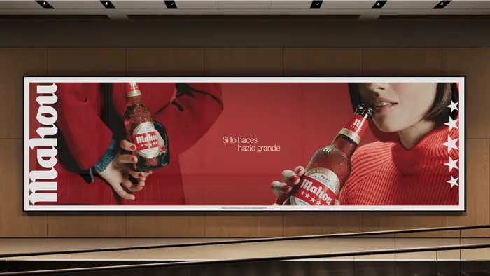
Firma and Rosàs have expanded the visual identity of Mahou Cinco Estrellas, Spain’s most consumed beer and the flagship of the Mahou brand. The updated system reinforces the brand’s presence and ensures a cohesive experience across all touchpoints.
To strengthen Mahou’s leadership and elevate its positioning around the concept of greatness, the agencies developed graphic resources and design elements that amplify its message and deliver consistency in every interaction.
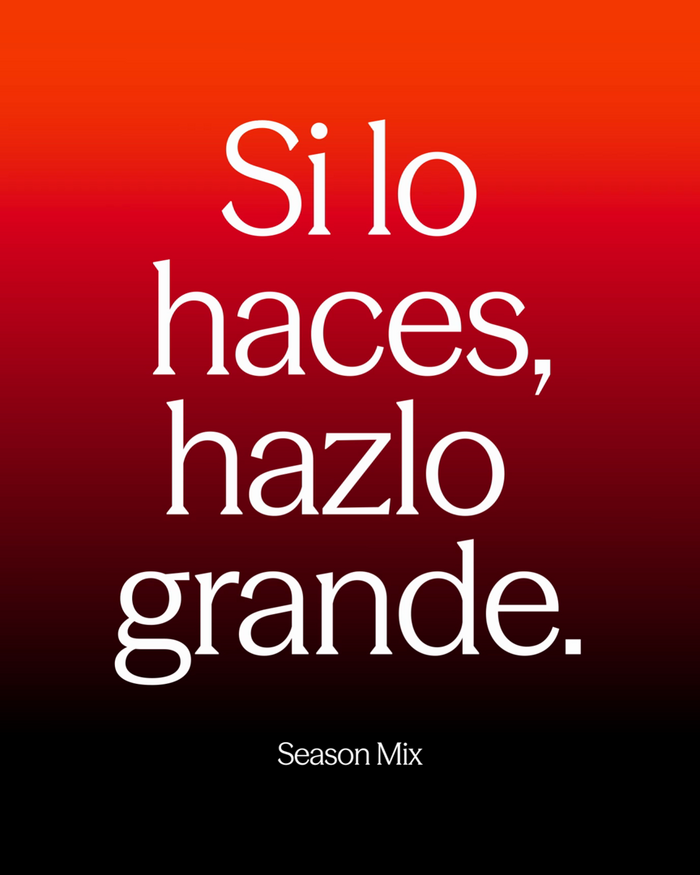
The typefaces in use are Season Mix and Saans by Displaay, and KTF Rublena by Kyiv Type Foundry
Source: www.wearefirma.com License: All Rights Reserved.
Source: www.wearefirma.com License: All Rights Reserved.
Source: www.wearefirma.com License: All Rights Reserved.
Source: www.wearefirma.com License: All Rights Reserved.
This post was originally published at Fonts In Use
Read full story.
WRITTEN BY
FontsInUse
An independent archive of typography.