Care.com 2025 rebrand

Source: manualcreative.com ©2025 Care.com. License: All Rights Reserved.

Care.com (launched 2007) is an online marketplace for families to find childcare, senior care and pet care, etc. It is also a two-sided marketplace allowing caregivers to find jobs.
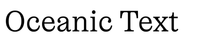
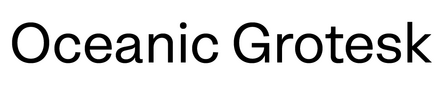
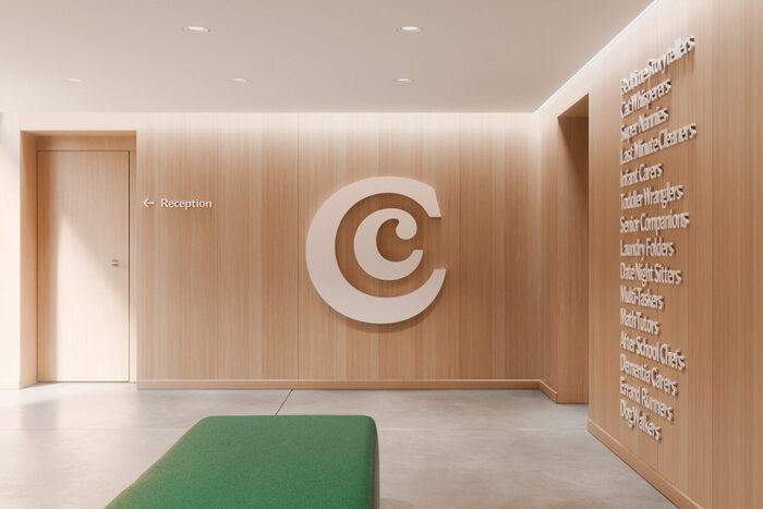
The platform launched a rebrand in 2025, directed by Manual. The agency makes the whole identity revolve around three type families: the serif/sans duo Oceanic Text / Oceanic Grotesk as well as NaN Druid Sans. The wordmark itself is set in a customized (by its own designer) version of Oceanic Text, the biggest change being to switch to an asymmetrical construction for the capital C with only one serif on top, whereas the original typeface featured one serif on the bottom as well. The logo symbol is an inclusion of a lowercase c inside a capital one, invoking notions of protection and of – care. You got it.
In terms of type hierarchy, NaN Druid is mostly used for main headings, Oceanic Text for sub-headings and Oceanic Grotesk for all texts. While both Oceanic families share a gentle spirit due to the relative roundness of their structures and details, NaN Druid Sans appears frank with its humanistic (open) structure, sharp ending and slight contrast.
See the full case study.

Source: manualcreative.com ©2025 Care.com. License: All Rights Reserved.

Source: manualcreative.com ©2025 Care.com. License: All Rights Reserved.

Source: manualcreative.com ©2025 Care.com. License: All Rights Reserved.

Source: manualcreative.com ©2025 Care.com. License: All Rights Reserved.

Source: manualcreative.com ©2025 Care.com. License: All Rights Reserved.
Source: manualcreative.com ©2025 Care.com. License: All Rights Reserved.

Source: manualcreative.com ©2025 Care.com. License: All Rights Reserved.

Source: manualcreative.com ©2025 Care.com. License: All Rights Reserved.

Source: manualcreative.com ©2025 Care.com. License: All Rights Reserved.

Source: manualcreative.com ©2025 Care.com. License: All Rights Reserved.
Source: manualcreative.com ©2025 Care.com. License: All Rights Reserved.

Source: manualcreative.com ©2025 Care.com. License: All Rights Reserved.
This post was originally published at Fonts In Use