Presentable website
Presentable. License: All Rights Reserved.


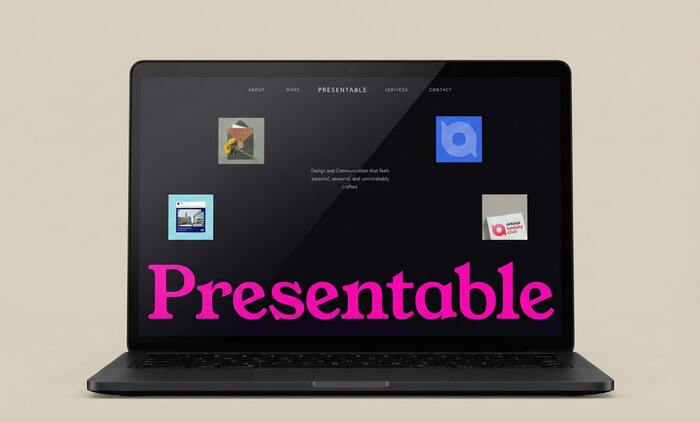
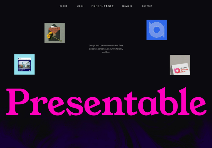
Presentable is a design studio website built around the idea of celebration as a cultural and emotional system. Typography plays a central role in establishing contrast between clarity and expression across editorial content, navigation, and large typographic statements.
Young Serif is used as the primary display typeface, most notably in oversized headings and key statements. Its sharp geometry and contemporary construction introduce tension against the otherwise restrained layouts, allowing scale and color to carry emphasis rather than ornament.
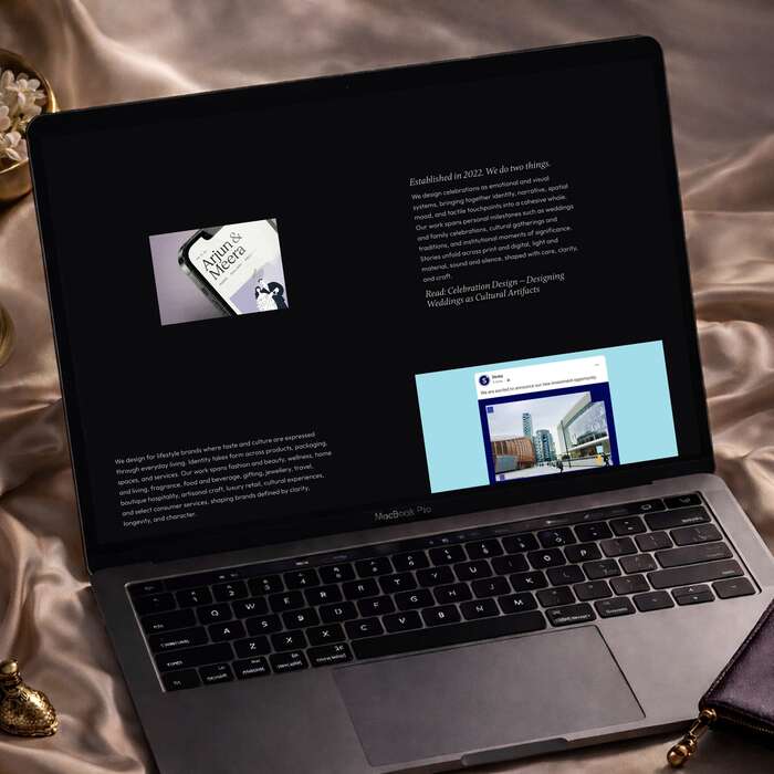
Poppins functions as a stabilizing counterpart, used for supporting headings and structured content. Its even proportions and neutral tone help maintain legibility across dense informational sections without competing with the display typography.
Outfit is used for body copy and interface elements, chosen for its clarity at smaller sizes and its calm presence across longer passages of text. The typeface supports the site’s editorial pacing and ensures consistency across desktop and mobile views.
The overall typographic system relies on contrast in scale, spacing, and hierarchy rather than decorative styling, aligning with the studio’s focus on clarity, restraint, and craft in both cultural and lifestyle contexts.
Presentable. License: All Rights Reserved.
Presentable. License: All Rights Reserved.
Presentable. License: All Rights Reserved.
Presentable. License: All Rights Reserved.
This post was originally published at Fonts In Use