CASA C ALMA
Published January 23, 2026
By FontsInUse
Contributed by Studio Böreck
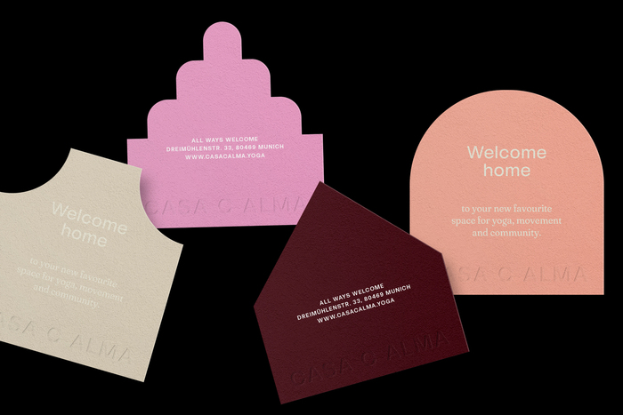
Photo: Studio Böreck. License: All Rights Reserved.

Photo: Studio Böreck. License: All Rights Reserved.
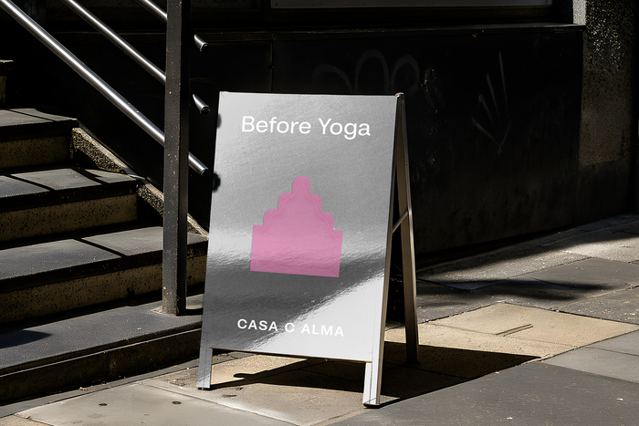
Photo: Studio Böreck. License: All Rights Reserved.
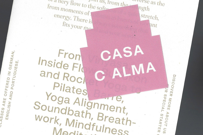
Photo: Studio Böreck. License: All Rights Reserved.
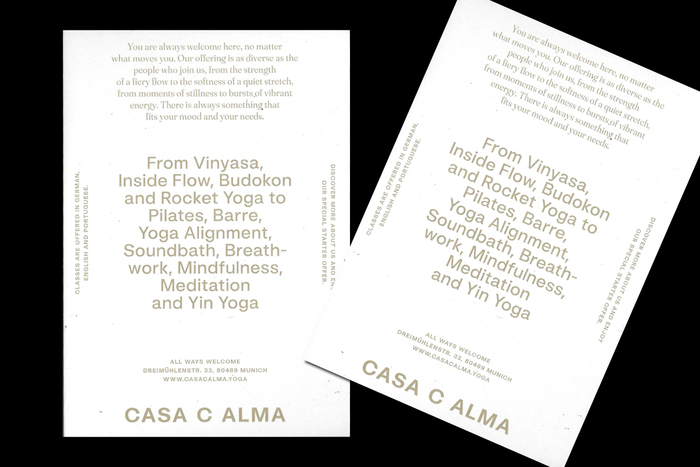
Photo: Studio Böreck. License: All Rights Reserved.
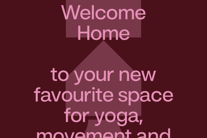
Photo: Studio Böreck. License: All Rights Reserved.
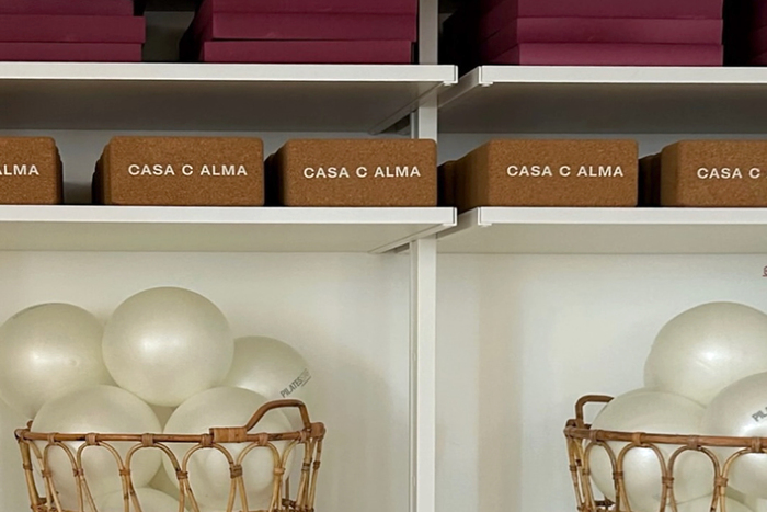
Photo: Studio Böreck. License: All Rights Reserved.
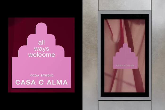
Photo: Studio Böreck. License: All Rights Reserved.
This post was originally published at Fonts In Use
Photo: Studio Böreck. License: All Rights Reserved.
Welcome home: CASA C ALMA. a new yoga studio built on grounding, connection, and community. The brand identity builds on one guiding idea: all ways welcome. The design represents a home of many shapes and colors, because casa means “home” – and this one is for everyone. Each form stands for uniqueness, belonging, and togetherness. That sense of softness, openness, and welcome is exactly what the design aims to reflect.
The house-shaped forms translate the idea of “home” into spatial orientation. Materials create a balance between openness and clarity. The typography remains clean and reduced, giving the system a calm and timeless presence.
Photo: Studio Böreck. License: All Rights Reserved.
Photo: Studio Böreck. License: All Rights Reserved.
Photo: Studio Böreck. License: All Rights Reserved.
Photo: Studio Böreck. License: All Rights Reserved.
Photo: Studio Böreck. License: All Rights Reserved.
Photo: Studio Böreck. License: All Rights Reserved.
Photo: Studio Böreck. License: All Rights Reserved.
This post was originally published at Fonts In Use
Read full story.
WRITTEN BY
FontsInUse
An independent archive of typography.
More from FontsInUse