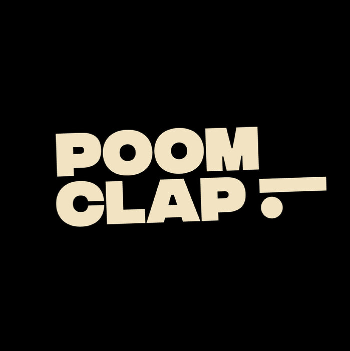
Poomclap branding
Published July 21, 2025
By FontsInUse
Contributed by Connary Fagen
Studio OUAM. License: All Rights Reserved.

Studio OUAM. License: All Rights Reserved.
Studio OUAM. License: All Rights Reserved.
Studio OUAM. License: All Rights Reserved.
Studio OUAM. License: All Rights Reserved.
Studio OUAM. License: All Rights Reserved.
This post was originally published at Fonts In Use
Studio OUAM. License: All Rights Reserved.
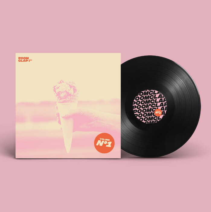
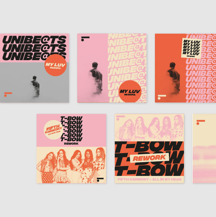
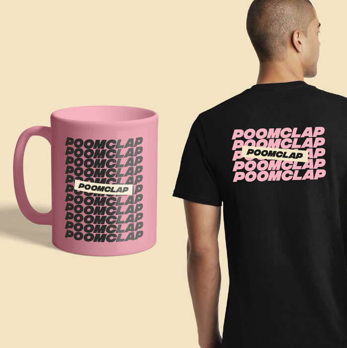
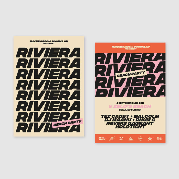
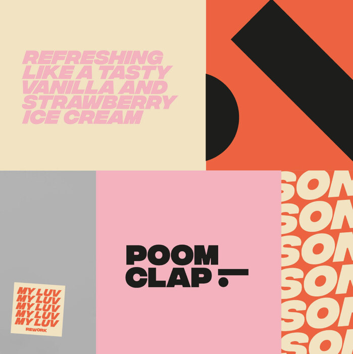
Check out Integral CF, the sleek font Studio OUAM chose to bring Poomclap’s branding to life! With clean lines and a modern geometric style, Integral CF shapes everything from album covers and posters to social media and merch, giving Poomclap – a French independent record label – a bold, consistent look that’s as fresh as its sound. It’s the perfect typographic match to the label’s cutting-edge music vibe – typography that speaks as loud as the beats.
Designed by Connary Fagen, Integral CF features strong vertical strokes, tight spacing, and confident letterforms that deliver clarity and punch. It’s versatile enough for headlines and identity systems but distinctive enough to leave a mark – just like Poomclap’s sound.
Studio OUAM. License: All Rights Reserved.
Studio OUAM. License: All Rights Reserved.
Studio OUAM. License: All Rights Reserved.
Studio OUAM. License: All Rights Reserved.
Studio OUAM. License: All Rights Reserved.
This post was originally published at Fonts In Use
Read full story.
WRITTEN BY
FontsInUse
An independent archive of typography.
More from FontsInUse