Switch ’24 conference
Harley Johnston Design. License: All Rights Reserved.


Switch is the annual conference run by the NSW Public Libraries Association. Each year the conference is held at a different location and brings together the New South Wales public libraries workforce, industry and key speakers to learn, network and celebrate the achievements of it’s members. After working with the NSWPLA on updating their brand identity I was brought on to update the way the Switch conference presents itself to the world. The result was an updated brand identity as well as design applications across print, screen and motion.
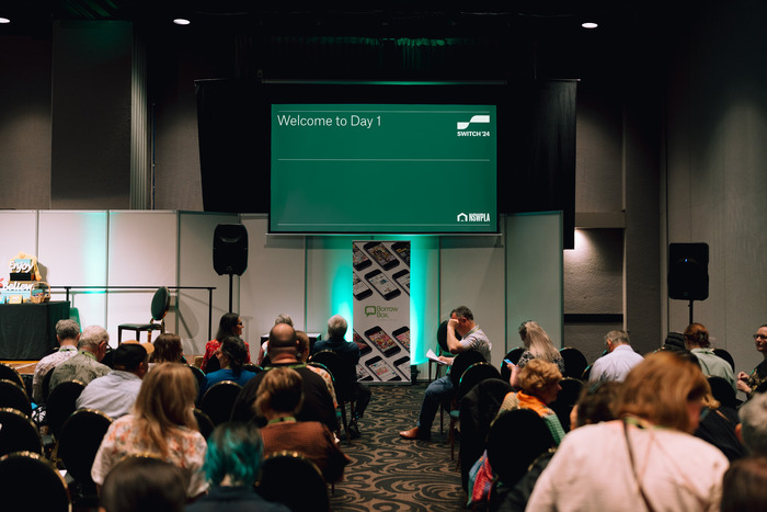
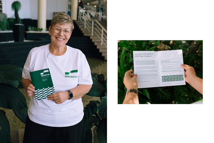
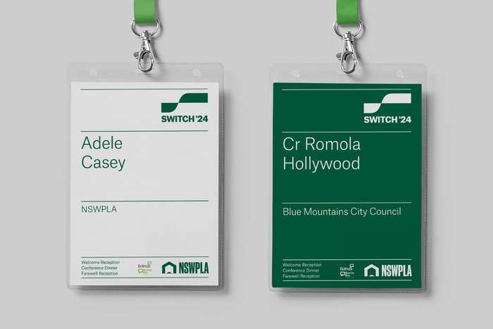
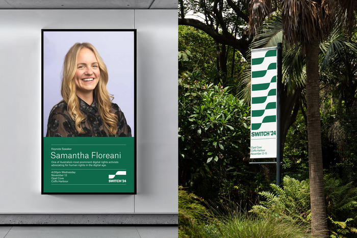
Upon talking to the leadership of the NSWPLA it became clear that the conference was a well-loved event for all involved. The three-day event includes educational talks from library leaders and industry, awards for library staff as well as networking opportunities. It was clear that people who attended left feeling elated, this concept was captured with the simple logo mark, the takes a rectangle and switches it up as it moves to the right to form a stylised S. This concept was re-enforced by using a set of thin horizontal lines across the design application which also add structure to the layouts. Working with the colours from the NSWPLA brand identity, the event colours change each year, as does the year in the logo.
Atlas Grotesk was chosen for the branding as it ties in with the updated NSWPLA branding and is a workhorse font that brings a refined character to the designs. The black weight was used for the logo whilst light and regular was used elsewhere. The logo uses an apostrophe from Söhne Black.

Harley Johnston Design. License: All Rights Reserved.

Harley Johnston Design. License: All Rights Reserved.
Harley Johnston Design. License: All Rights Reserved.

Harley Johnston Design. License: All Rights Reserved.
Harley Johnston Design. License: All Rights Reserved.
Harley Johnston Design. License: All Rights Reserved.

Harley Johnston Design. License: All Rights Reserved.
This post was originally published at Fonts In Use