Pinguino Ice Creams
Source: kpot.be © 2024 Kpot Design & Pinguino. License: All Rights Reserved.

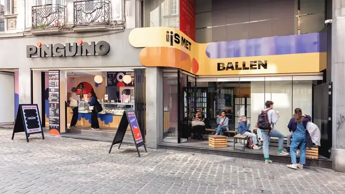
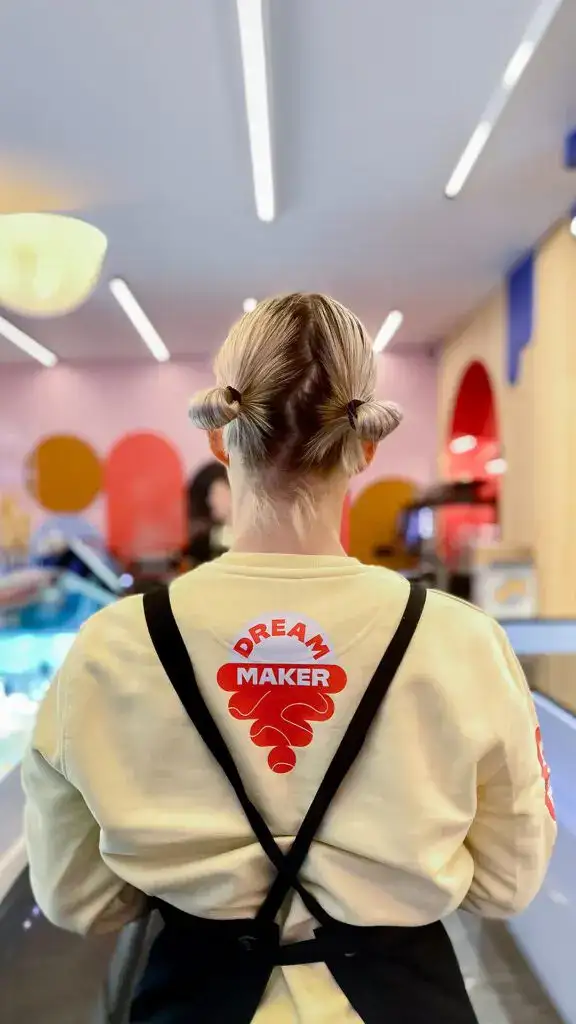
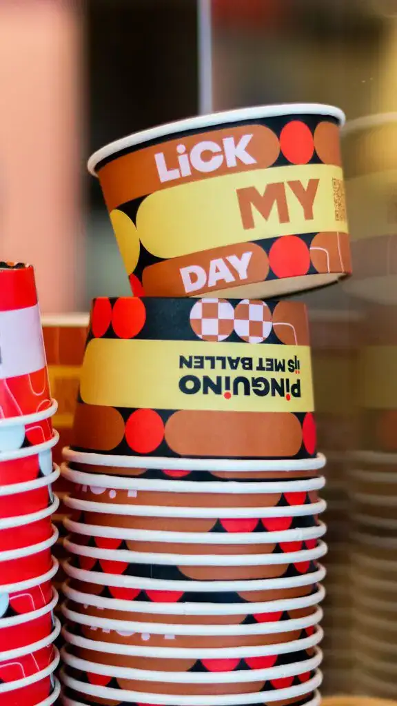
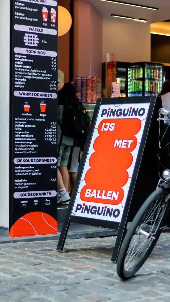
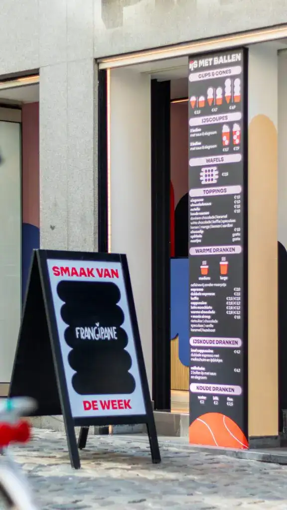
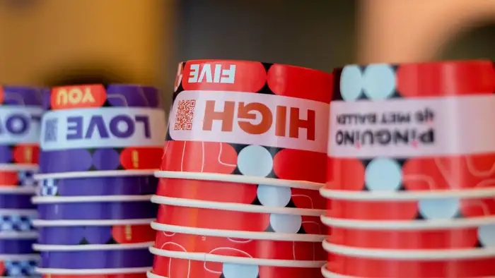
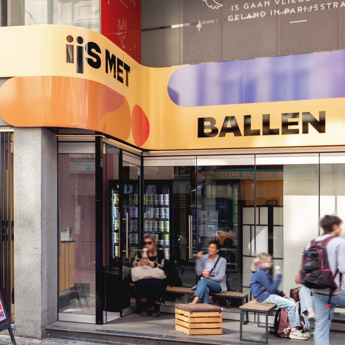
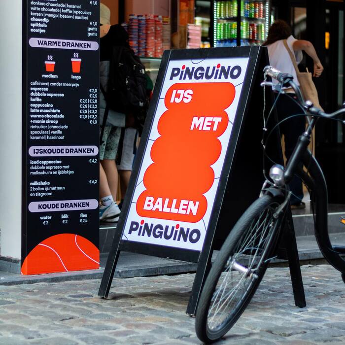
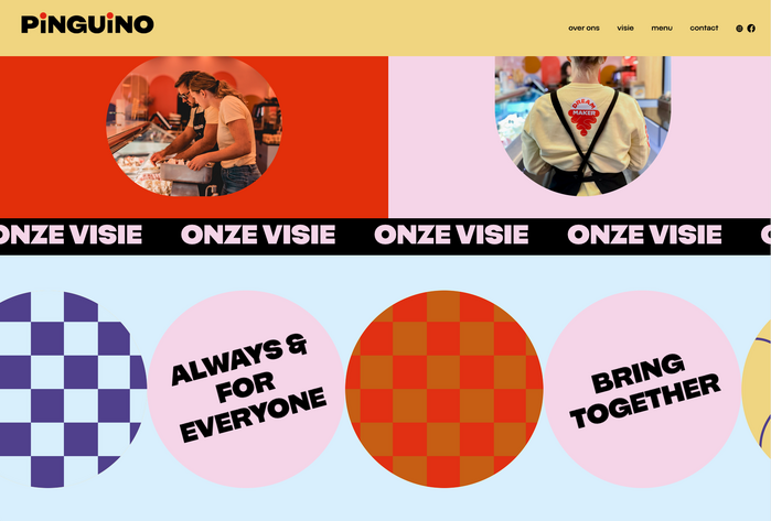
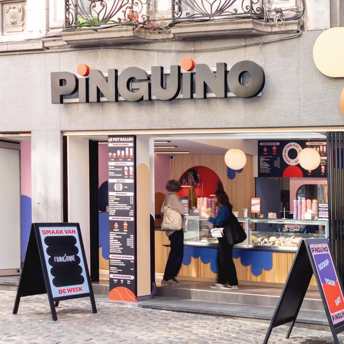
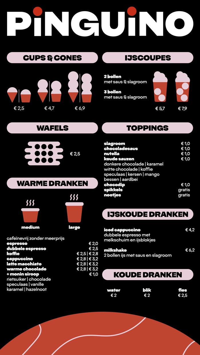
Pinguino is a new ice cream shop in the center of the Belgian city of Leuven (Flanders). Local design agency kpot created a brand that is leaning in the colorful and pop trends that are seen a lot in the food market these days. Block colour geometrical patterns mix with big and bold type in a colour scheme dominated by orange, black and white with accents of yellow and purple.
The only type family used here in two styles is NaN Fiasco, NaN’s whimsical geometric sans built around consistent inconsistencies and voluntary quirks and mistakes which all bring warmth and a more human and playful spirit. It’s worth to note that this not the first use of Fiasco in the context of branding a food / beverage place, making it almost look like a dynamic for this typeface.
Source: kpot.be © 2024 Kpot Design & Pinguino. License: All Rights Reserved.
Source: kpot.be © 2024 Kpot Design & Pinguino. License: All Rights Reserved.
Source: kpot.be © 2024 Kpot Design & Pinguino. License: All Rights Reserved.
Source: kpot.be © 2024 Kpot Design & Pinguino. License: All Rights Reserved.
Source: kpot.be © 2024 Kpot Design & Pinguino. License: All Rights Reserved.
Source: kpot.be © 2024 Kpot Design & Pinguino. License: All Rights Reserved.
Source: kpot.be © 2024 Kpot Design & Pinguino. License: All Rights Reserved.
Source: kpot.be © 2024 Kpot Design & Pinguino. License: All Rights Reserved.
Source: kpot.be © 2024 Kpot Design & Pinguino. License: All Rights Reserved.
Source: kpot.be © 2024 Kpot Design & Pinguino. License: All Rights Reserved.
Source: kpot.be © 2024 Kpot Design & Pinguino. License: All Rights Reserved.
This post was originally published at Fonts In Use