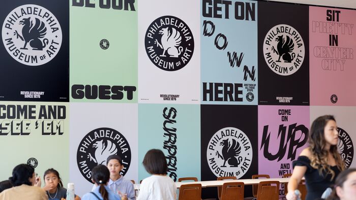
Philadelphia Museum of Art identity
Source: gretelny.com Gretel. License: All Rights Reserved.


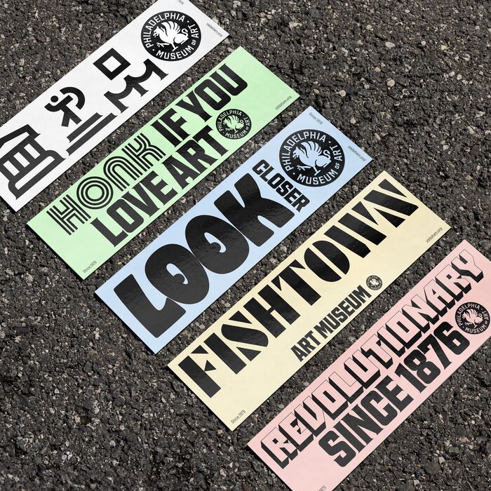
The Philadelphia Museum of Art, in collaboration with design studio Gretel, rebuilt its identity with the goal of putting the institution in direct conversation with the city that surrounds it. Typography is the primary device for achieving this. The type palette mainly works on two levels: outside-and-inside, or community-and-institution.
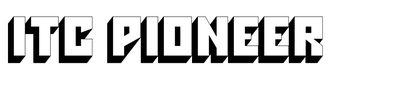
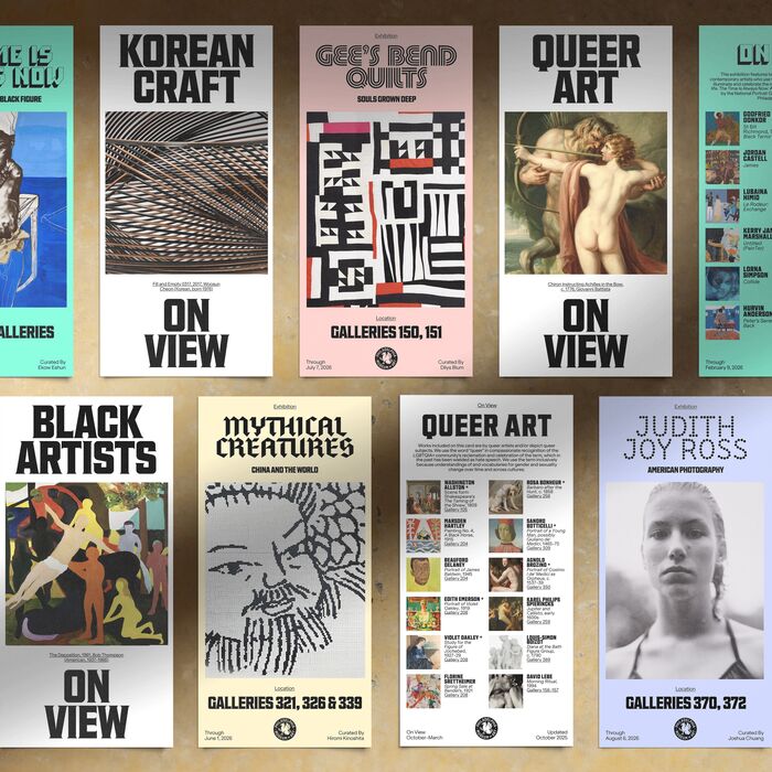
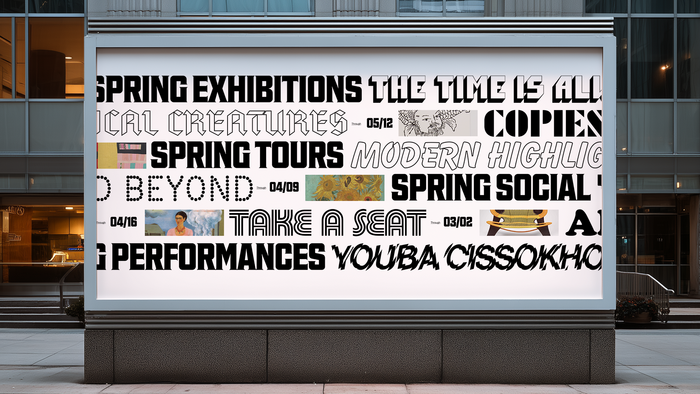
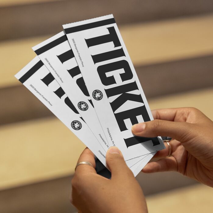
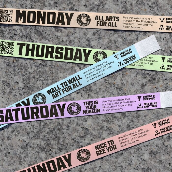
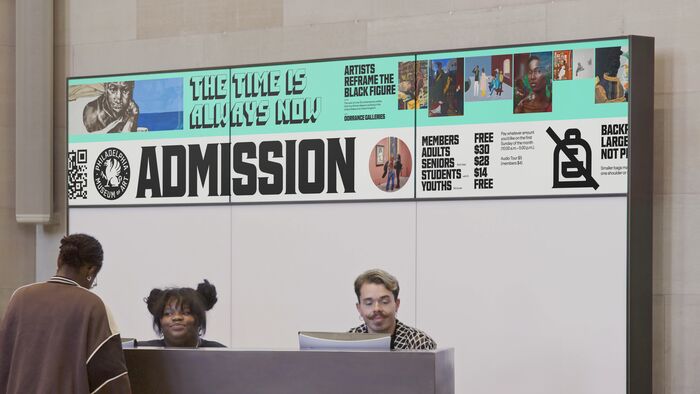
Inspired by Philadelphia’s rich visual texture of storefronts, street vendors, and murals, the vernacular type palette brings the voice of Philly into the museum and injects the identity system with contrast and spontaneity. The current library is curated (exemplified by the likes of Shatter, Cooper Black, and Balloon), but it is designed to continue growing over time. Each of these display typefaces can be used on various seasonal activations, or specifically assigned to exhibitions or departmental roles. ITC Pioneer was used for the recent exhibition The Time is Always Now, a survey of contemporary Black and African diasporic figurative art. Purple Haze is the designated typeface for PMA Members, and Megazoid is used for PMA Kids.
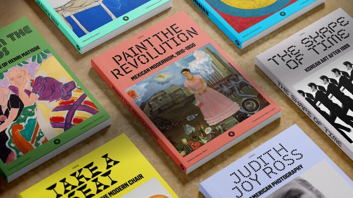
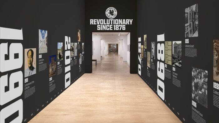
On the other hand, the institutional typographic voice serves an evergreen role: echoing the museum’s classical character while embodying Philadelphia’s industrial sensibility. The core typeface, Fairmount Serif—named for the Fairmount neighborhood—was custom-drawn by Ryan Bugden after a study of Philadelphia’s typographic history. Searching for a balance between the industrial structure of 1930s American sans-serifs and a classical features brought Hess Neobold forward as a key reference. Its designer Sol Hess attended PMSIA—the precursor to the museum—and later succeeded Frederic Goudy as Philadelphia-based Lanston Monotype’s type director. Fairmount Serif evolves the Hess Neobold model while incorporating more contemporaneous industrial cues. It remains relatively neutral alongside the museum’s broad palette of display faces while providing a distinct, authoritative voice of its own. Fairmount Serif was also used as a starting point in rendering the various institutional logos.
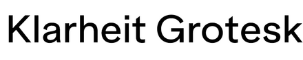
For the more workhorse level, Klarheit Grotesk serves as the museum’s body text typeface. It is set at small sizes across branding, materials, signage, and exhibition text.
See more images in Gretel’s case study.
Source: gretelny.com Gretel. License: All Rights Reserved.
Source: gretelny.com Gretel. License: All Rights Reserved.
Mockups of exhibition catalogs
Source: gretelny.com Gretel. License: All Rights Reserved.
Source: gretelny.com Gretel. License: All Rights Reserved.
Source: gretelny.com Gretel. License: All Rights Reserved.
Source: gretelny.com Gretel. License: All Rights Reserved.
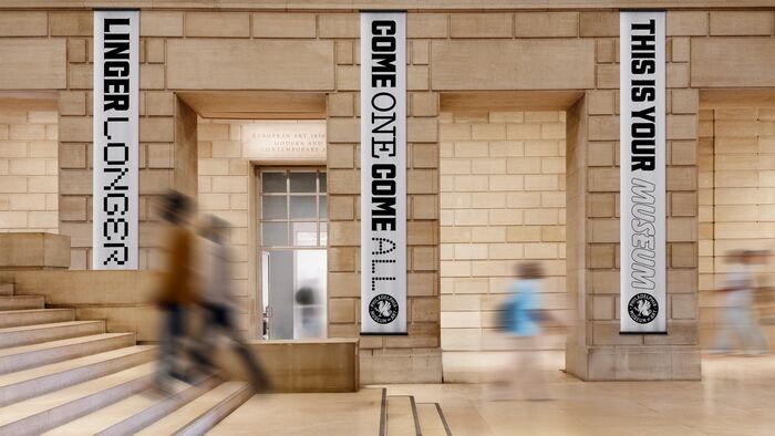
Banners.
Source: gretelny.com Gretel. License: All Rights Reserved.
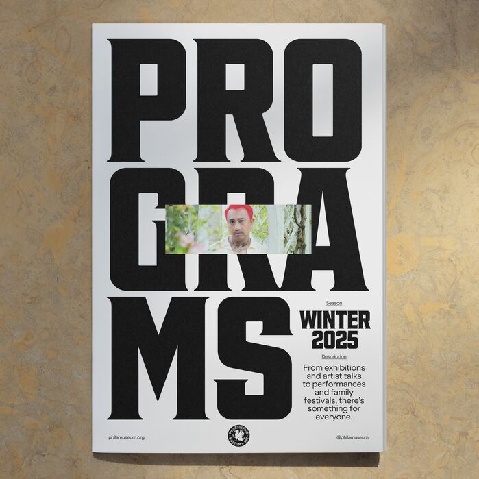
Seasonal program.
Source: gretelny.com Gretel. License: All Rights Reserved.
Source: gretelny.com Gretel. License: All Rights Reserved.
Source: gretelny.com Gretel. License: All Rights Reserved.
This post was originally published at Fonts In Use