Htag magazine
Source: www.pascallienard.com Pascal Liénard. License: All Rights Reserved.


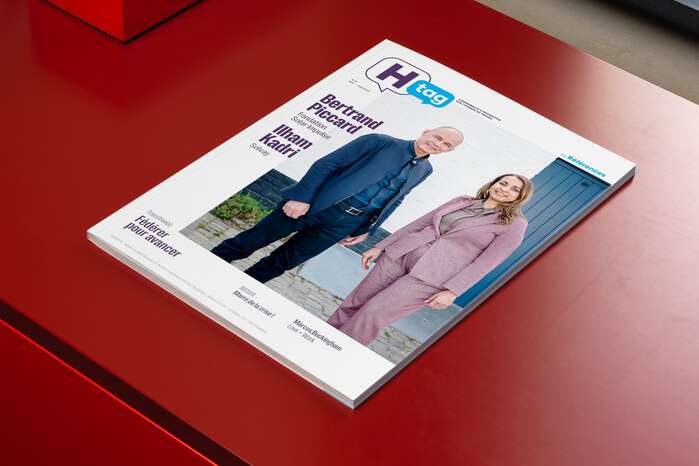
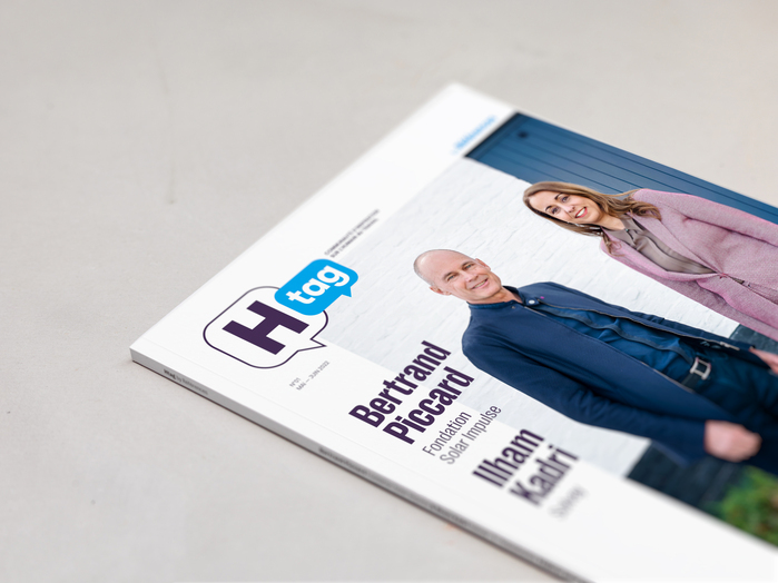
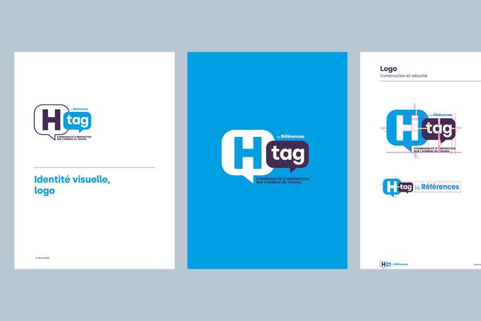
Htag is a professional magazine published by Références (Groupe Rossel) for the French-speaking Belgian HR community. The design brief called for an editorial identity that would break with the conservative conventions of B2B publishing – using B2C visual codes to produce something genuinely engaging while remaining credible in a professional context.
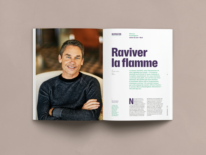
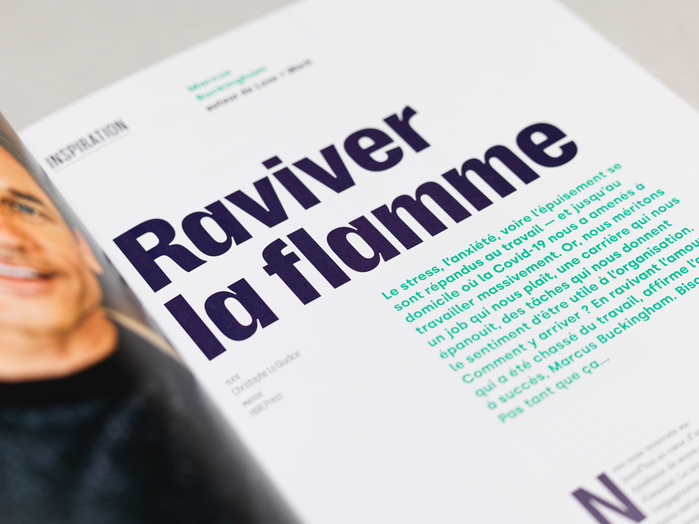
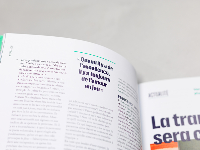
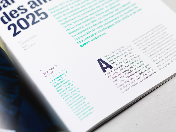
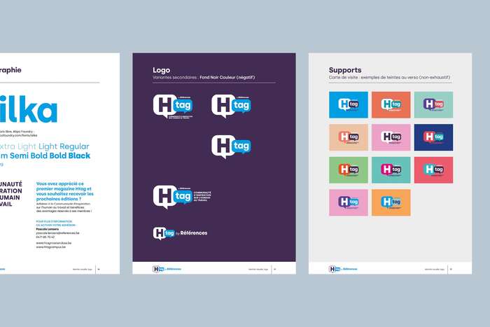
The typographic system is built around three families that each occupy a distinct register. Right Grotesk drives the display layer: Compact Dark handles the largest headline sizes, while Compact Bold appears in pull quotes, all-caps section headers, and colour-block infographics. Compact Light is used for quotation marks and pagination. The Narrow cuts – Light for bylines and section labels, Bold for feature section titles – introduce optical contrast within the same family and sustain rhythm across the grid.
Newsreader Text sets all running text – chosen for its optical-size calibration at small sizes and its ability to sustain long-form reading while giving the pages a considered, editorial weight.
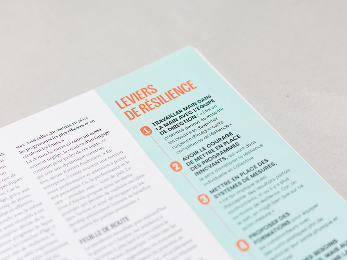
Silka anchors the identity – logotype, standfirsts, and interview questions – its humanist tone counterbalancing Right Grotesk's geometric rigour. In colour-block encadrés, Silka replaces Newsreader as body copy, visually differentiating these sections from the main editorial flow.
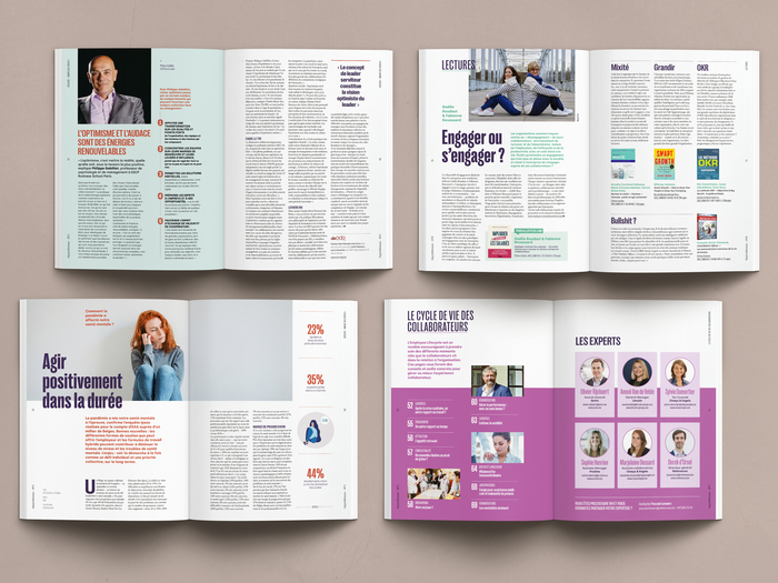
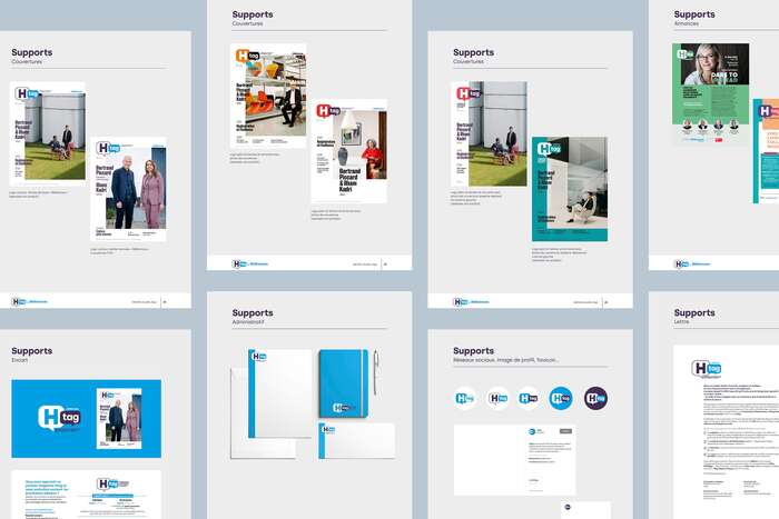
The grid alternates between strict alignment and deliberate offsets, typographic elements breaking the column structure to introduce visual tension. Colour is used boldly – frank, saturated accents punctuating the rhythm of the pages – an unusual stance for a readership accustomed to the conservative visual codes of HR publishing.
Source: www.pascallienard.com Pascal Liénard. License: All Rights Reserved.
Source: www.pascallienard.com Pascal Liénard. License: All Rights Reserved.
Source: www.pascallienard.com Pascal Liénard. License: All Rights Reserved.
Source: www.pascallienard.com Pascal Liénard. License: All Rights Reserved.
Source: www.pascallienard.com Pascal Liénard. License: All Rights Reserved.

Source: www.pascallienard.com Pascal Liénard. License: All Rights Reserved.
Source: www.pascallienard.com Pascal Liénard. License: All Rights Reserved.
Source: www.pascallienard.com Pascal Liénard. License: All Rights Reserved.
Source: www.pascallienard.com Pascal Liénard. License: All Rights Reserved.
Source: www.pascallienard.com Pascal Liénard. License: All Rights Reserved.
Source: www.pascallienard.com Pascal Liénard. License: All Rights Reserved.
This post was originally published at Fonts In Use