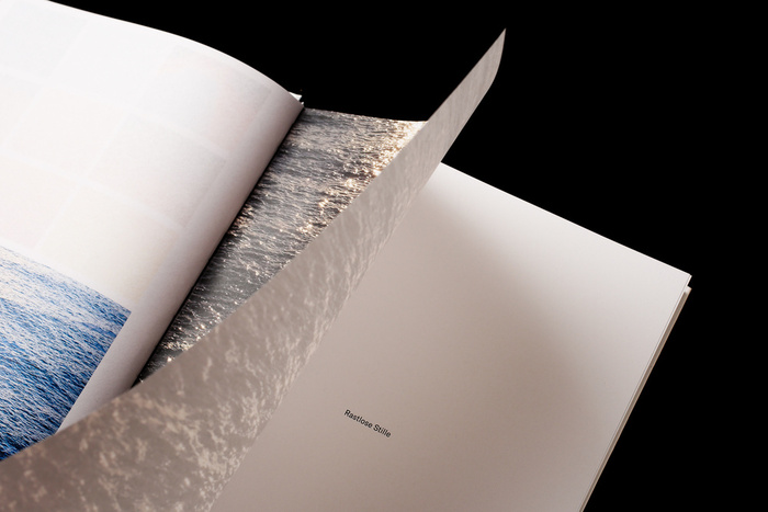
La Dolce Vita: A Restless Silence
Melina Heggenberger. License: All Rights Reserved.

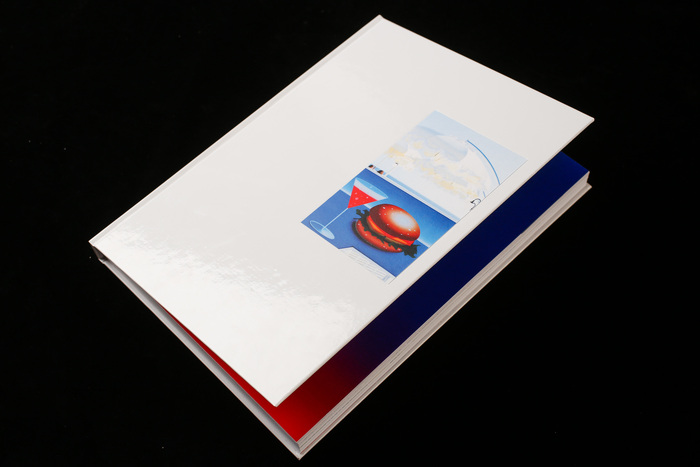
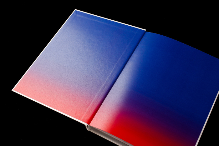
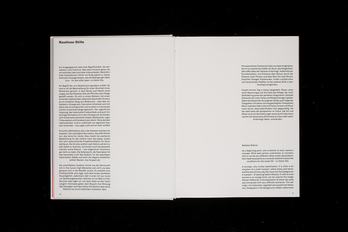
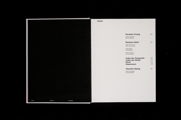
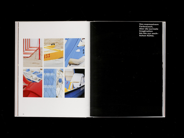
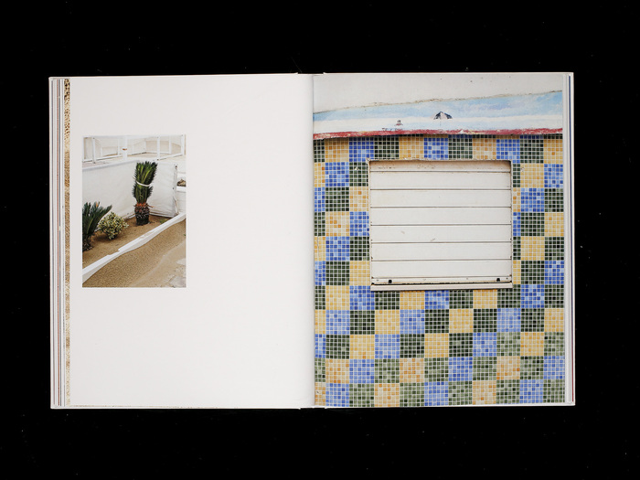
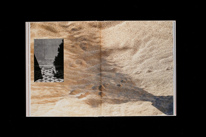
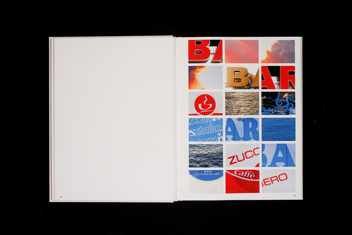
This photographic volume explores the divergence between the myth of La Dolce Vita and its contemporary reality. Moving from expressive, saturated color experiences to surreal imaginations, the book arrives at a “factual coolness.” It documents a journey through Italy outside the tourist season—spanning from Cremona to Genova, through Tuscany to Rome, and finally Rimini.
For the typography, I chose GT America. The book focuses on composition and observation, questioning the “perfect imagination” of the south. To anchor the rich, atmospheric photography, GT America was chosen for its versatile and utilitarian character.
As a typeface that bridges the gap between 19th-century American Gothics and 20th-century European Neo-Grotesks, GT America provides a deliberate structural counterpoint. Its straightforward, unembellished aesthetic reflects the “factual coolness” of the investigation, acting as a neutral, documentarian observer. By using GT America sparingly, the design allows the saturated color palettes and the restless silence of the Italian landscapes to remain at the forefront, while the interviews are manifested through a typeface that feels both timeless and modern.
Made as Diploma project at the ABK Stuttgart.
Melina Heggenberger. License: All Rights Reserved.
Melina Heggenberger. License: All Rights Reserved.
Melina Heggenberger. License: All Rights Reserved.
Melina Heggenberger. License: All Rights Reserved.
Melina Heggenberger. License: All Rights Reserved.
Melina Heggenberger. License: All Rights Reserved.
Melina Heggenberger. License: All Rights Reserved.
Melina Heggenberger. License: All Rights Reserved.
Melina Heggenberger. License: All Rights Reserved.
Melina Heggenberger. License: All Rights Reserved.
This post was originally published at Fonts In Use