The Beatles – The Beatles album art
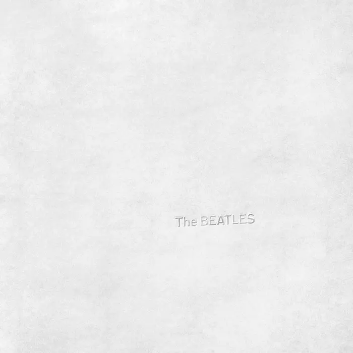
Photo: André Gooren. License: All Rights Reserved.
The Beatles, commonly known as the White Album, is usually described online as having its title set in Helvetica. I have not found a single public identification pointing to Akzidenz-Grotesk for the original LP sleeve; the visible consensus instead seems to cite Helvetica, often quite authoritatively. A close comparison of the original embossed lettering, however, suggests that this attribution is likely incorrect.
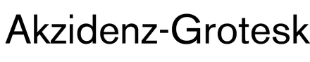
The type on the original LP sleeve appears to be Akzidenz-Grotesk Medium, specifically the original metal type rather than Neue Haas Grotesk or Helvetica Bold. The closest digital approximation I have found is Akzidenz-Grotesk Old Face Medium, which preserves the older metal-type forms more closely than contemporary Akzidenz-Grotesk or Helvetica cuts. This should not be taken to mean that Akzidenz-Grotesk Old Face itself was used on the sleeve; rather, it is the nearest available digital proxy for comparing the original metal Akzidenz-Grotesk Medium.
The clearest tell is the S, whose angled terminals differ markedly from Helvetica’s more rationalized forms. The proportions of the B, E, A and the lowercase letters in “The” also align much more closely with the older Akzidenz-Grotesk Medium forms than with Helvetica.
One possible reason for the persistent Helvetica attribution is that later formats appear to have changed the lettering. The CD and cassette versions seem to use Helvetica LT 75 Bold, or something very close to it, which may have retroactively shaped assumptions about the original embossed LP cover. Because the LP lettering is white-on-white inkless embossing, its details are easily softened or lost in reproduction; in photographs, the evidence can look like Helvetica at a glance.
Richard Hamilton’s sleeve design reduces the album cover almost to absence: a plain white surface, a serial number, and the band’s name barely present as physical impression rather than printed image. In that context, the older Akzidenz-Grotesk Medium feels especially apt—neutral, industrial, unadorned, and slightly rougher than the smoother Helvetica it has long been mistaken for.
This post was originally published at Fonts In Use