Point-of-sale display for compasses
Published May 30, 2026
By FontsInUse
Photo(s) by altpapiersammler on Flickr.
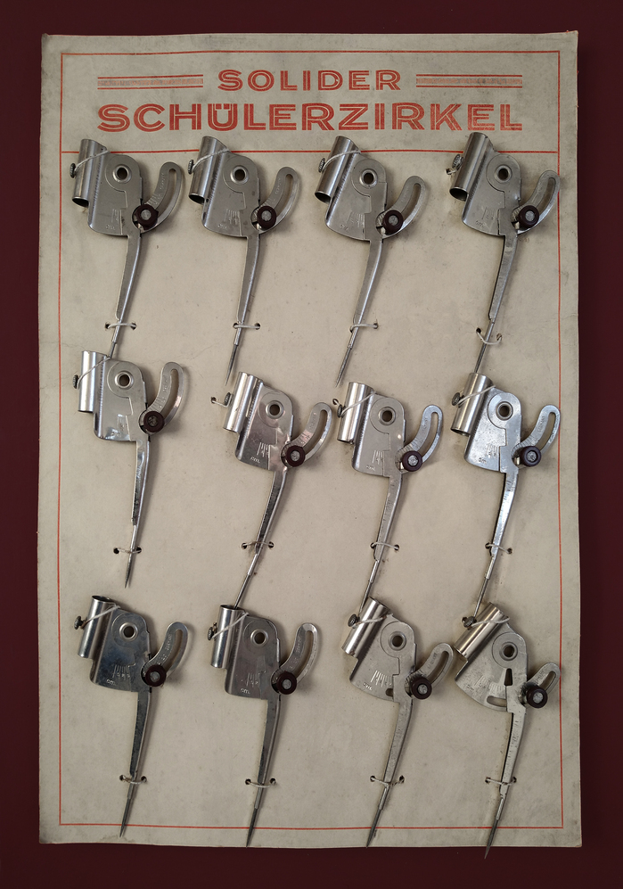
Source: www.flickr.com Uploaded to Flickr by altpapiersammler and tagged with “koralle”. License: All Rights Reserved.
This post was originally published at Fonts In Use
Source: www.flickr.com Uploaded to Flickr by altpapiersammler and tagged with “koralle”. License: All Rights Reserved.
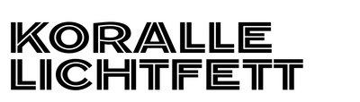
Koralle lichtfett (1926), the extrabold inline style of Schelter & Giesecke’s Koralle family, in use for presenting a dozen of “solid compasses for pupils”, probably from around the 1950s. Note the dots in the Ü umlaut that are integrated into the cap height.
This post was originally published at Fonts In Use
Read full story.
WRITTEN BY
FontsInUse
An independent archive of typography.
More from FontsInUse