{typ_
Source: www.sderidder.nl Sjoerd de Ridder. License: All Rights Reserved.
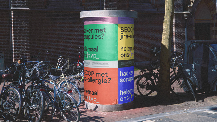
Typ Recruitment, stylized as {typ_, had the energy of a misfit collective, but the identity told a far safer story. Behind the company lived curiosity, experimentation, grit, and a very particular kind of humor. None of it reached the surface.
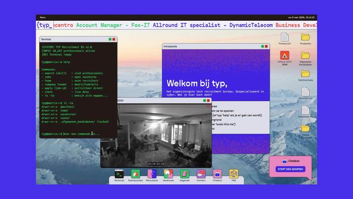
The new identity brings that internal culture forward. Built for people who explore before they read, the system filters through behavior rather than brand language.
At the center sits the {typ_ logo, a small manifesto reflecting the idea that identity is never finished, but always shaped by context and iteration.
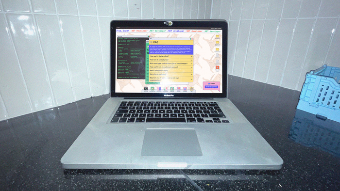
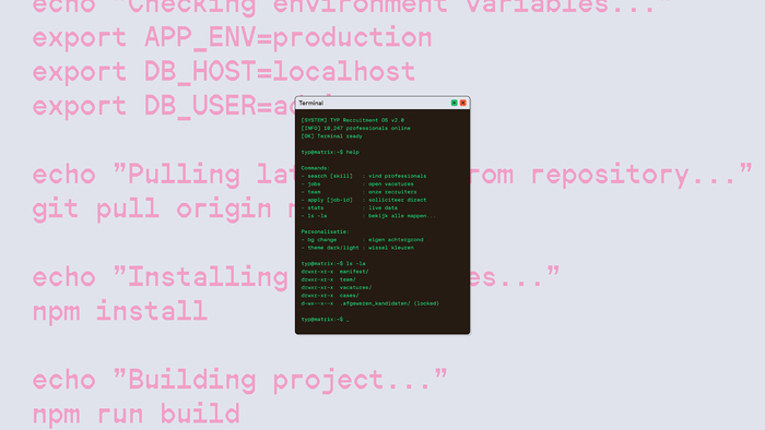
Instead of a traditional corporate website, we designed a layered desktop-like environment with terminal interactions, overlapping windows, hidden details, and subtle narrative clues. The visual language draws from tech culture and open-source systems, modular, exploratory, and intentionally imperfect.
Source: www.sderidder.nl Sjoerd de Ridder. License: All Rights Reserved.
Source: www.sderidder.nl Sjoerd de Ridder. License: All Rights Reserved.
Source: www.sderidder.nl Sjoerd de Ridder. License: All Rights Reserved.
Source: www.sderidder.nl Sjoerd de Ridder. License: All Rights Reserved.
Source: www.sderidder.nl Sjoerd de Ridder. License: All Rights Reserved.
Source: www.sderidder.nl Sjoerd de Ridder. License: All Rights Reserved.
This post was originally published at Fonts In Use