Peter Max clocks for General Electric
Source: clickamericana.com License: All Rights Reserved.
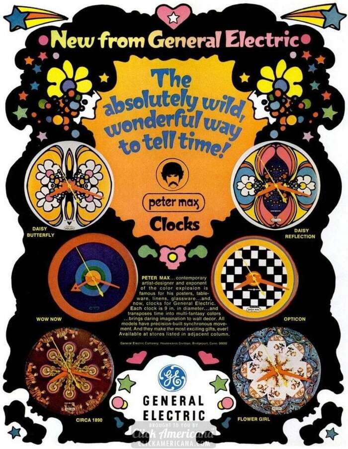
Ad in LIFE magazine, October 11, 1968


New imaginative styles by Peter Max. Three wild designs to choose from. Repeat alarm wakes you – lets you snooze – then awakes you again. Daring and decorative – great gift.
Every time I come across a Peter Max work, whether it’s a pair of jeans (ad) or the cover of his own magazine—my eyes literally overdose on all the colors and swirling forms. Peter Max is not just another “hippie” artist, rather he’s a kind, caring and loving person who’s influenced a whole generation of artists and people abroad. Even if his name has never crossed your eyes or ears, you’ve probably seen his art somewhere. So many others around the world admire Max and his artwork, although these days it absolutely breaks my heart to see how others treat him in his current state.
Let's move on to something lighter… literally!
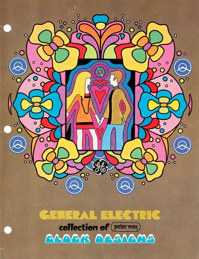
From 1968 to 1970, Peter Max was commissioned to design clocks and a poster for General Electric. The poster, advertising some absolutely wonderful wall clocks is set in Millstein Orientale for “New from General Electric” and below, with some Helvetica for the tinier text.
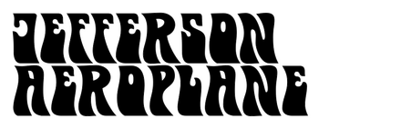
Moving on to the 1970 Snooz-Alarm clocks advertisement which shows Norton Futuramic, a Photo-Lettering face that was issued in the 1940s, paired with Obese E, a Psychedelitype (link two) released in 1967—note that this wouldn’t be the first or last time Obese would be used in Max’s work. Jefferson Aeroplane appears for the Symmetry clock, and Davison Arabesque for the Spectrum clock. Aura is just Futuramic, repeated, and below the three is presented in Futura for the price and bold words, Bodoni for the quoted text.
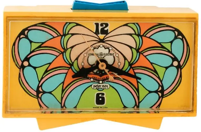
The actual Symmetry clock uses an illustrated form of Obese, Spectrum uses Art Nouveau-esque numericals not unlike Benguiat Laurent, and the Aura clock uses custom numerals not specific to any phototype… but still looks rad anyway!

Source: clickamericana.com License: All Rights Reserved.
Ad in Courier Journal, March 22, 1970
Source: clickamericana.com License: All Rights Reserved.
Symmetry
Source: clickamericana.com License: All Rights Reserved.
Spectrum
Source: clickamericana.com License: All Rights Reserved.
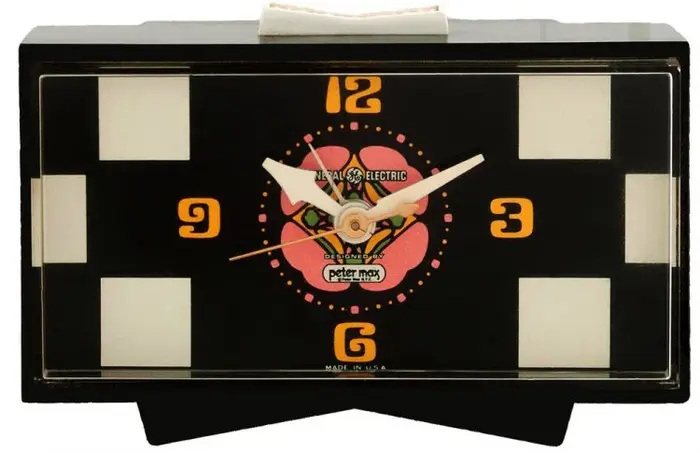
Aura (black version)
Source: clickamericana.com License: All Rights Reserved.
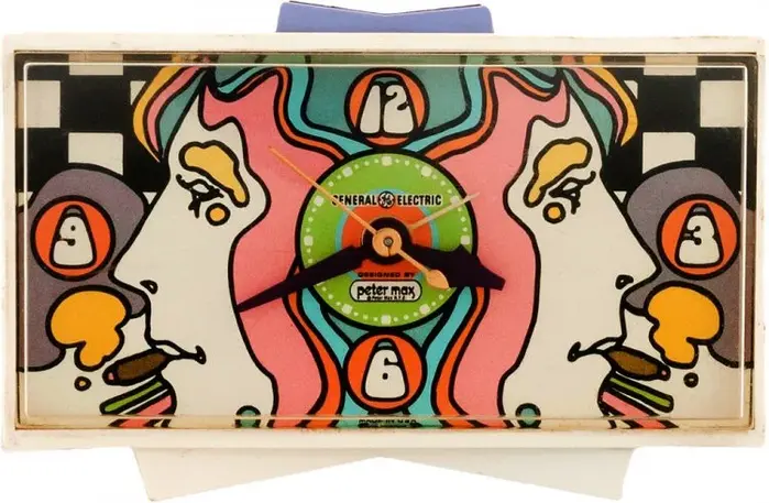
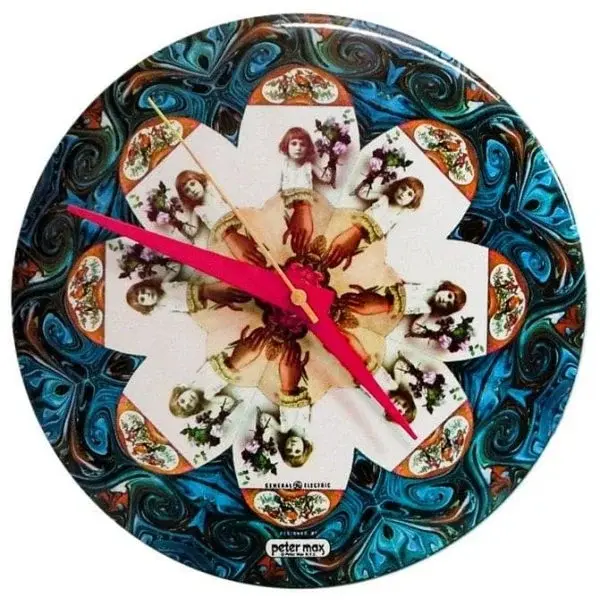
Flower Girl
Source: www.pinterest.com License: All Rights Reserved.
This post was originally published at Fonts In Use