Pescheria Pedol
Cobra Studio. License: All Rights Reserved.


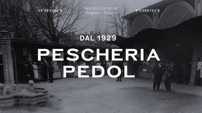
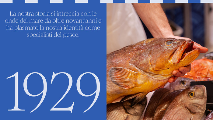
For almost a century, Pescheria Pedol has pursued a clear vision based on respect for the sea and a constant pursuit of quality in every detail. Specialists in fish and a historic reference point for the retail sale of fish products, the company has always represented an authentic balance between tradition, expertise, and passion.
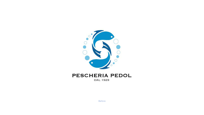
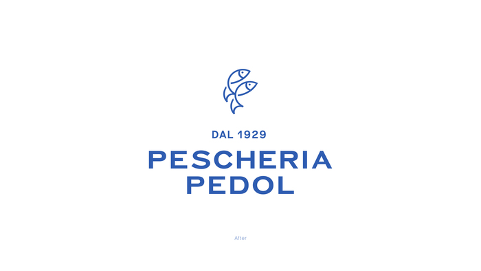
Today, we discreetly present our new rebranding: an evolution of our visual identity designed to reflect even more accurately the values that define Pescheria Pedol – essentiality, rigor, and fidelity to our idea of excellence.
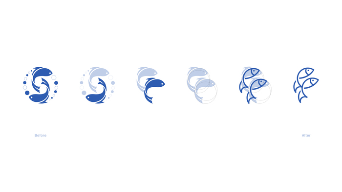
At the heart of this renewal is a new pictogram, a symbol that encapsulates stories of family, the sea, and daily commitment. A sign capable of guiding the company’s identity with consistency, along a path of continuity and loyalty to its roots, projected towards the future with the solidity of its history.
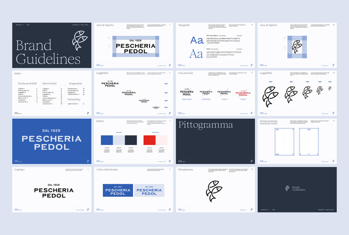
Together with the new pictogram, we have rethought and curated the entire visual image of Pescheria Pedol: an authentic and coherent story, capable of conveying the essence of the company through a contemporary lens.
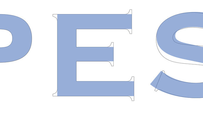
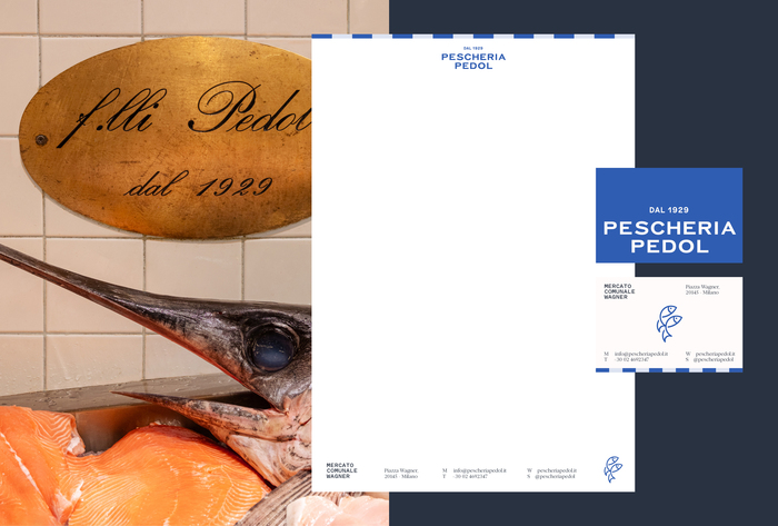
The logo is custom drawn, based on the previous one in Copperplate Gothic. The brand typefaces are Claude Type’s Romie and Klim Type Foundry’s Pitch.
The new identity has already been rolled out to the company’s Instagram and Facebook profiles.

Cobra Studio. License: All Rights Reserved.
Cobra Studio. License: All Rights Reserved.
Cobra Studio. License: All Rights Reserved.
Cobra Studio. License: All Rights Reserved.
The new logo in custom sans-serif letters, shown on top of the previous one in Copperplate Gothic.
Cobra Studio. License: All Rights Reserved.
Cobra Studio. License: All Rights Reserved.
Cobra Studio. License: All Rights Reserved.
Cobra Studio. License: All Rights Reserved.
This post was originally published at Fonts In Use