Casabella magazine, 2024–25
Source: www.tassinarivetta.it TassinariVetta. License: All Rights Reserved.


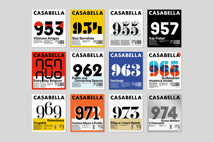
In March 1996 TassinariVetta took over the art direction of Casabella, the historic architectural review founded in 1928. From that moment on the magazine has become part of the everyday life of the studio, where it is designed month after month.
Aiming to go beyond the traditional concept of ‘typographic architecture’ – which sees graphic arts subject to the universal compositional rules expressed in architecture – and to offer a new perspective on the world of letters, the 2024-25 cover design sets editorial objectives ahead of graphic ones.
Taking advantage of the constraints inherent in monthly publication in sectoralization and serialization, and enhancing repetitive elements—the masthead, headlines, but above all the sequential number—the project brings editorial content to the cover through the choice of the font used to compose the number, its graphic interpretation, and the explanatory note published on the inside pages, which is an integral part of the project itself.
Faithful to the magazine tradition, issue after issue, the choice of lettering or typeface moves through the 20th century between avant-garde and modernism, with forays into adjacent spaces suggested by unlikely discards or ambiguous analogies, while exploring the development of the industrial means underlying mechanical writing.
With philological respect—using fonts available under license, photographic reproductions of original specimens, or vector redrawing, as appropriate—and with the calibrated use of a color palette consistent with the magazine visual history, the graphic interpretation ultimately aims to bring the historical artifact into the present, contextualizing it in a contemporary and accessible language.

Source: www.tassinarivetta.it TassinariVetta. License: All Rights Reserved.
The numerals for no. 976 are from a custom design made by Carlo Scarpa in 1951 for the Veritti Tomb in Udine.

Source: www.tassinarivetta.it TassinariVetta. License: All Rights Reserved.

Source: www.tassinarivetta.it TassinariVetta. License: All Rights Reserved.

Source: www.tassinarivetta.it TassinariVetta. License: All Rights Reserved.

Source: www.tassinarivetta.it TassinariVetta. License: All Rights Reserved.

Source: www.tassinarivetta.it TassinariVetta. License: All Rights Reserved.

Source: www.tassinarivetta.it TassinariVetta. License: All Rights Reserved.
Source: www.tassinarivetta.it TassinariVetta. License: All Rights Reserved.
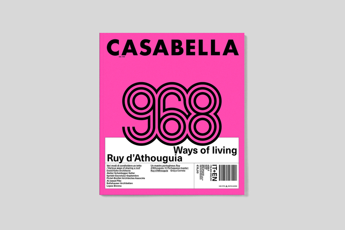
The multiline numerals for no. 968 refer to Mexico Olympic and the graphic identity developed by Lance Wyman for the Mexico City Olympics (1966–68). The version used here has been redesigned by the TassinariVetta studio and represents a graphic elaboration based on the iconic typeface.

Source: www.tassinarivetta.it TassinariVetta. License: All Rights Reserved.

Source: www.tassinarivetta.it TassinariVetta. License: All Rights Reserved.

Source: www.tassinarivetta.it TassinariVetta. License: All Rights Reserved.

Source: www.tassinarivetta.it TassinariVetta. License: All Rights Reserved.

Source: www.tassinarivetta.it TassinariVetta. License: All Rights Reserved.

Source: www.tassinarivetta.it TassinariVetta. License: All Rights Reserved.

Source: www.tassinarivetta.it TassinariVetta. License: All Rights Reserved.

Source: www.tassinarivetta.it TassinariVetta. License: All Rights Reserved.

Source: www.tassinarivetta.it TassinariVetta. License: All Rights Reserved.
Source: www.tassinarivetta.it TassinariVetta. License: All Rights Reserved.
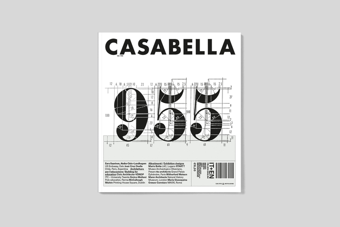
The numerals for no. 955 refer to Nebiolo’s Aldina (Aldino), redesigned by Adalberto Libera in 1938. The image is taken from the manual commissioned in the same year to standardise and preserve the harmonious proportions of the alphabetical models produced by Nebiolo and Raimondi & Zucca.

Source: www.tassinarivetta.it TassinariVetta. License: All Rights Reserved.

Source: www.tassinarivetta.it TassinariVetta. License: All Rights Reserved.
This post was originally published at Fonts In Use