CorContainer.nl
CorContainer.nl. License: All Rights Reserved.

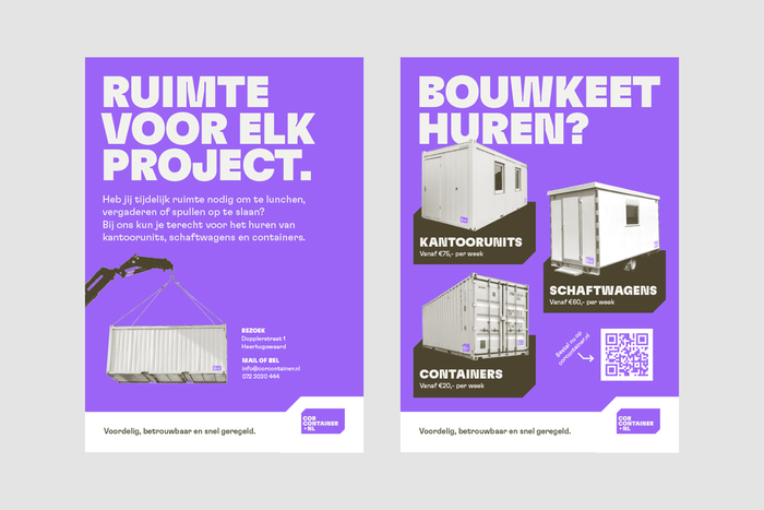
CorContainer.nl is a Dutch container rental company operating in a sector where visual identities are often purely functional. The branding was designed to stand out – primarily through typography and color – while remaining appropriate to the construction environment.
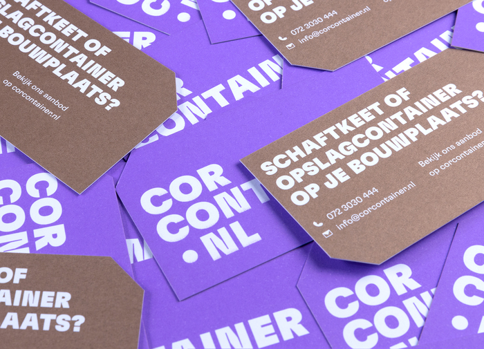
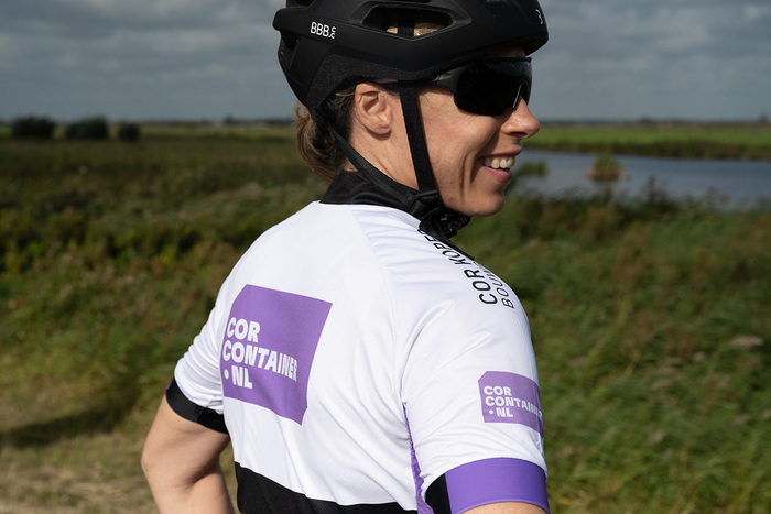
The identity is built around GT Flexa, a typeface that balances strength and clarity with a friendly, distinctive character. Headlines are set in GT Flexa Black in uppercase, forming bold, compact typographic statements that function almost as graphic elements. For body copy and supporting text, GT Flexa Regular provides legibility and warmth, offering a subtle counterbalance to the heavy display style.
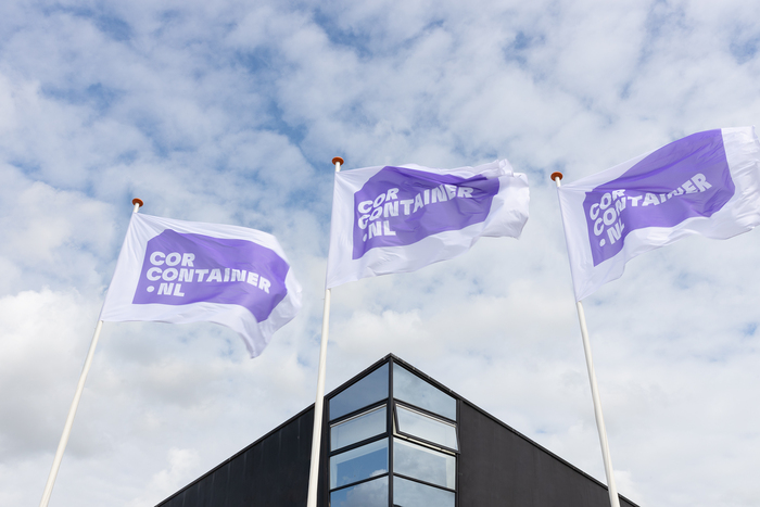
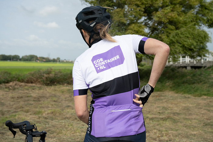
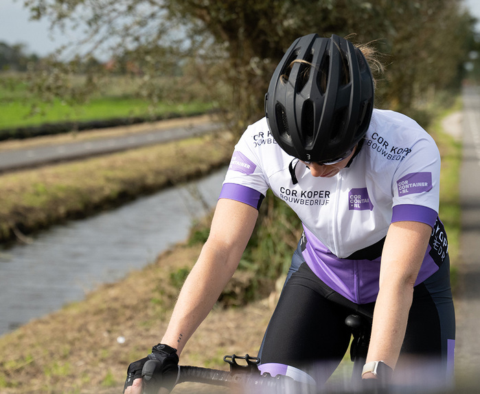
A vibrant purple – rare within the industry – reinforces recognition and sets the brand apart from the typical blues and reds associated with construction.
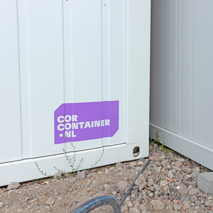
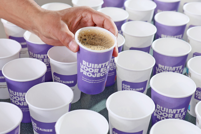
Application shifts depending on context. On containers, office units, and site cabins, the branding is deliberately understated, functioning more like a garment label: present but never intrusive. In contrast, promotional materials – posters, cycling jerseys, coffee cups, and other brand touchpoints – allow the typography and color to take center stage, building visibility and recognition.
The result is an identity that is both bold and considerate – distinctive when needed, restrained where appropriate.
CorContainer.nl. License: All Rights Reserved.
temet.studio. License: All Rights Reserved.
Thomas Nondh Jansen. License: All Rights Reserved.
CorContainer.nl. License: All Rights Reserved.
Jasmijn Slegh. License: All Rights Reserved.
Jasmijn Slegh. License: All Rights Reserved.
Jasmijn Slegh. License: All Rights Reserved.

CorContainer.nl. License: All Rights Reserved.
This post was originally published at Fonts In Use