DE1 Tea packaging
Published February 25, 2026
By FontsInUse
Contributed by Aliv Pandu
Source: www.de1tea.co.uk License: All Rights Reserved.


Source: www.de1tea.co.uk License: All Rights Reserved.
Source: www.de1tea.co.uk License: All Rights Reserved.
Source: www.de1tea.co.uk License: All Rights Reserved.
Source: www.de1tea.co.uk License: All Rights Reserved.
Source: www.de1tea.co.uk License: All Rights Reserved.
Source: www.instagram.com License: All Rights Reserved.
This post was originally published at Fonts In Use
Source: www.de1tea.co.uk License: All Rights Reserved.
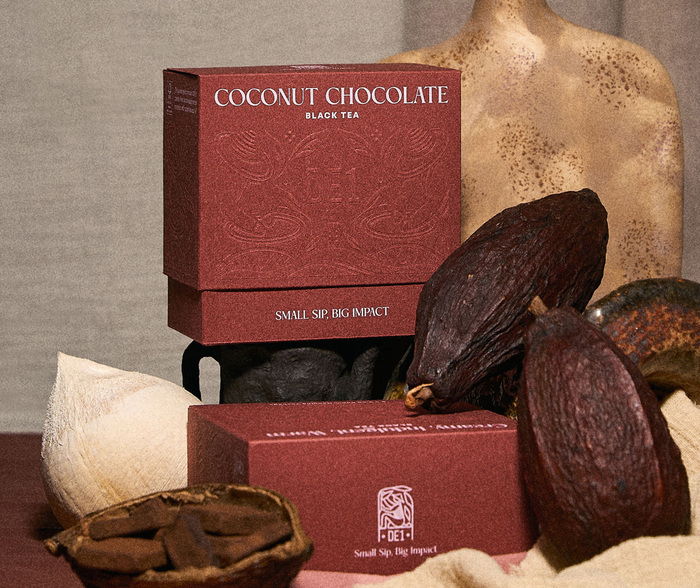
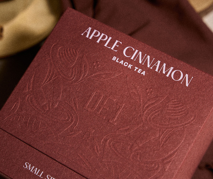
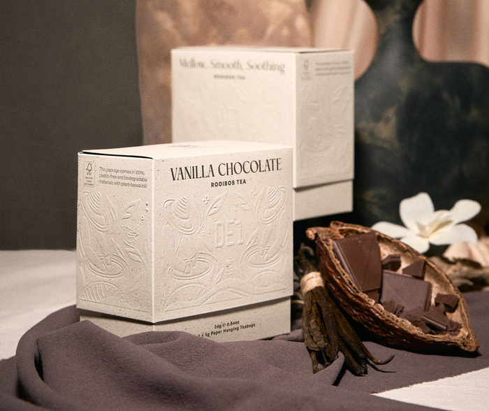
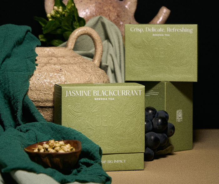
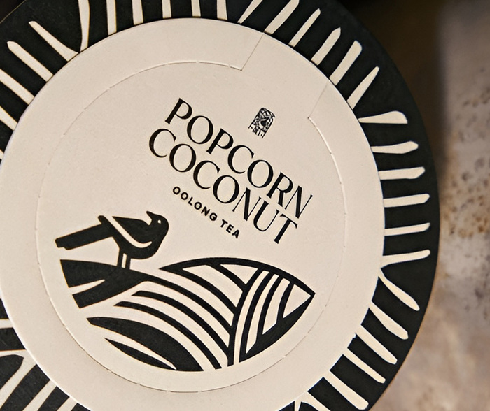
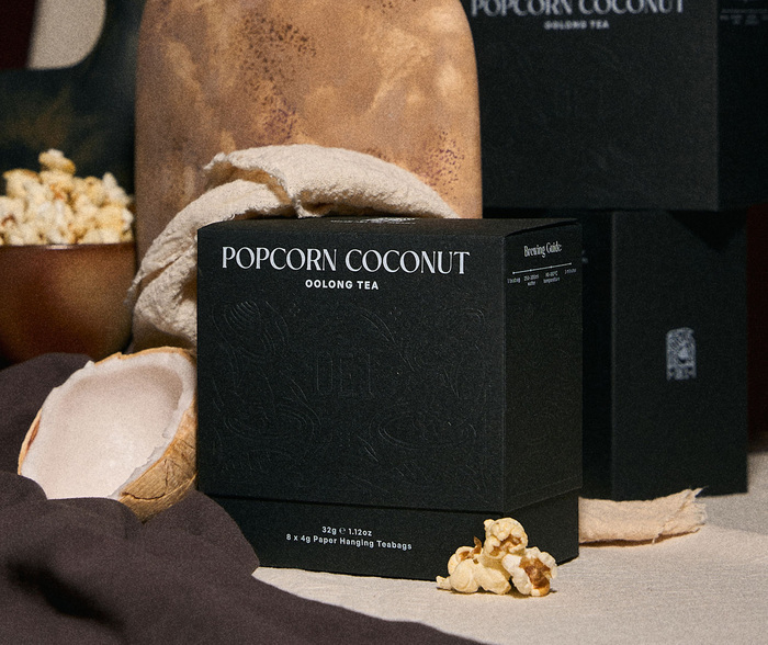
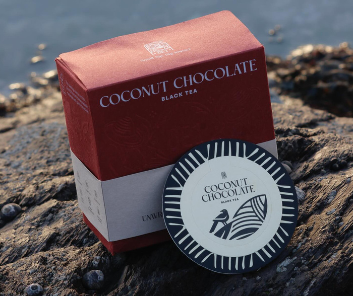
DE1 Tea uses TC Rooms together with General Sans for their product packaging to express a clean, modern, and composed brand identity. The typeface strengthens the brand’s minimalist direction while introducing subtle warmth and quiet character.
Instant tea, made purposeful. DE1 Tea does more than contain tea, its packaging communicates mindful design and planet-forward thinking. Every detail is carefully considered to reflect the brand’s commitment to sustainability and its contemporary, refined aesthetic.
The design remains intentionally minimal. Clear layouts, generous white space, and a well-defined typographic hierarchy allow the product to stand out with confidence and clarity, free from unnecessary distraction.
Source: www.de1tea.co.uk License: All Rights Reserved.
Source: www.de1tea.co.uk License: All Rights Reserved.
Source: www.de1tea.co.uk License: All Rights Reserved.
Source: www.de1tea.co.uk License: All Rights Reserved.
Source: www.de1tea.co.uk License: All Rights Reserved.
Source: www.instagram.com License: All Rights Reserved.
This post was originally published at Fonts In Use
Read full story.
WRITTEN BY
FontsInUse
An independent archive of typography.