AirGo Radio identity
Published February 24, 2026
By FontsInUse
Contributed by Hans Slade
Source: www.slade.studio Hans Slade. License: All Rights Reserved.
Source: www.slade.studio Hans Slade. License: All Rights Reserved.
Source: www.slade.studio Hans Slade. License: All Rights Reserved.
Source: www.slade.studio Hans Slade. License: All Rights Reserved.
Source: www.slade.studio Hans Slade. License: All Rights Reserved.
Source: www.slade.studio Hans Slade. License: All Rights Reserved.
Source: www.slade.studio Hans Slade. License: All Rights Reserved.
This post was originally published at Fonts In Use
Source: www.slade.studio Hans Slade. License: All Rights Reserved.
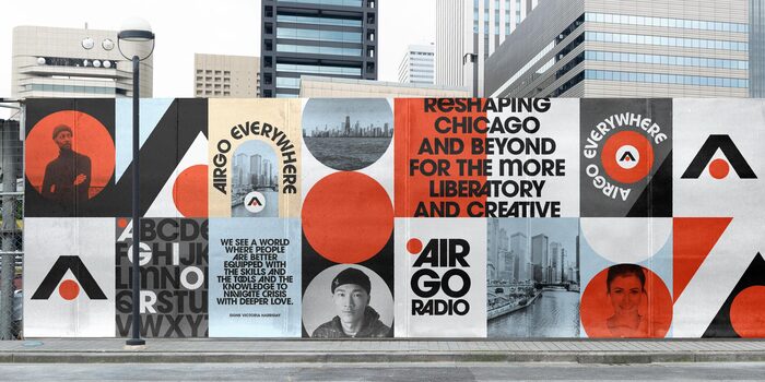
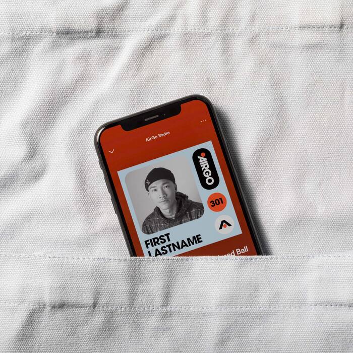
AirGo Radio is a podcast and media hub in Chicago reshaping the culture of the city and beyond. At a key moment for growth, they needed a future-facing brand with echoes of the history inspiring them.
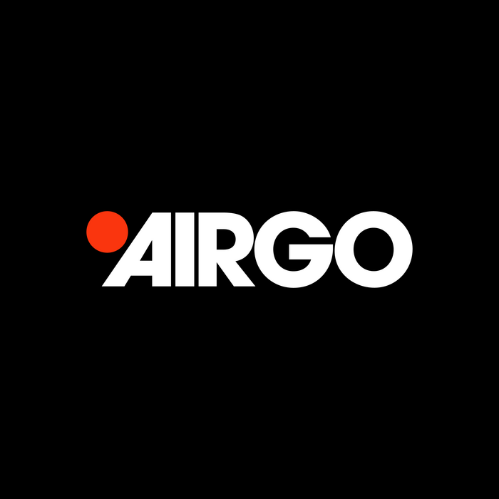
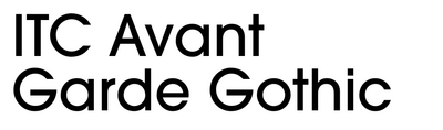
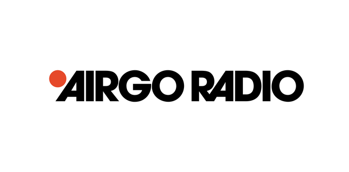
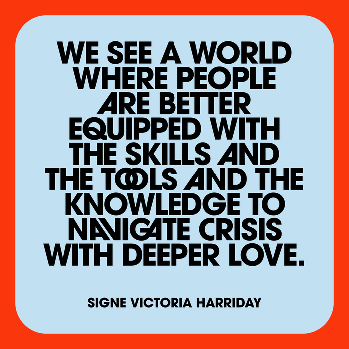
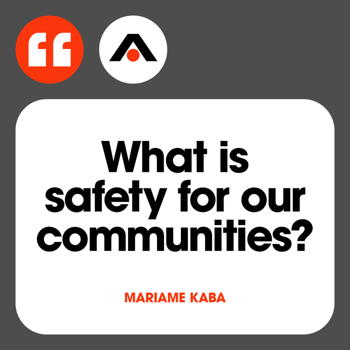
AirGo’s wordmark references “on-air” and video recording iconography with a simple red dot, which expands to form the basis for the visual identity. The simple contrast of circle and angle expands to the broader system, inspired by mid-century media such as Avant Garde magazine and PBS Television. ITC Avant Garde Gothic was a practical choice as well—when handed off to the client for use, it’s sturdy enough to live unchanged, but its alternates can easily add visual interest to a pull quote or other text.
Source: www.slade.studio Hans Slade. License: All Rights Reserved.
Source: www.slade.studio Hans Slade. License: All Rights Reserved.
Source: www.slade.studio Hans Slade. License: All Rights Reserved.
Source: www.slade.studio Hans Slade. License: All Rights Reserved.
Source: www.slade.studio Hans Slade. License: All Rights Reserved.
Source: www.slade.studio Hans Slade. License: All Rights Reserved.
This post was originally published at Fonts In Use
Read full story.
WRITTEN BY
FontsInUse
An independent archive of typography.
More from FontsInUse