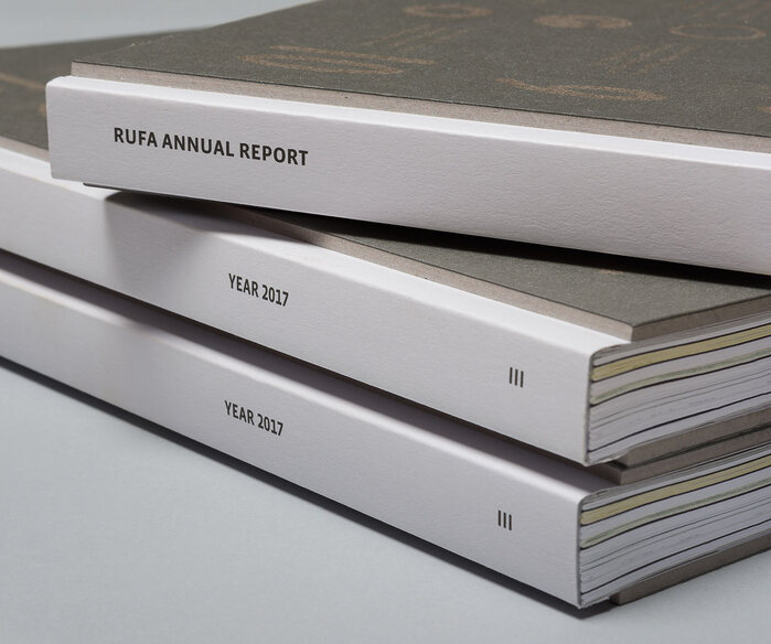
RUFA Annual Report 2017
Eleonora Cerri Pecorella / Intorno Design. License: All Rights Reserved.


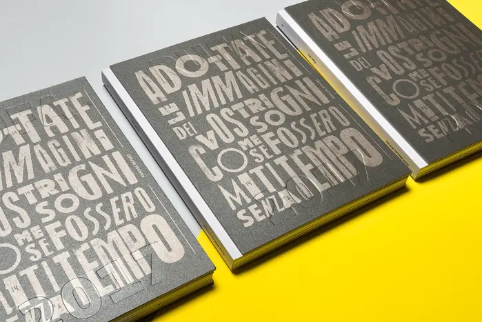
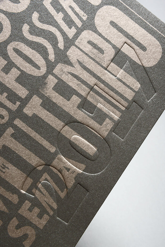
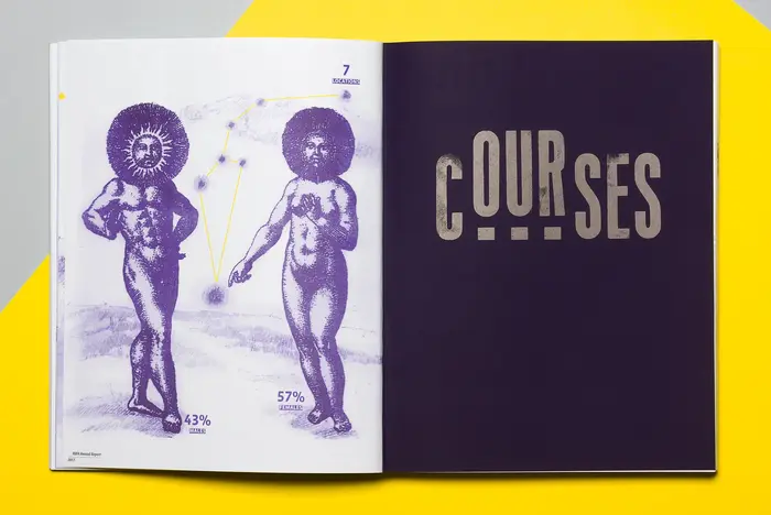
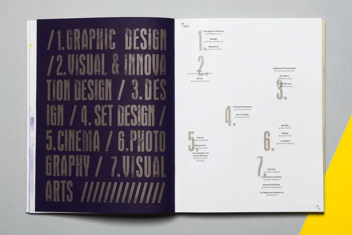
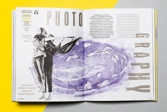
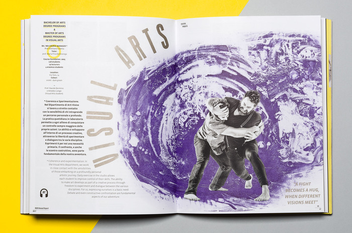
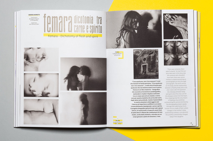
The book brings together the best annual projects of the Academy. Printed in six-colour offset with the addition of a metallic Pantone, and partially in Risograph (internal insert), it employs hand-crafted movable type for the titles, with manual typesetting combined with black-and-white photography, as well as artist illustrations produced through intaglio and engraving, printed in two colours.
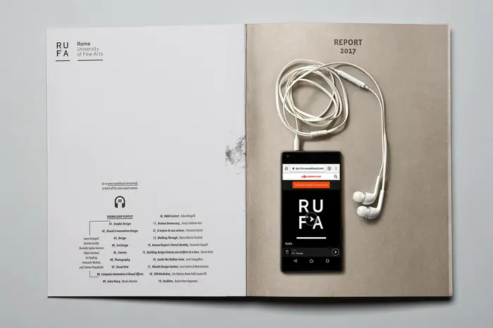
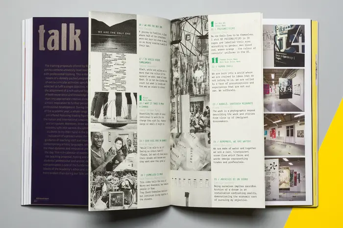
The layout is conceived as a fluid composition: a hybrid system of techniques and visual overlays that positions the book somewhere between graphic design and the artist’s book. While flipping through the pages, readers can access additional audio content related to the various activities.
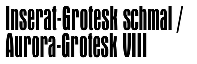
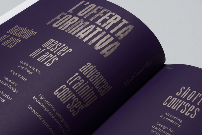
Some of the typefaces used belong to the Academy’s collection of movable type. This includes a version of Inserat-Grotesk – possibly Fondografica’s Piacenza – and Motor. The names and origins of others are uncertain or undocumented.
Eleonora Cerri Pecorella / Intorno Design. License: All Rights Reserved.
Eleonora Cerri Pecorella / Intorno Design. License: All Rights Reserved.
Eleonora Cerri Pecorella / Intorno Design. License: All Rights Reserved.
Eleonora Cerri Pecorella / Intorno Design. License: All Rights Reserved.
Eleonora Cerri Pecorella / Intorno Design. License: All Rights Reserved.
Eleonora Cerri Pecorella / Intorno Design. License: All Rights Reserved.
Eleonora Cerri Pecorella / Intorno Design. License: All Rights Reserved.
Eleonora Cerri Pecorella / Intorno Design. License: All Rights Reserved.
Eleonora Cerri Pecorella / Intorno Design. License: All Rights Reserved.
Eleonora Cerri Pecorella / Intorno Design. License: All Rights Reserved.
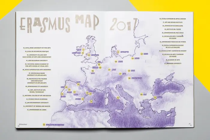
The E and P are from an Art Deco typeface that’s similar to Triennale.
Eleonora Cerri Pecorella / Intorno Design. License: All Rights Reserved.
Eleonora Cerri Pecorella / Intorno Design. License: All Rights Reserved.
Eleonora Cerri Pecorella / Intorno Design. License: All Rights Reserved.
This post was originally published at Fonts In Use