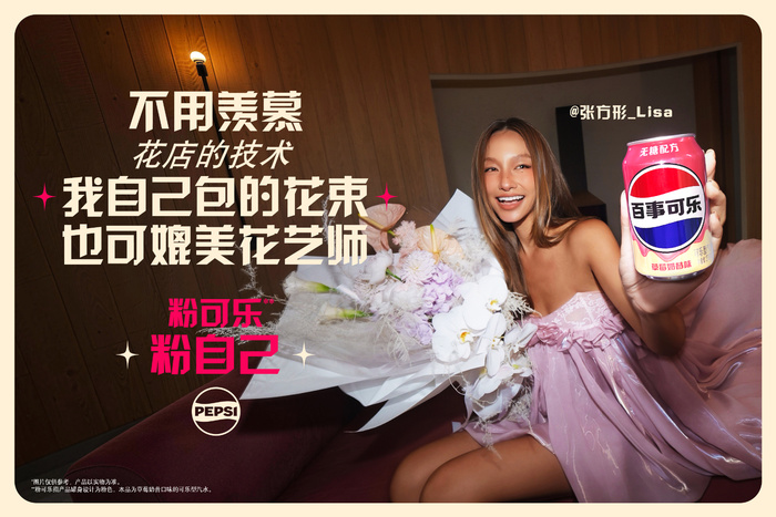
Pepsi Chinese market campaign
Pepsi. License: All Rights Reserved.
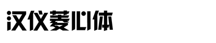
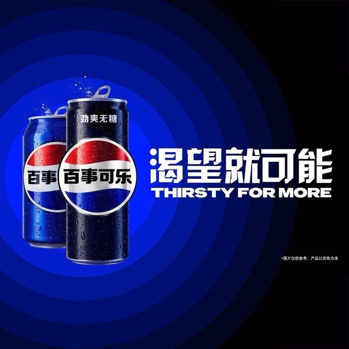
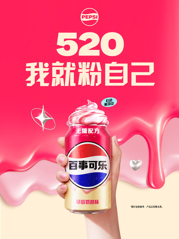
Pepsi used HY Lingxin for bold and modern Chinese campaign visuals. As a global soft drink brand, Pepsi often communicates through strong color, movement, music, youth culture, and high energy images. The Chinese typeface therefore needs to be clear, modern, and powerful enough to work together with these visual elements. HY Lingxin’s geometric structure and balanced weight make it a suitable display face for this purpose.
HY Lingxin gives Chinese headlines a clean and confident shape. It can stand out in posters, digital banners, social media images, and outdoor advertising. At the same time, it does not feel too traditional or too decorative. This helps Pepsi keep a modern and international tone in the Chinese market. The font supports the brand’s need for speed, energy, and easy recognition, while making the Chinese copy feel well designed and visually connected to the whole campaign.
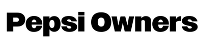
The English slogan “Thirsty for more” and the numbers are in the custom Pepsi Owners.
Pepsi. License: All Rights Reserved.
Pepsi. License: All Rights Reserved.
This post was originally published at Fonts In Use